There’s always that tiny moment when I unlock my phone and think, “Why does this look tired?” Not broken. Definitely not ugly. Just tired in that sneaky little way clutter feels tired. That’s where black and white wallpaper earns its keep, because it changes the whole mood fast.
I love a screen that looks clean without acting boring. Big difference. A strong contrast, a soft sketch, or a moody pattern can make everything look sharper. Suddenly, your apps look less chaotic. Your lock screen looks like it has a tiny stylist. Cute behavior, honestly.
Living in Orlando, I see color everywhere, from bright skies to theme park signs. So sometimes my screen needs the opposite. That contrast feels nice. I want crisp, calm, and a little dramatic. Black and white designs give that without yelling across the room.
This post is for choosing designs you’ll want to save, switch, and maybe hoard like digital snacks. We’re not making anything from scratch here. Instead, we’re browsing, noticing, and picking the ones that match your mood. Minimal today. Bold tomorrow. Soft and artsy when life gets a bit loud.
Also, yes, changing a wallpaper can feel strangely powerful. It’s small, but it gives “fresh start” energy without cleaning a closet. And once you see the right design, you’ll know exactly why that matters. The best part is how sneaky that little change becomes. Small, yes, but it works. That tiny switch can do a lot. Weirdly satisfying, too.
Some of the links on this page are affiliate links. That means if you click and make a purchase, I may earn a small commission at no extra cost to you. If you’re curious about the fine print, you can check out my full disclosure.
Why Black And White Wallpaper Always Looks Chic
Black and white wallpaper has a funny little superpower. It looks simple, but it rarely looks lazy. The contrast does most of the heavy lifting, which feels deeply unfair. Some designs work harder before my coffee does.
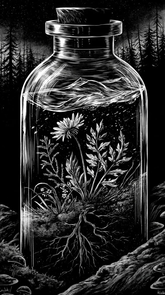
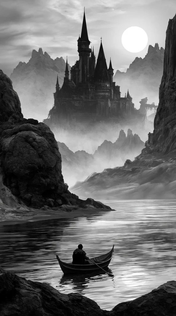
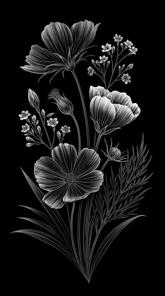
A black background with a white line drawing gives moody gallery wall energy. White backgrounds with black botanicals feel clean and soft. Then a bold check, stripe, or abstract shape looks more daring. Same colors, totally different attitudes.
That’s the sneaky part. People often think black and white means plain. I tend to notice the opposite. Without color, the shape, spacing, and texture matter more. The design has nowhere to hide, which sounds dramatic, but it’s true.
This is also why these wallpapers work across ages and styles. Teen readers can love a checkerboard. Busy moms can love a calm floral sketch. A grandmillennial heart can pick toile and feel right at home. Everyone gets a lane, and nobody has to fight over beige.
Plus, these designs make app icons look cleaner. Colorful wallpapers can compete with every tiny square on your screen. Meanwhile, black and white keeps the whole thing looking pulled together. It’s like putting your phone in a crisp button-down.
The real charm comes from restraint. A limited palette makes every curve, dot, and shadow count. That gives even a simple pattern more presence. It also keeps your screen from looking like a craft drawer exploded.
Still, the best part comes later. Once you choose the right design, your phone starts matching your mood. Not in a deep, life-changing way, of course. But in a “my lock screen has its act together” way. Sometimes that counts.
The Mood Changes More Than You Think
A wallpaper seems small until you realize how often you see it. You check the time. A text comes in. Then you open Pinterest. After that, there it is again, silently setting the mood like a tiny background actor.
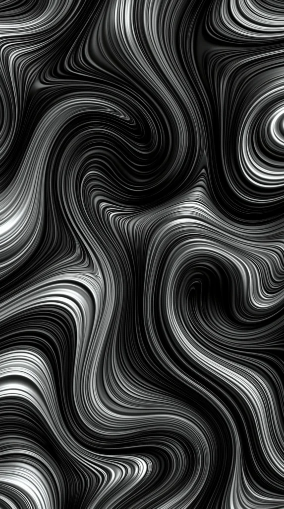
That’s why black and white wallpaper designs can feel calm, bold, artsy, or polished. The color palette stays the same, yet the mood shifts fast. A thin floral line drawing feels gentle. Thick abstract swirls feel confident. Tiny patterns feel neat. Meanwhile, a dramatic marble print feels expensive.
I’ve found that the best designs usually have one clear mood. They don’t try to be everything. That matters, because your screen already has plenty happening. Notifications show up. Apps crowd the space. Life adds its own little pop-up windows.
Here’s the twist, though. Even a busy pattern can feel peaceful if the scale works. Yet a plain design can feel loud if the contrast feels harsh. So the question isn’t “simple or bold?” The better question is, “Does this design let my eyes settle?”
That reframe changes the whole hunt. You stop looking for the prettiest option. Instead, you start looking for the design that makes your screen useful and good. Useful gets overlooked, which is rude because useful carries the group project.
The mood also changes by where the design sits. A bold lock screen can feel fun because you see it briefly. On a home screen, that same design may feel bossy. Same art. Different job.
Of course, pretty still matters. I’m not trying to turn your phone into a tax form. The fun lives in that middle space. Clean, but not cold. Stylish, but not fussy. Noticeable, but not needy.

Black And White Wallpaper Designs For Minimal Girls
Minimal style sounds simple until you start choosing. Then every tiny line suddenly has an opinion. A minimal black and white wallpaper should look clean, but it should still have charm. Otherwise, it becomes a blank screen with better branding.
I like minimal designs that leave breathing room around the main shape. That space helps your clock, widgets, and app icons stay easy to read. More importantly, it keeps your screen from looking like it lost a fight with a pattern book.
Look for designs that give quiet polish without going flat:
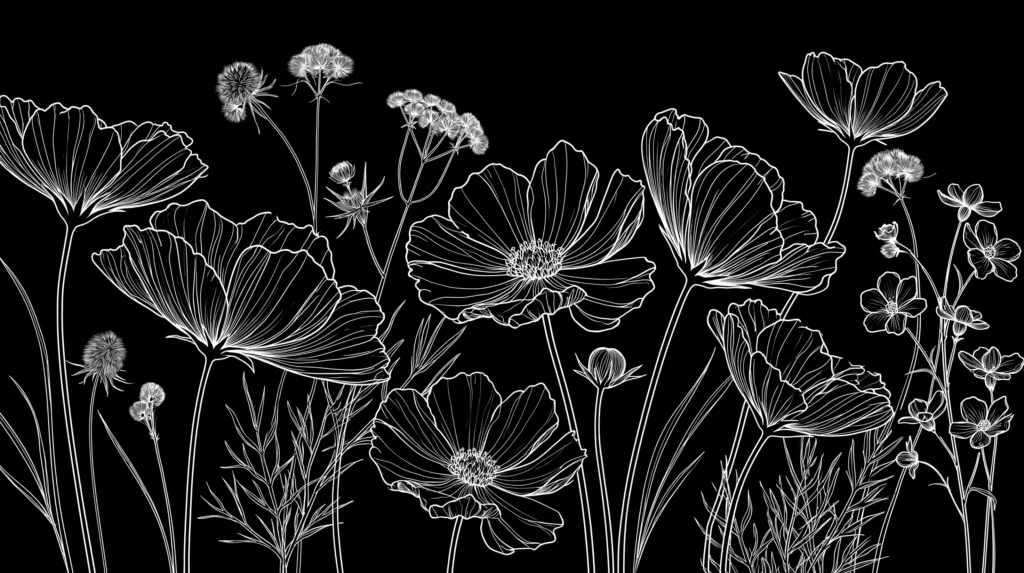
- Thin botanical sketches with lots of white space
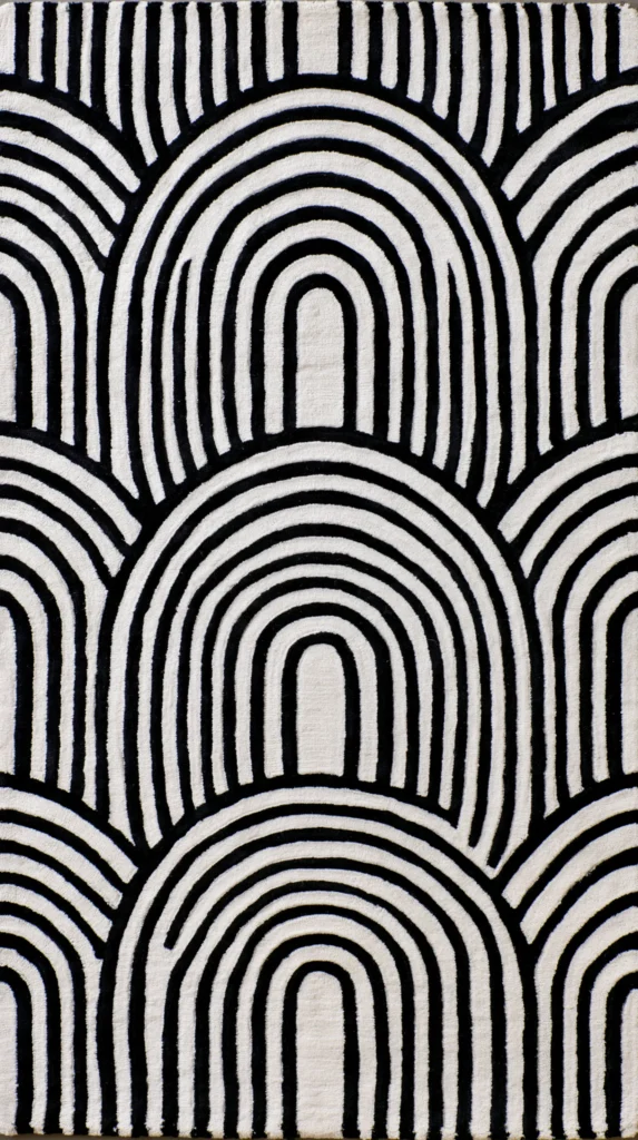
- Soft black arches on a warm white background
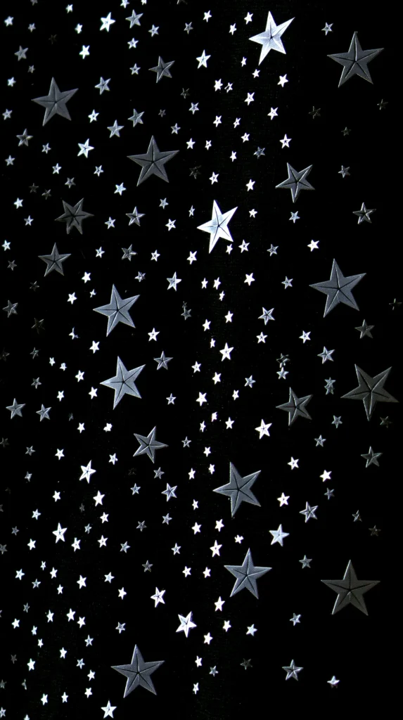
- Tiny dots, stars, or speckles that stay subtle
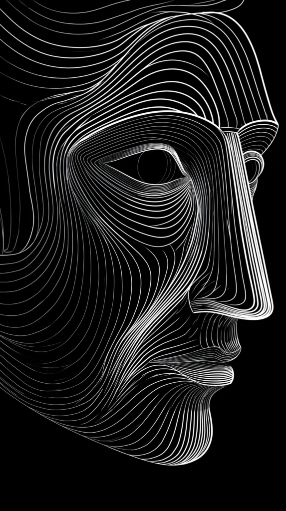
- Simple line art faces, hands, or florals
- Clean grid patterns with thin lines
- Small script words used sparingly
- Abstract shapes that sit off-center
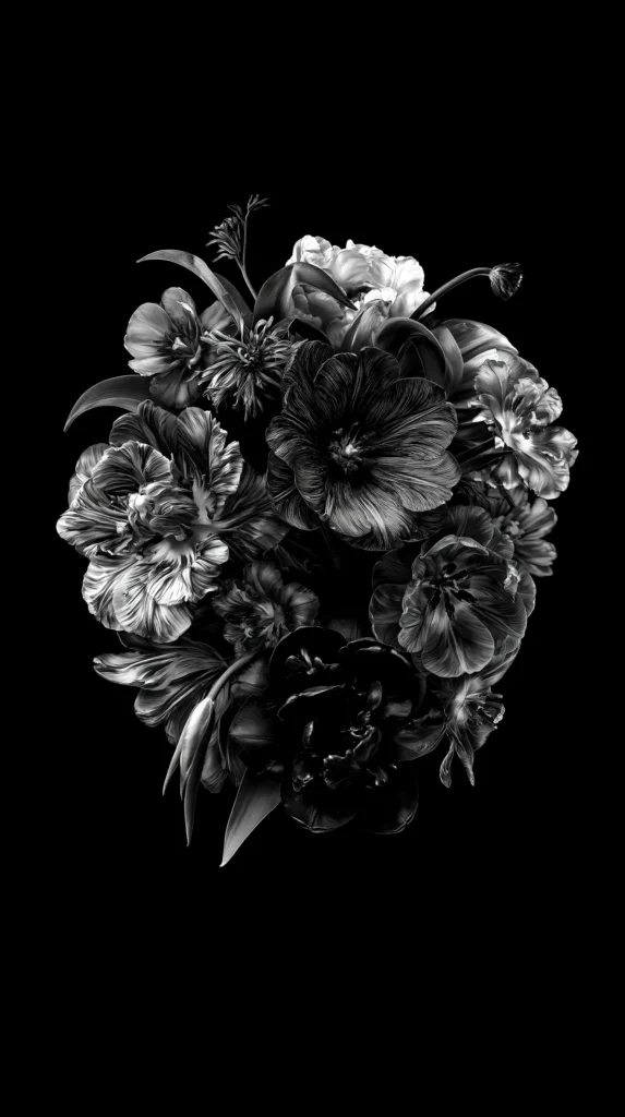
- White marble designs with gentle gray veining
The common assumption says minimal means empty. Nope. Minimal means edited. It means the design has enough confidence to stop before the chaos begins. Very chic. Also very helpful when your home screen already looks like a tiny command center.
A minimal wallpaper also plays nicely with seasons. It works during summer, fall, Christmas, and that odd week after New Year’s. You know the week. Nobody knows what day it is, and everyone owns too many leftovers.
I also like how minimal styles make widgets behave better. Weather boxes, calendars, and reminders stay readable. That matters when your screen handles errands and emergencies. “Where did my dentist appointment go?” should never become a design issue.
These designs also age well. A trend-heavy wallpaper can look dated by next month. But a clean black and white wallpaper can stay cute for ages. That is rare behavior in the digital world, where everything ages like milk.

Prints That Make Your Screen Look Expensive
Some prints look fancy without trying too hard. That’s my favorite kind of fancy. I want the screen to whisper “put together,” not scream “I organized my life at 2 a.m.” A good black and white print can pull that off beautifully.
Marble is the obvious one, but it still works. Soft veining adds movement without taking over. It gives the screen a polished look, especially when the background leans creamy white or smoky black. Too much veining, though, can make your icons look lost. Nobody needs a scavenger hunt for the weather app.
Toile also deserves attention. It has that classic, old-soul charm without feeling dusty. A black and white toile wallpaper can look sweet, historic, and oddly fresh. I know, toile being fresh sounds impossible. Yet here we are.
Then come stripes, checks, and tiny geometric prints. These can look modern, playful, or preppy depending on scale. Big checks feel bold. Tiny checks feel charming. Thin stripes feel crisp. Wide stripes feel more graphic and dramatic.
Here’s the reframe. Expensive-looking does not mean complicated. It usually means controlled. Lines have purpose. Spacing feels balanced. The contrast doesn’t attack your eyes at full volume.
I tend to trust designs that leave room for the screen to breathe. That little bit of space makes the whole thing look intentional. It says, “Yes, I meant to do this.” Nothing about it says, “I panicked and picked the loudest option.”
That’s why the best black and white wallpaper designs often look calm first. Then they show their detail after a second look. It’s a little slow-burn moment, which I respect. Your phone deserves intrigue, not visual yelling.

Black And White Wallpaper For Phones, Tablets, And Desktops
A design can look amazing on one device and awkward on another. Annoying, yes. But also useful to know before you fall in love too fast. A black and white wallpaper for a phone needs different things than one for a desktop.
Phone screens are tall and narrow. So vertical designs usually shine there. A centered floral stem, tall arch, stacked quote, or vertical stripe can look lovely. However, tiny details may disappear behind the clock or widgets.
Tablets give a little more breathing room. They can handle softer patterns, wider scenes, and larger artwork. Desktops need the most space, especially near the center. That’s where folders and windows usually hang out, causing their usual little mess.
When choosing from the designs in this post, I’d think about device fit like this:
- Pick tall designs for iPhone and Android lock screens
- Choose softer repeats for home screens with many apps
- Save wider patterns for tablets or desktop backgrounds
- Use darker designs when app icons need more contrast
- Try lighter designs when you want a cleaner look
- Choose simple patterns for widget-heavy screens
- Pick bold art for lock screens with fewer icons
- Save a few favorites so you can switch with your mood
The common mistake is choosing only by thumbnail. I get it. A thumbnail can look adorable. Then it lands on your screen and suddenly your clock has vanished into a floral branch. Betrayal, but preventable.
So give the design a quick mental test. Where will the clock sit? How do your icons land? Will the pattern help or heckle? Once you notice that, choosing gets easier. Also, your screen stops looking like it dressed in the dark.

Tiny Details That Make A Big Difference
The best black and white wallpaper often wins through details nobody mentions. I’m talking about spacing, scale, texture, and contrast. Very glamorous words? No. Extremely useful? Absolutely.
Spacing decides whether your screen feels calm or crowded. One small flower with open space can look peaceful. A repeating print with tight spacing can look lively. Neither one is wrong. But each one changes how your eyes move.
Scale matters just as much. Large patterns feel bold and modern. Tiny prints feel softer and sweeter. Medium prints can be tricky because they often fight with app icons. That middle zone needs confidence, or it turns messy fast.
Texture adds another layer. Paper grain, linen texture, marble veining, and ink-style lines create depth. They keep the design from looking flat. However, too much texture can make the screen look dusty. And nobody asked for a phone with attic energy.
Contrast is the sneakiest detail. Pure black and pure white can look sharp and dramatic. Softer black with cream can look warmer. Charcoal with white can feel more relaxed. A little gray can make the whole design easier to use.
This is where preference becomes personal. One person wants crisp and bold. Another wants soft and quiet. Both can be right, which is rude to anyone wanting one perfect answer.
I also notice how negative space changes everything. Empty space can look boring in a preview. On a phone, though, it gives the clock room to shine. Sneaky little hero move.
So, when a design catches your eye, look again. Notice whether it still works after the first cute moment. A wallpaper should look good on day one. It should also survive Tuesday morning chaos, low battery, and fourteen notifications.
How To Change Your Black And White Wallpaper On iPhone
Once you pick a favorite design from this post, the iPhone change is pretty quick. Apple keeps moving tiny things around, because apparently menus need hobbies. Still, the basic flow stays friendly enough.
First, save the black and white wallpaper design you want from this page. Then open the image so it’s easy to find. You’re choosing the design you picked here, not digging around for random camera-roll chaos. We are keeping the assignment tidy.
Here’s the simple iPhone path:
- Open Settings
- Tap Wallpaper
- Tap Add New Wallpaper
- Choose the saved design from your images
- Pinch or drag the design into place
- Tap Add
- Choose Set As Wallpaper Pair or customize each screen
- Check your lock screen and home screen after saving
That last check matters more than people think. A design can look perfect in preview, then sit weirdly behind the time. It can also hide widgets in a very rude way. So adjust before you commit.
If the design looks too busy on your home screen, use it only for the lock screen. That is not settling. It is strategy. Lock screens can handle more drama because they have less clutter. Home screens need to cooperate with icons.
Also, try pairing a bold lock screen with a calmer home screen. That gives you style without daily eye gymnastics. A dramatic black and white wallpaper can still behave if you give it the right job.
The best part? You can save several designs and swap them whenever your mood changes. That feels fancy, even though it takes seconds. It also keeps the page useful after your first pick. No extra drama needed. Skip the menu spiral.
How To Change It On Android Without Drama
Android settings can vary by phone, which is very Android of them. Samsung, Google Pixel, Motorola, and other brands may use slightly different words. Good news? The path usually follows the same general idea.
After you save a black and white wallpaper design from this post, open your wallpaper settings. Some phones let you press and hold the home screen. Others guide you through Settings. Either way, you’re picking the design you selected here.
Try this common Android path:
- Press and hold an empty spot on your home screen
- Tap Wallpaper And Style or Wallpapers
- Choose the saved design from your images
- Adjust the crop and position
- Select Lock Screen, Home Screen, or both
- Tap Set Wallpaper or Apply
- Return to your screen and check the placement
If that route looks different, open Settings and search “wallpaper.” The search box can save your sanity. I support any menu shortcut that prevents unnecessary tapping.
Here’s the part people overlook. Android phones often crop images in different ways. A design may shift slightly between preview and final placement. So after you apply it, check the clock, icons, and widgets. Tiny changes can make the design look much cleaner.
If your icons blend into the pattern, use the design on the lock screen only. Or choose a calmer black and white wallpaper for the home screen. Again, this is not a downgrade. This is screen styling with boundaries.
The point is to make your phone look better, not busier. You want a design that makes the screen feel fresh. Nobody wants one that turns every app into a tiny guessing game. Simple wins here, every time. No drama required.

The Little Screen Glow-Up That Feels Bigger Than It Is
I love small changes that make a normal day look slightly more together. Not perfect. Far from showroom-level organized. Just better in a way that keeps catching your eye. A fresh black and white wallpaper can do that without asking much from you.
There’s something satisfying about choosing a design based on mood, not rules. Maybe today needs soft florals. Tomorrow may need bold stripes. Next week may need moody marble because life keeps doing the most. I respect a screen with range.
Living in Orlando keeps me around bright color all year. So a crisp screen can feel like a tiny reset. It’s clean, calm, and still stylish enough to enjoy. That balance is why these designs work so well. I like that kind of low-effort delight. It lets a regular screen feel chosen, not ignored.
Pinterest has trained us to notice pretty details everywhere. Yet our phones often get whatever background we chose months ago. Poor things. They’re out here doing daily labor in last season’s outfit.
So scroll through the designs and save the ones that spark something. Let your screen have a little moment. Keep one soft option, one bold option, and one “I’m feeling fancy” option. Future you will appreciate the tiny digital wardrobe.
And if changing your wallpaper makes you feel one percent more pulled together, I say count it. We take the wins where we find them. Especially the cute ones. That’s the whole wink. Tiny change, better mood.