I have a soft spot for tea party table settings, and I’ve stopped pretending that’s quirky trivia. I notice tables immediately. Napkins, spacing, colors, and chair alignment all register before dessert even exists. That first glance tells me if the host exhaled or spiraled. Tables broadcast energy fast. Some whisper calm. Others yell chaos.
I’ve found that people underestimate how much the table does the social heavy lifting. A good table relaxes everyone before the conversation starts. A confusing table makes people fidget, rearrange, and apologize for nothing. That’s why I care about napkin folding, place settings, and color palettes more than centerpieces. Those quiet details set the tone without demanding attention.
Living in Orlando changes how I approach this stuff. Light is brighter here. Colors show up louder. Outdoor tables sneak into plans even when you swear it’s an indoor thing. Because of that, I lean toward choices that behave well in real light and don’t melt emotionally by hour two. I like tables that feel intentional but not stiff. Thoughtful, not precious. Pulled together, not Pinterest-perfect.
This isn’t a how-to lecture. This is me talking out loud about what actually works. We’re chatting tea party table settings in a way that feels human. Napkin folds that don’t fight you. Place settings that feel charming instead of uptight. Color palettes that calm the table instead of overwhelming it. Basically, we’re making tables that invite people to sit down and stay awhile (and maybe compliment your napkins, which is always satisfying).
Some of the links on this page are affiliate links, which means that if you click on them and buy something, I might get a small commission. (Never costing you more.) You can peek at my full disclosure if you’re curious about the fine print.
Why Tea Party Table Settings Deserve More Respect
Tea party table settings get dismissed as fussy, which is wildly unfair. They’re actually one of the easiest ways to create instant atmosphere without buying more stuff. I’ve found that when the table looks intentional, guests relax faster. They stop scanning for instructions. They stop asking where to sit. They just settle.
The beauty lives in restraint. A tea table doesn’t need ten competing ideas. It needs clarity. When place settings feel balanced, people instinctively know what to do. When colors cooperate, the whole table feels calmer. That calm carries into conversation, which is the real goal.
I tend to notice that the most successful tables share a few traits. They repeat colors gently. They leave breathing room between pieces. They let napkins participate instead of disappearing. None of that requires expensive dishes or matching sets. It requires editing.
Tea party table settings also benefit from softness. Hard lines feel wrong here. Rounded shapes, layered fabrics, and gentle contrasts do better. Even when the theme leans playful, the structure stays simple. That’s what keeps it from feeling juvenile.
A few quiet truths worth keeping in mind:
- Tables don’t need symmetry to feel balanced.
- Napkins can act as décor without being theatrical.
- Place settings should guide, not confuse.
- Color palettes matter more than patterns.
When the table feels friendly, guests mirror that energy. People lean in instead of hovering, and laughter stretches out longer than planned. Nothing about that is accidental, because the table is carrying the moment.
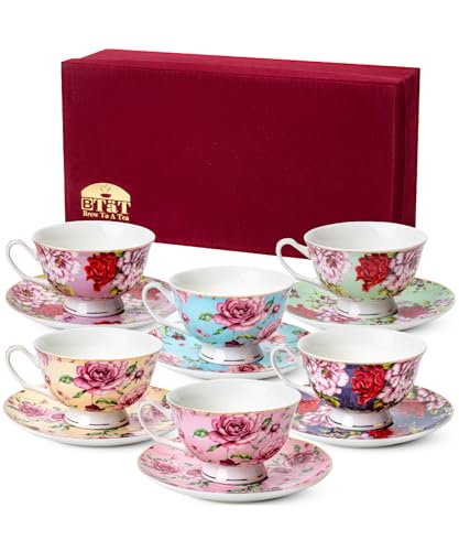
Napkin Folding That Looks Thoughtful, Not Try-Hard
Napkin folding has a reputation problem. People hear it and imagine cranes, fans, or something that requires YouTube confidence. I’ve found that the best napkin folds look casual, even when they aren’t. They suggest effort without announcing it.
For tea party table settings, napkins should feel like part of the table story. They shouldn’t compete with teacups or steal attention from plates. Instead, they soften the place setting and add texture. That’s their lane.
I tend to reach for folds that sit low and stay put. Tall folds feel aggressive at a tea table. They block sightlines and scream “formal dinner,” which is not the vibe. Soft folds invite hands to pick them up naturally.
A few folds that consistently work:
- The loose rectangle, slightly offset on the plate.
- The casual knot (not tight, never tight).
- The pocket fold for holding a name card or sprig.
- The draped fold over the edge of the plate.
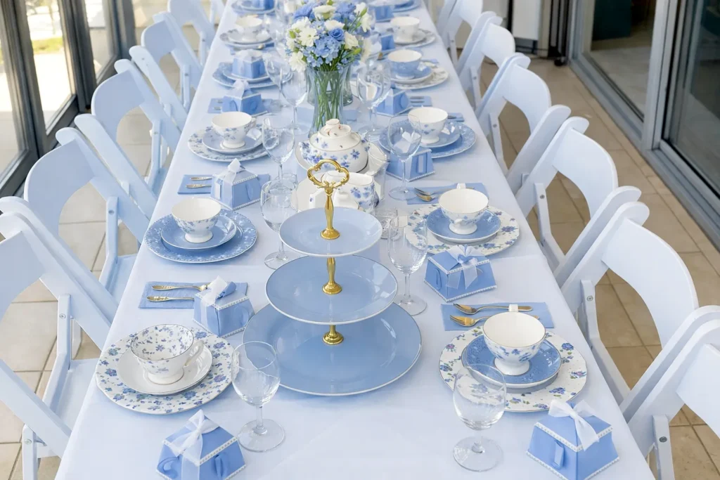
Color matters here. A napkin is an easy way to echo the palette without adding clutter. When tea party table settings feel cohesive, it’s often because the napkin quietly ties everything together. Linen textures work especially well because they catch light softly (and forgive wrinkles).
I’ve also noticed that guests interact more with napkins when they look approachable. If a napkin looks precious, people hesitate. If it looks relaxed, they use it. That ease matters. After all, tea parties are meant to feel welcoming, not museum-like.
Conversation Lanes Inside Tea Party Table Settings
I’ve found that tea party table settings can quietly guide who talks to who. Instead of identical place settings, I build two conversation lanes across the table. One lane nudges people toward the left. The other lane nudges people toward the right. It sounds silly until you see it work (and you will).
First, I angle every teacup handle slightly toward the nearest neighbor. Then I point the spoon the same direction on that setting. Meanwhile, I fold the napkin so its open edge faces that same neighbor. Each setting becomes a gentle invitation that says, “Chat this way.” Because the cues repeat, guests follow them without thinking. However, the table still looks normal, not staged.
Next, I alternate lanes down the table. So one place setting leans left, and the next leans right. That creates small pairs and mini-groups naturally. Consequently, nobody gets stuck staring straight ahead, waiting for a topic. Also, shy guests get an easy entry point because the table already “introduced” them. I tend to notice that laughter starts sooner when people have a clear person to glance at.
Finally, I keep the center calm and low so the lanes stay open. A narrow runner works, although bare wood works too. Then I repeat one small color cue on each lane, like two napkin shades. Even better, use the same flower in two tints. That keeps the tea party table settings cohesive while still directing flow. If someone asks why it works, I just smile and say, “The table’s being helpful!” Also, if you’re using name cards, place them toward the lane direction. Seriously, it reduces awkward pauses.
Tea Party Table Settings That Feel Inviting Instead of Intimidating
Place settings can either guide guests gently or overwhelm them instantly. I’ve found that tea party table settings shine when place settings feel intuitive. Guests shouldn’t wonder which fork belongs to them or whether they’re allowed to move things. Everything should say, “Sit here. You’re good.”
I tend to simplify place settings more than people expect. Tea already brings visual interest through cups, saucers, and trays. Adding too many extras muddies the picture. Instead, I focus on spacing and alignment. That’s where calm lives.
A good place setting does a few things well:
- It centers the plate without crowding it.
- It keeps utensils close and minimal.
- It leaves room for teacups to breathe.
- It avoids stacking items vertically.
Tea party table settings benefit from horizontal flow. Items should guide the eye across the table, not upward. That keeps conversations open and sightlines clear. It also helps outdoor tables, especially in bright Orlando light, look less cluttered.
Name cards can be charming here, but only if they behave. Flat cards tucked into napkins or resting against plates work better than anything standing tall. Again, subtlety wins.
I’ve found that when place settings feel approachable, guests stop fussing. Rather than rearranging plates or asking where things go, people sit down and start chatting right away. That’s the goal. The table should support the gathering, not compete for attention.
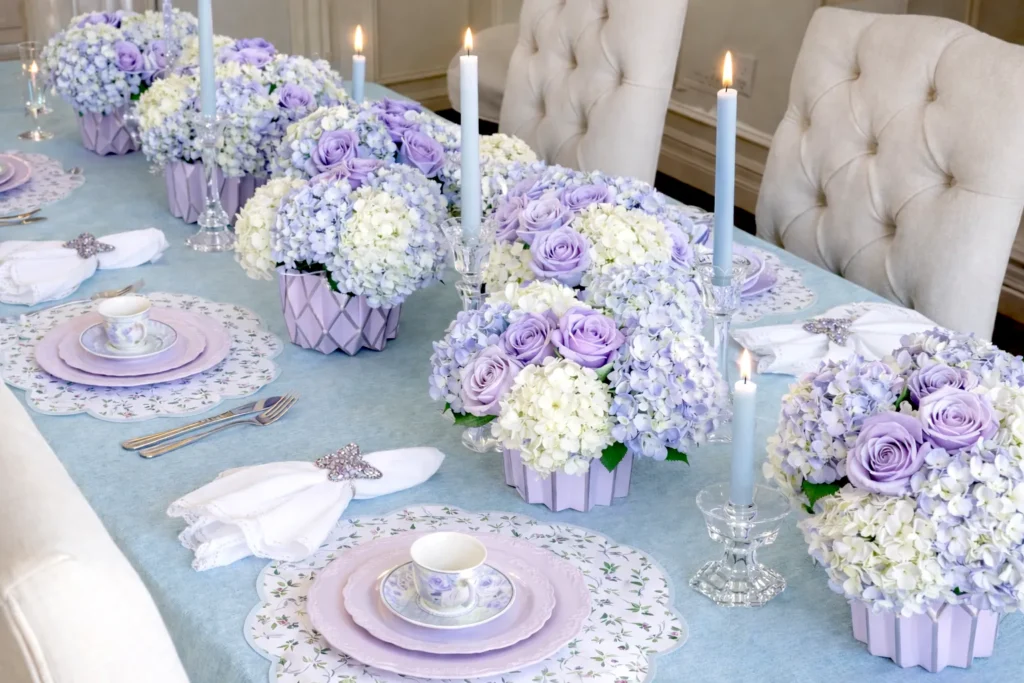
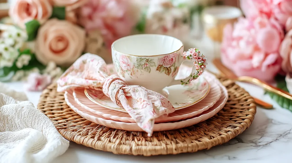
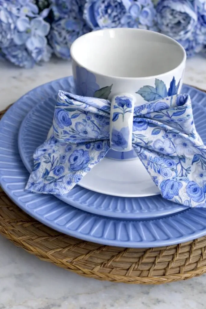
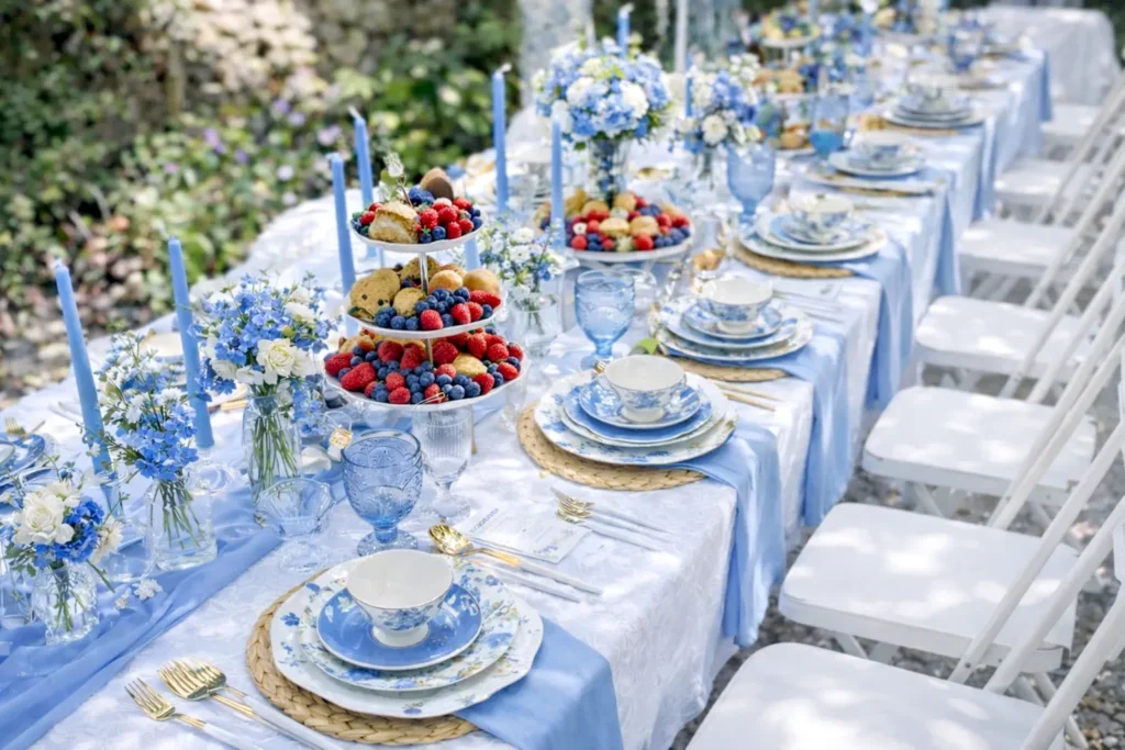
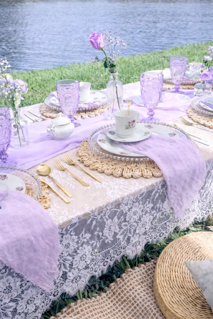
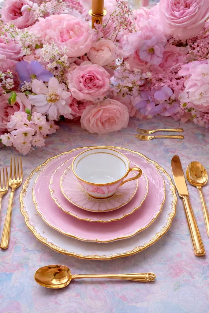
Color Palettes That Calm the Table (Instead of Shouting)
Color palettes do emotional work whether we acknowledge it or not. I’ve found that tea party table settings succeed or fail based on color harmony more than any other factor. When colors argue, the table feels busy. When they cooperate, everything else relaxes.
I tend to limit palettes to two main colors and one soft accent. That’s it. More than that, and the table starts competing with itself. Tea cups, desserts, florals, and linens already bring variation. The palette’s job is to keep them playing nicely.
Soft contrasts work especially well here. Think warm whites paired with blush, sage, or pale blue. Even brighter colors behave better when grounded by neutrals. That balance keeps the table from tipping into chaos.
Some combinations I consistently trust:
- Cream, soft pink, and muted gold.
- White, sage, and natural wood.
- Pale blue, ivory, and silver.
- Soft lavender with warm neutrals.
Tea party table settings also benefit from repeating color quietly. Napkins echo cups. Plates echo florals. Nothing shouts. Everything nods. That repetition creates cohesion without being obvious.
Living in Orlando has taught me to respect light. Bright sun amplifies color fast. What looks subtle indoors can scream outside. Because of that, I err on the side of softer tones. They photograph better, age better, and feel calmer longer.
Bridgerton Style Without the Costume Commitment
I tend to notice that Bridgerton energy lives in restraint, not excess. It’s about pauses, posture, and letting silence do some work. That same idea translates perfectly to tea party table settings. Instead of piling on details, I slow everything down visually. Plates get more space. Cups sit slightly farther back. Nothing crowds the edge or begs for attention.
Because that show thrives on tension, I borrow contrast rather than drama. Soft linens meet structured plates. Delicate teacups sit beside sturdier flatware. That balance keeps the table from tipping into costume territory. I’ve found that when the table looks composed, guests mirror that calm without realizing why.
I also pay attention to symmetry, but only loosely. Perfect alignment feels stiff. Slight variation feels human. So I’ll center plates carefully, then let napkins land a touch off-center. That tiny shift adds movement while keeping the look polished. It’s subtle, but it matters.
Color plays a quiet role here. Muted tones work harder than brights. Cream, pale blue, soft blush, and warm neutrals set the mood. Instead of matching everything, I repeat shades sparingly across the table. That repetition creates cohesion without looking staged. Meanwhile, metallics stay restrained, since too much shine breaks the spell.
I’ve found that this approach keeps conversations unhurried. People linger. Cups refill slowly. No one rushes to clear space. Tea party table settings inspired this way don’t perform. They wait patiently and let the gathering unfold, which feels very Bridgerton in spirit (minus the scandal).
Mixing Vintage and Modern Without It Looking Random
Tea party table settings often flirt with vintage, and for good reason. Teacups, saucers, and trays already bring nostalgia. However, too much vintage can feel cluttered fast. I’ve found that mixing eras works best when there’s a clear anchor.
I tend to anchor with modern basics. Clean plates. Simple linens. Neutral chargers. Those pieces ground the table. Then I layer in vintage elements thoughtfully. A mismatched teacup set. An antique spoon tray. A delicate sugar bowl. Each one gets room to shine.
Rules I quietly follow:
- One vintage statement per place setting, max.
- Keep patterns small and repeat them sparingly.
- Let modern pieces carry the weight.
- Edit aggressively.
Tea party table settings thrive on contrast, but only when it’s intentional. When every piece tells a different story, the table feels confused. When old and new support each other, the table feels curated.
I’ve noticed guests respond warmly to this balance. They admire details without feeling overwhelmed. They comment on pieces without asking where everything came from. That ease is the reward for restraint.

Small Details That Make the Table Look Finished
I tend to notice when a table crosses that invisible line from “set” to “settled.” Nothing new gets added, yet everything suddenly cooperates. That shift matters because finished tables don’t try harder. Instead, they calm down. I’ve found that tea party table settings reach that point through editing, not layering. More pieces rarely help. However, spacing almost always does.
Spacing changes everything. When items sit too close, the table looks nervous. When there’s breathing room, the setup looks confident. Guests notice that immediately, even if they can’t name it. Because of that, I pull things apart slightly and see what happens. Plates relax. Cups behave. The whole table exhales.
I also pay close attention to alignment. Teacup handles sound small, but they matter more than people expect (this is where I get opinionated). When handles point everywhere, the table looks unsettled. Once they line up, everything clicks. Napkins act the same way. When folds face one direction, the table reads as intentional instead of accidental.
A few quiet refinements I always check:
- Teacup handles aligned the same way.
- Napkins folded and placed consistently.
- Heights kept low and varied, not stacked.
- One metal tone repeated, not mixed randomly.
Tea party table settings also benefit from repetition. When something shows up three times, it looks planned. When it appears once, it looks forgotten. That’s an easy fix that adds polish without effort. Meanwhile, color repetition does the same work. A napkin shade echoed in florals or cups pulls everything together gently.
Before guests arrive, I always do a slow walk-around. During that moment, I adjust pieces, pull things back, and straighten anything misbehaving (politely). That quiet editing step matters more than setup time, since it’s where the table locks in and relaxes.
Letting the Table Support the Gathering
I tend to think the table should work quietly in the background. It shouldn’t audition for attention. Instead, it should hold space while people do their thing. That’s why tea party table settings matter more than they get credit for. They set expectations without speaking. They tell guests they’re welcome before anyone says hello.
I’ve found that when a table supports the gathering, people settle faster. They don’t hover. They don’t ask where things go. Instead, they sit, pour, and start chatting naturally. That ease doesn’t happen by accident. It comes from choices that guide without bossing. Plates feel obvious. Cups land where hands expect them. Napkins behave (which is honestly half the battle).
Living in Orlando has trained me to respect flexibility. Light shifts quickly here. Breezes show up uninvited. Outdoor plans sneak into indoor ones. Because of that, I notice how tables react over time. Strong setups don’t unravel when conditions change. They adapt and keep working.
I keep circling back to a few grounding ideas:
- Place settings should make sense at first glance.
- Napkin folds should stay put without drama.
- Color palettes should calm the scene, not compete.
- Spacing should invite movement, not restrict it.
However, none of this should feel stiff. Tea party table settings shine when they look relaxed, not rehearsed. I aim for tables that say, “Come sit,” not “Don’t touch.” That tone changes everything. Guests linger longer. Conversations stretch. Someone pours another cup without asking.
Ultimately, the table isn’t the point. The people are. When the setup supports them quietly, I know I did it right.

Final Thoughts
I know the table is done when I stop fixing and start grinning. Somehow that moment arrives right after I threaten a napkin corner (politely). Usually I step back, tilt my head, and think, “Okay, yes.” Then I leave it alone, even if my brain begs for one more tweak!
Because I live in Orlando, sunlight always tests my choices fast. However, I like that pressure, since it forces clean decisions. Meanwhile, I keep the table practical, so people relax quickly. So I space plates with breathing room and keep the cup placement obvious. Also, I pick napkin folds that stay put without looking uptight. If something slides around, I change it and move on.
I’ve found that tea party table settings work best when they look inviting, not staged. Instead of chasing perfection, I chase ease and a little charm. After all, guests shouldn’t fear touching anything. Even the fanciest plate should still say, “Sit down already.” That’s why I repeat colors gently and let textures do the talking. On purpose, I keep the palette calm so conversation stays front and center.
Plus, I remind myself that Pinterest loves tables that look effortless. Finally, I aim for a table that supports people, not my ego. Honestly, I’d rather hear laughter than compliments.