Valentine wallpaper is one of those small details that quietly controls the mood more than it should. I always notice right away when a background misses the mark. Too loud, and it adds chaos. Too literal, and it turns juvenile fast. February already brings a lot of visual noise, so whatever lives on a phone screen needs to calm things down, not pile on.
I’ve found that this is the month where people either lean way too hard into hearts or avoid them altogether. Neither extreme really works for me. I like romance, but I don’t want a phone background that looks like a candy aisle exploded. At the same time, pretending Valentine’s Day doesn’t exist feels oddly joyless. The sweet spot lives somewhere in between, and wallpaper is an easy way to land there without committing to anything dramatic or cringey.
Design taste shows quickly in February. Color choices matter more. Patterns age faster. Scale suddenly becomes obvious. Some wallpapers photograph beautifully but fall apart once icons land on top. Others look simple at first glance, yet somehow stay polished all day. That difference is subtle, but it’s real. Because of that, restraint usually wins.
Living in Orlando adds another layer to this. February still comes with bright light, sunshine, and warm afternoons, which makes heavy reds and dark visuals feel out of place fast. Softer tones behave better. Gentle patterns read cleaner. Designs that nod to the season without overpowering everything else just work.
That’s what this post is really about. Choosing Valentine wallpaper that feels charming, intentional, and grown-up, without turning a phone screen into a theme park.

A few links on this page are affiliate links, so if you click and buy, I might earn a small commission. It never costs you more, and it helps support the site. You can read my full disclosure if you’re into the fine print.
Valentine Wallpaper That Feels Romantic Without Being Loud
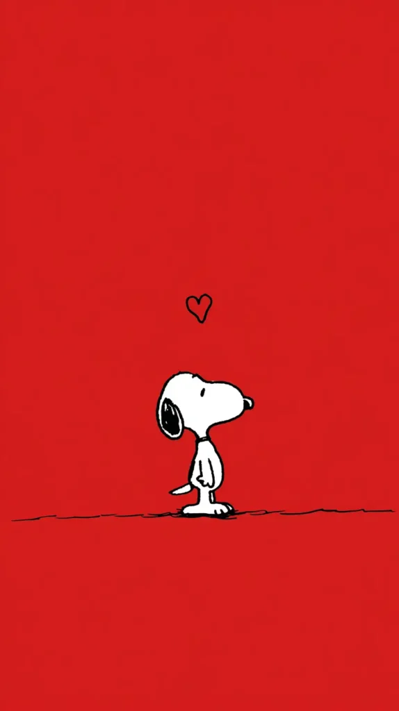
There’s a big difference between romantic and overwhelming, and Valentine wallpaper sits right on that line. I always notice when designs try to do too much at once. Hearts stack up. Red takes over. Sparkles start competing for attention. Romance doesn’t need that kind of noise. In fact, subtle usually lands harder.
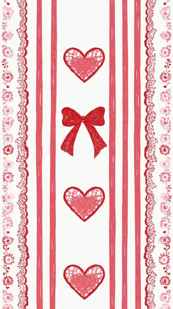
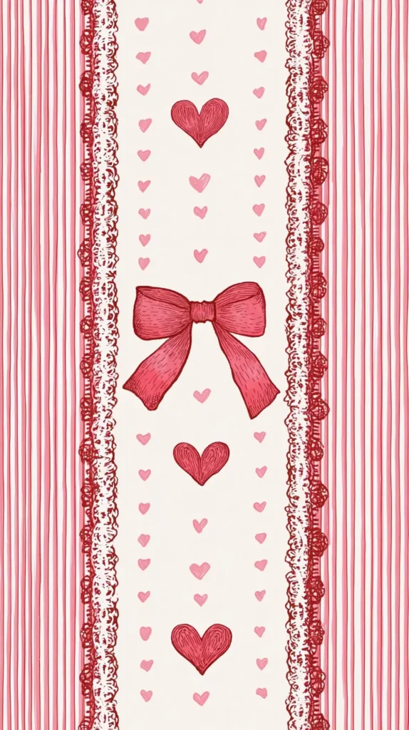
Soft color palettes make a huge difference. Blush, muted rose, warm neutrals, and even creamy whites feel intentional without screaming Valentine’s Day. I’ve found that gentle patterns work better than literal symbols. A faint heart outline or abstract curves can hint at romance without looking juvenile. Meanwhile, typography-based designs feel fresh when they use clean fonts and restrained phrases.
Minimal designs age better through the month. Early February might invite something sweeter, but by the time the holiday passes, you don’t want to rush to change it. That’s where understated visuals shine. They still work when the candy disappears and life goes back to normal.
Some elements that consistently work well include:
- Soft gradients instead of bold color blocks
- Abstract shapes rather than literal hearts
- Neutral backgrounds with a single romantic accent
- Clean layouts that don’t compete with app icons
Because Valentine wallpaper shows up constantly, it should feel calming. I think of it more like background music than decoration. Loud designs drain energy fast. Gentle ones add something pleasant without demanding attention. That balance makes the difference between enjoying a screen and simply tolerating it.

When Pink Works and When It Absolutely Does Not
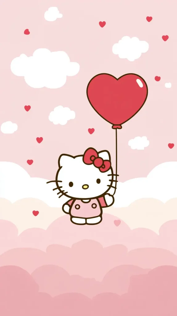
Pink gets a bad reputation every February, mostly because it’s overused and poorly handled. That doesn’t mean it’s the problem. The execution usually is. I’ve found that pink works beautifully when it’s softened and balanced with neutrals. Bubblegum shades tend to feel childish, while dusty rose and blush feel intentional and chic.
The key is contrast. Pink paired with cream, beige, gray, or even soft brown instantly looks more grown-up. Valentine wallpaper that leans monochrome almost always feels more polished. Instead of layering every shade of pink imaginable, choosing one tone and letting it breathe creates a calmer effect.
Patterns matter here too. Large repeating hearts can feel overwhelming fast. Smaller patterns or abstract interpretations are easier to read. I also notice that texture adds depth. Linen-style backgrounds, watercolor washes, or soft grain effects keep pink from feeling flat or loud.
That said, pink isn’t mandatory. February romance doesn’t require it. Neutral lovers can absolutely stay neutral and still participate. Taupe, warm gray, soft white, and even sage tones work surprisingly well when paired with subtle Valentine details. Romance isn’t a color. It’s a mood.
I’ve found that the best Valentine wallpaper designs understand restraint. They don’t try to convince you it’s romantic. They let the softness speak for itself.


How I Change Valentine Wallpaper On iPhone Without Ruining The Vibe
I’ve learned that changing Valentine wallpaper on an iPhone is easy. Making it look good is the real challenge. Most designs look good in preview mode, but when icons and widgets are added, they fall apart.
I start in Settings, tap Wallpaper, then choose Add New Wallpaper. From there, I pick the Valentine wallpaper I already saved. This is where restraint matters. I avoid zooming in too far. I also skip tight crops. Space keeps things calm.
These choices consistently work for me:
- I leave breathing room around patterns or hearts
- I avoid placing details behind the clock
- I skip wallpapers with text entirely
- I choose softer colors over bold red
I also separate my screens on purpose. The Lock Screen can handle personality. The Home Screen needs quiet. Valentine wallpaper with gentle color works better behind app icons than literal designs.
I’ve noticed that Apple’s Lock Screen widgets make busy wallpaper look chaotic fast. Because of that, simpler Valentine wallpaper always lasts longer for me. One focal detail beats a full pattern every time.
If a wallpaper looks cute for ten seconds but annoying after ten minutes, I change it. That’s my rule. The best Valentine wallpaper fades into the background while still feeling seasonal.

How I Use Valentine Wallpaper On Android Without Making It Look Messy
I like Android for the control, but that same control can ruin Valentine wallpaper fast. Icons, widgets, and themes stack quickly, so balance matters more here.
I change my wallpaper by long-pressing an empty Home Screen area. Then I tap Wallpaper or Styles and select my Valentine wallpaper. I always check the scale before I use it. Centering works better than stretching. Busy designs get louder when resized badly.
These details keep things clean for me:
- Solid or lightly textured backgrounds
- Soft patterns instead of repeating hearts
- Muted pinks instead of bright red
- Designs with obvious negative space
I always set different wallpapers for each screen. Valentine wallpaper with more detail works better on the Lock Screen. Apps need a calm Home Screen so they can be read.
I also pay attention to icon colors. Android themes can clash with Valentine wallpaper quickly. High contrast looks harsh. Softer backgrounds give everything room to breathe.
When a wallpaper looks messy after widgets appear, I don’t force it. I swap it. Android makes that easy. The right Valentine wallpaper supports the screen instead of stealing attention.

Wallpaper That Survives Past February 14
One thing I always consider is longevity. I don’t want a background that expires the second Valentine’s Day passes. Changing wallpaper mid-month feels chaotic, and honestly, I forget half the time. Designs that rely heavily on dates, phrases, or obvious holiday icons tend to feel awkward after the holiday ends.
That’s why I lean toward Valentine wallpaper that feels seasonal rather than specific. Romance-inspired designs work beyond the holiday when they focus on color, texture, and mood instead of symbols. A soft floral pattern still feels fine on February fifteenth. A bold heart collage does not.
I’ve noticed that abstract designs age best. Shapes, lines, and gradients inspired by warmth or softness carry over easily into late winter. Typography also works when it’s subtle. Short phrases or single words in clean fonts tend to feel less dated than long sayings.
If you want something that lasts, look for:
- Designs without dates or holiday references
- Abstract patterns with warm tones
- Minimal text, or none at all
- Backgrounds that complement app layouts
Wallpaper should work with your phone, not against it. When it survives the holiday gracefully, it feels like a smart choice instead of a seasonal impulse.
Lock Screen vs. Home Screen Options Are More Important Than You Think.
Switching up the lock screen and home screen? Total game changer! They serve different purposes, yet people often use the same design for both. That’s where things can start to feel cluttered or overwhelming.
Lock screens can handle a little more personality. You see them briefly, then move on. A romantic quote, a softer photo, or a slightly busier pattern works well there. Home screens need restraint. App icons already bring visual noise, so the background should stay calm and supportive.
Valentine wallpaper works best on home screens when it’s lighter and less detailed. Too much contrast makes icons harder to read. Soft colors, gentle gradients, and minimal patterns keep everything usable. Meanwhile, lock screens can handle deeper tones or more detail because they aren’t competing with apps.
I always suggest choosing complementary designs rather than identical ones. They should live in the same color family but serve different roles. That tiny tweak makes your phone feel like it was meant to be, not just a happy accident.
It’s a practical detail, but it changes how enjoyable your phone is throughout the day. And since we all look at our phones constantly, it’s worth getting right.

Wallpaper Choices for Moms, Busy Women, and Everyone In Between
Life looks different depending on the season you’re in, and Valentine wallpaper should fit real life, not an idealized version of it. I’ve noticed that busy women often want something calming rather than stimulating. With all the notifications, schedules, and endless scrolling, finding some visual peace is a must!
For moms especially, wallpaper becomes background noise during hectic days. Loud designs add to the mental clutter. Soft, grounding visuals help balance everything else competing for attention. Romance doesn’t need to be flashy to be meaningful.
Simple designs also age better with changing routines. Your phone background should be your cheerleader, not a distraction, whether you’re at work, out and about, or stuck in car line. Valentine wallpaper can look great without stealing the spotlight.
I always think about screen brightness, how easy the icons are to see, and how the design looks in different lighting. A background that looks great at night but disappears in sunlight isn’t practical. Designs that stay legible and balanced across settings always win.
The best wallpaper fits into your life quietly. It doesn’t ask for attention. It simply makes everything look a little nicer.

Where to Find Valentine Wallpaper That Doesn’t Feel Cheesy
The internet is full of options, but not all sources understand restraint. I’ve found that independent designers often create the most tasteful Valentine wallpaper. Their work tends to focus on mood and aesthetic rather than novelty. Marketplaces with curated collections usually offer better options than generic wallpaper apps.
Pinterest remains a favorite starting point because it allows you to see patterns across designs. If a style keeps making a comeback, it’s probably a winner! Clean layouts, muted tones, and minimal text dominate the designs that age well.
I also pay attention to aspect ratios and resolution. A beautiful design that crops awkwardly ruins the experience. Wallpaper should fit naturally without forcing adjustments.
Saving a small collection helps too. Sometimes what feels right today won’t feel right next week. Having options keeps things flexible without constant searching.
Finding the right design feels less stressful when you know what you’re looking for. Subtle romance. Clean visuals. Intentional design.

Last Few Lovely Thoughts
Valentine wallpaper may seem like a small choice, but design decisions add up faster than people expect. I always notice when a background quietly supports everything else on the screen instead of competing with it. That kind of visual consistency makes a phone look polished without trying too hard.
I lean toward designs that suggest romance without demanding attention. Soft color palettes, gentle patterns, and balanced layouts keep things looking intentional. Because bright light changes how colors read, lighter tones and simpler designs usually work better than heavy visuals. Overdone backgrounds look dramatic at first, then exhausting surprisingly fast.
Wallpaper does not need approval from anyone else. It just needs to hold up day after day. That is why intentional design matters more than chasing trends. Pinterest helps spot patterns early, especially when the same styles start repeating across saved boards. Loud designs burn out quickly. Calm ones stick around longer.
Living in Orlando makes that balance even more important. Sunshine exposes busy designs immediately, while softer backgrounds stay easy on the eyes. I have found that restraint always wins on a bright screen.
When a background works, everything else looks better by default. Icons read clearly. Widgets behave. The whole phone feels more pulled together. That quiet advantage is why Valentine wallpaper is worth choosing carefully, instead of grabbing whatever looks cute for five seconds. Thoughtful choices age better, save better, and never feel dated the next week.