I change my phone wallpaper more often than I change my nail color, and that says a lot. My phone opens a hundred times a day, sometimes more, and I always notice what’s sitting behind the apps. A good background sets the tone before I even read a text. Lately, I’ve noticed how drawn people are to a Texas aesthetic, even if they don’t live there. Something is grounding about it. It’s confident without being loud. It’s calm without being boring. It knows who it is, which is refreshing.
I’ve found that phone wallpapers work best when they reflect a mood rather than a trend. Trends move fast, but identity sticks. Texas style has identity baked in. Wide skies, warm colors, quiet strength, and just enough attitude to keep things interesting. It’s not about novelty. It’s about presence. I tend to notice that when someone picks a Texas-inspired background, they’re choosing stability and personality at the same time.
Living in Orlando, I’m surrounded by color, movement, and constant stimulation, which is exactly why I crave visual calm on my phone. A wallpaper inspired by Texas brings in space and breathing room, even when life feels busy. That contrast matters. It makes opening your phone feel intentional instead of frantic. If you’re scrolling through this post, you’re probably looking for something that fits your mood today, not instructions or homework. Good news. These Texas wallpapers are meant to be chosen, not built. You’re here to browse, linger, and pick what feels right.
Some of the links on this page are affiliate links. That means if you click and make a purchase, I may earn a small commission at no extra cost to you. If you’re curious about the fine print, you can check out my full disclosure.
Why Texas Aesthetic Wallpapers Just Work
There’s a reason Texas-inspired wallpapers don’t need much explanation. They speak in a quiet, confident way that doesn’t ask permission. I’ve found that the best Texas aesthetic designs balance softness and strength. They don’t shout cowboy clichés or lean into novelty graphics. Instead, they show restraint, which is oddly powerful.
Texas visuals rely heavily on space. Wide skies, long roads, subtle textures, and grounded colors create room for your eyes to rest. That matters on a phone screen packed with notifications. When your background isn’t fighting for attention, everything else feels easier to manage. I tend to notice that women gravitate toward wallpapers that don’t compete with their apps. They want something steady behind the chaos.
A Texas aesthetic also carries emotional weight without spelling it out. It suggests independence, calm resilience, and pride without waving a flag. Those themes resonate deeply, especially for women juggling work, family, and everything else. The wallpaper becomes a quiet companion rather than a distraction.
Here’s what consistently makes Texas-inspired designs so appealing:
- Natural color palettes that don’t strain your eyes
- Simple compositions that age well
- Subtle symbols that feel meaningful without being obvious
- Textures that suggest warmth and grounding
When you choose a wallpaper from this collection, you’re not choosing decoration. You’re choosing the atmosphere. That’s why these designs work so well across ages and lifestyles. They don’t chase trends. They settle in.

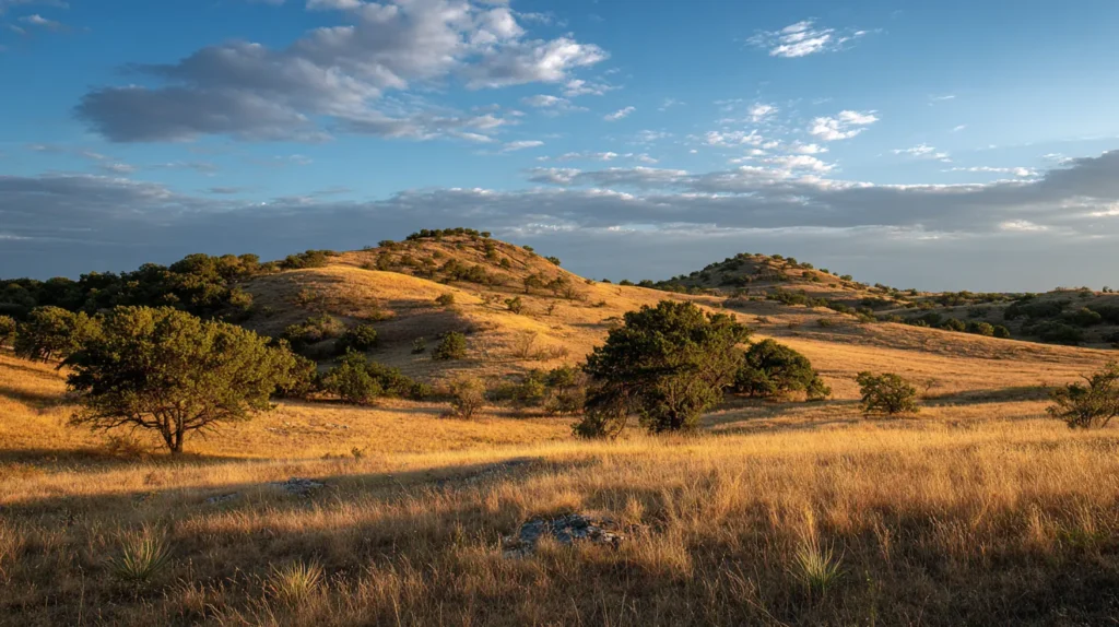
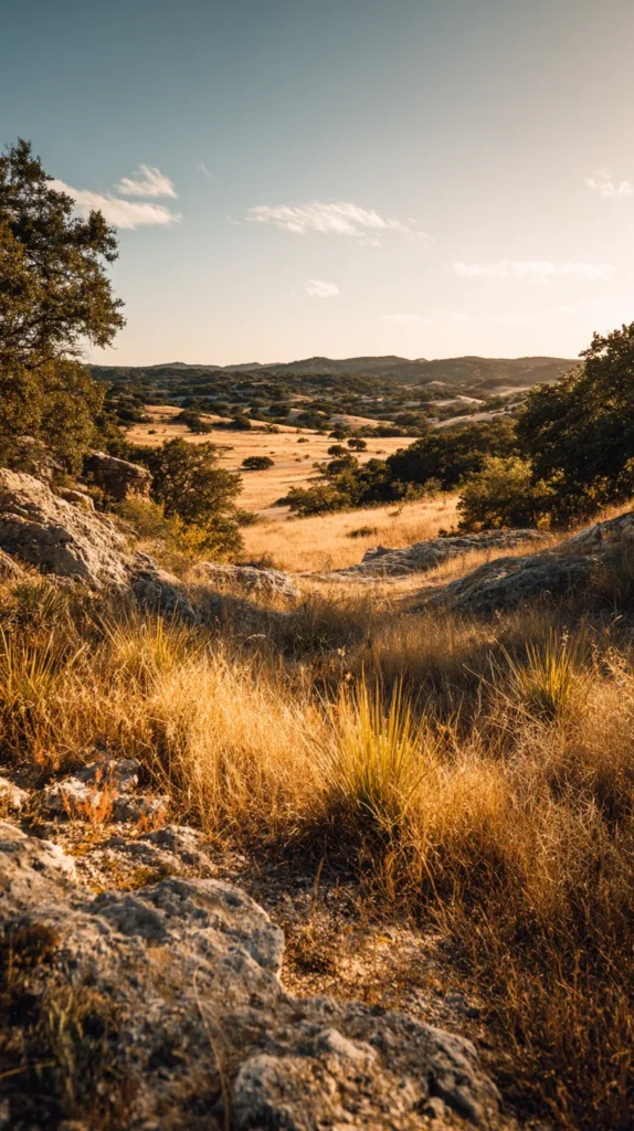
Soft Western Neutrals With Texas Soul
Soft western neutrals are the unsung heroes of phone wallpapers. They don’t demand attention, yet they quietly elevate everything. I’ve found that these designs appeal to women who want something stylish but calm. Think warm beige, dusty taupe, soft clay, and gentle browns layered in thoughtful ways.
A Texas aesthetic shines here because the palette mirrors real landscapes. These colors come from earth, sun, and sky, not a design software preset. They feel familiar, which is comforting. When you unlock your phone, your eyes don’t need to adjust or brace. Everything just sits right.
These wallpapers often feature subtle textures rather than obvious imagery. Linen-like backgrounds, faint grain, soft gradients, and gentle light shifts keep things interesting without clutter. I tend to notice that these designs age beautifully. You won’t get tired of them after a week.
What makes these neutral Texas designs especially versatile:
- They pair well with any phone case
- They keep icons easy to see
- They suit both minimal and decorative styles
- They work year-round
If you’re someone who likes a cohesive look, these wallpapers are a safe but stylish choice. They don’t box you into a theme. Instead, they create a foundation. Texas-inspired neutrals are about confidence through simplicity, which always translates well on a small screen.

Using A Texas Aesthetic To Set The Tone Of Your Day
One thing I’ve found surprisingly helpful is treating my wallpaper like a quiet boundary, not decoration. A Texas aesthetic works especially well for this because it carries mood without instructions. Instead of choosing something flashy, you choose something steady. That steadiness matters the moment you unlock your phone in the morning.
Most people don’t think about timing when they pick a wallpaper, but timing changes everything. Morning screens benefit from light, open designs that don’t rush you. Midday screens handle a bit more contrast and structure. Evening screens work best when everything softens again. Texas-inspired designs naturally fit this rhythm because they already lean into light, space, and grounding.
I tend to notice that when my wallpaper looks calm, I check my phone less impulsively. That wasn’t intentional, but it’s consistent. A Texas aesthetic doesn’t pull you in. It lets you glance, do what you need, and move on. That alone adds practical value to your day.
Instead of thinking, which wallpaper looks prettiest, I ask a different question. What kind of energy do I want behind my notifications today? Wide skies support focus. Muted tones support patience. Clean composition supports clarity. Texas visuals offer all three without feeling designed for productivity (which can get exhausting).
There’s also something reassuring about consistency. When your wallpaper stays visually stable, your phone feels less chaotic. I’ve found that consistency reduces mental friction, especially during busy seasons. The design becomes familiar, like a visual exhale.
This approach isn’t about control or optimization. It’s about support. A Texas aesthetic wallpaper works quietly in the background, shaping how often and how urgently you interact with your screen. That subtle shift adds up over time, which makes this choice more practical than it first appears.
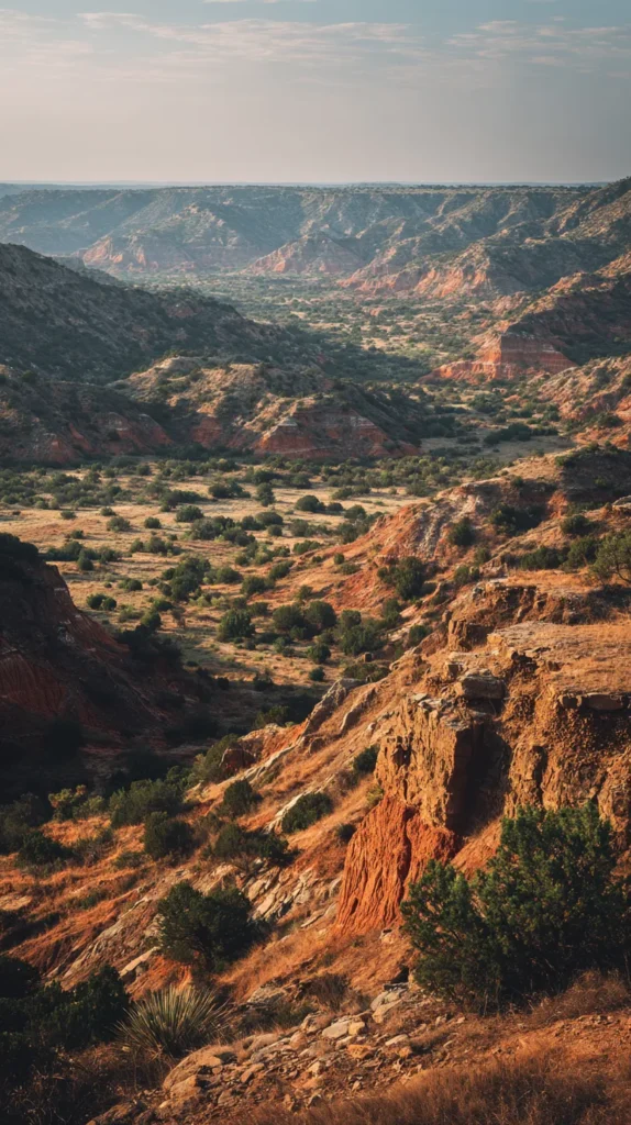

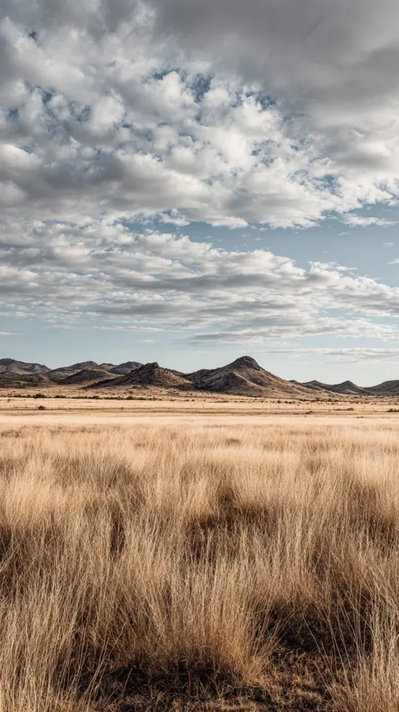
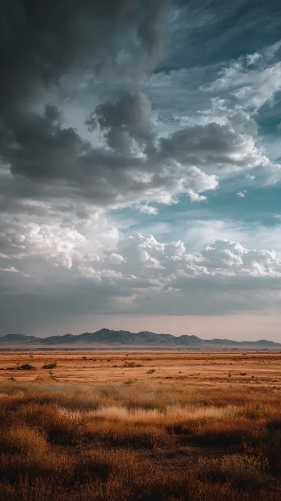
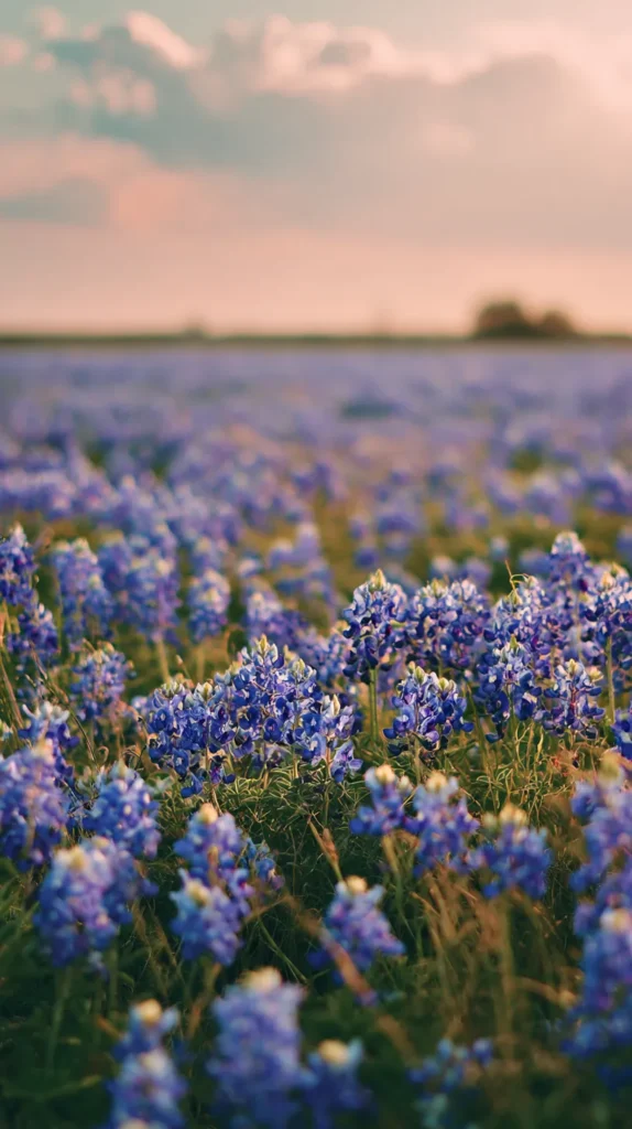
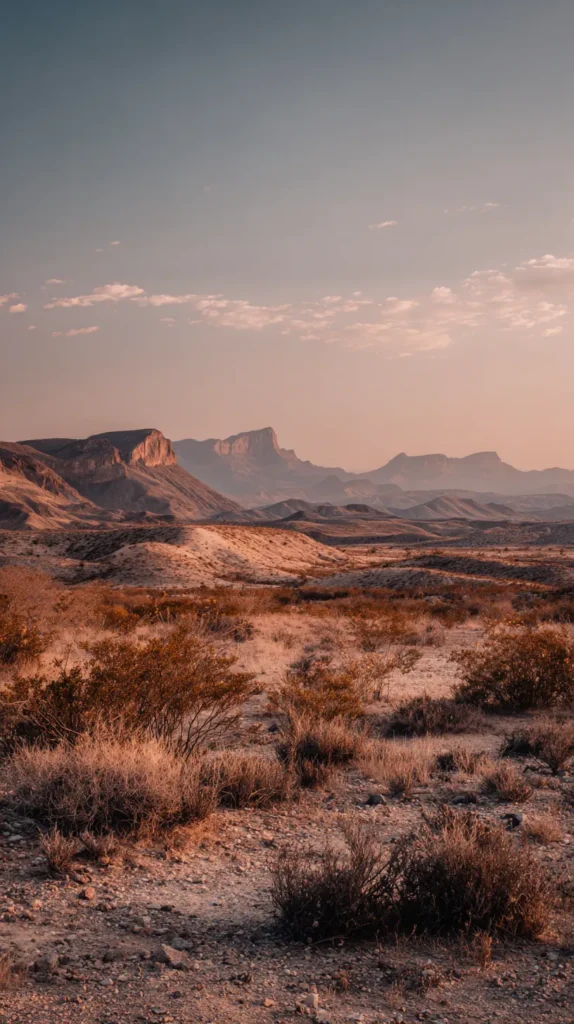
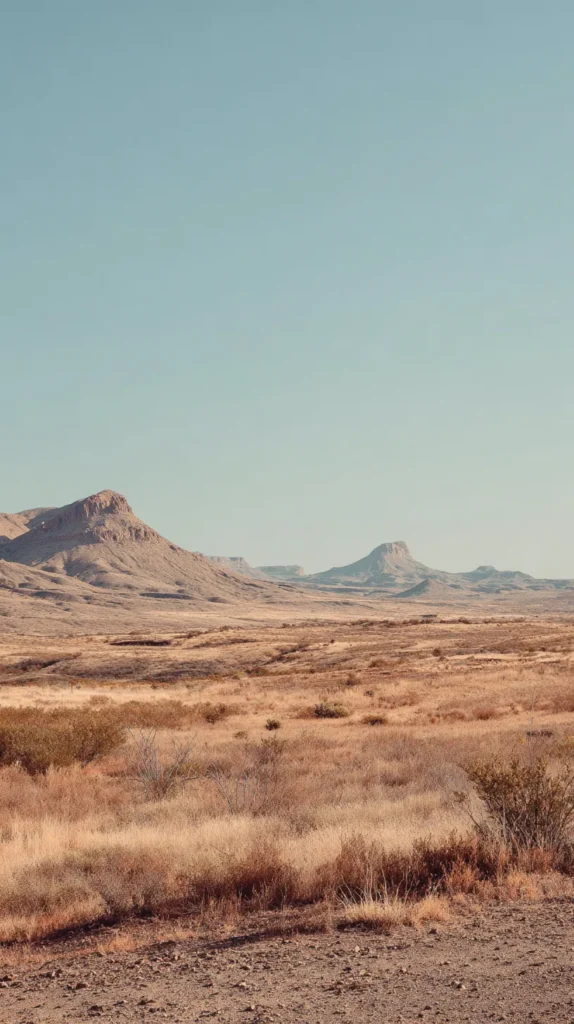
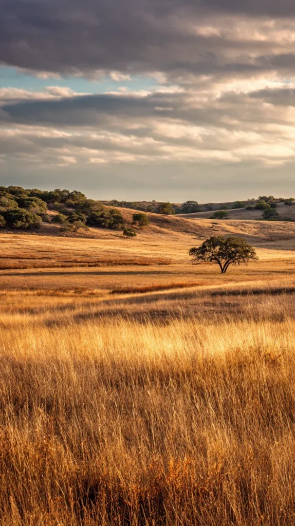
Texas Skies That Change Your Mood
Skies are emotional, whether we admit it or not. A Texas aesthetic often leans heavily into sky imagery, and for good reason. Big skies symbolize freedom, space, and perspective. I’ve found that wallpapers featuring Texas skies instantly soften the mental noise of the day.
These designs usually feature open horizons, subtle clouds, and warm light. They’re never crowded. They invite you to pause, even if just for a second. That pause matters. It resets your nervous system more than you realize. I tend to notice that women choose sky wallpapers when life feels full.
Texas sky wallpapers work especially well vertically. The natural flow from bottom to top mirrors how we hold our phones. That alignment makes everything feel intentional rather than accidental. Even better, these designs allow icons to float without interference.
Common elements you’ll see in these wallpapers:
- Golden hour lighting
- Pale blues mixed with warm tones
- Soft cloud movement
- Minimal foreground detail
If your phone background feels heavy or busy right now, a sky-based Texas aesthetic might be the reset you need. It creates breathing room without feeling empty. That balance is hard to find, which is why these designs resonate so deeply.

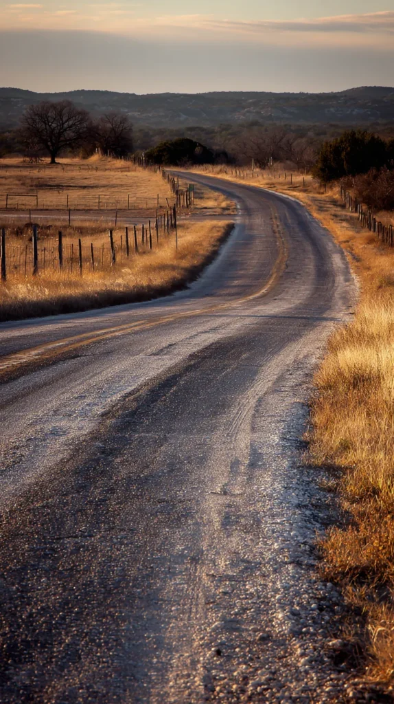
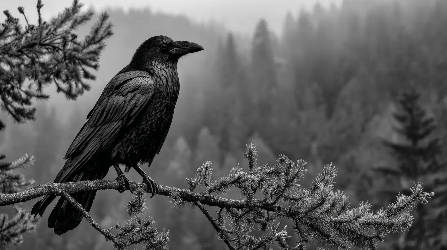
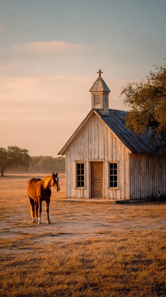
Rustic Details Without the Cheesy Vibe
Rustic style gets a bad reputation, and honestly, it doesn’t deserve it. I’ve found that rustic only goes wrong when it tries too hard. A Texas aesthetic wallpaper handles rustic elements with restraint, which is exactly why it works. Instead of shouting western, it quietly nods in that direction (which I always appreciate). Wood grain, worn leather tones, and softened metal textures show up refined, calm, and intentional.
These wallpapers suggest durability and history without looking heavy. That balance matters on a phone screen. I tend to notice that women gravitate toward designs that feel steady but not dated. They want warmth without clutter and character without chaos. Rustic Texas designs deliver that every time.
Rather than using obvious imagery, these wallpapers lean into close-up texture and light. Grain patterns stay subtle. Shadows stay soft. Contrast stays controlled. As a result, your phone looks current while still feeling grounded. That’s harder to pull off than it looks.
Why these rustic-inspired designs stay popular:
- They add warmth without visual noise
- They age well instead of chasing trends
- They pair easily with neutral phone cases
- They create a sense of calm confidence
At the same time, nothing here looks themed or novelty-driven. I’ve found that the best Texas aesthetic wallpapers don’t explain themselves. They just sit there quietly doing their job. Someone once described this style as strong but polite, and honestly, that stuck with me.
Ultimately, rustic works best when it feels edited. These designs respect space, tone, and balance. That restraint keeps them wearable long-term. Your phone deserves a background that feels intentional, not gimmicky. They let you bring your own. That’s why these wallpapers feel personal even when shared by thousands.
Subtle Texas Symbols That Stay Classy
Symbols work best when they whisper instead of shout. I’ve found that Texas aesthetic wallpapers handle symbolism with impressive restraint. They don’t rely on loud graphics or obvious icons. Instead, they suggest meaning and trust you to catch it (which feels respectful, honestly). That subtle approach is why these designs land so well.
Rather than spelling things out, these wallpapers use hints. A softened star shape tucked into texture. A quiet outline blended into color. A design that rewards noticing instead of demanding attention. I tend to notice that women prefer this kind of visual intelligence. It feels intentional and grown, not decorative for decoration’s sake.
Recognition plays a big role here. When you spot the reference, there’s a little internal nod. No explanation required. That quiet confidence translates beautifully to a phone screen. You aren’t making an announcement. You’re choosing something that resonates, and that’s a different energy entirely.
These symbolic designs work so well because they respect visual balance. Icons stay minimal. Lines stay soft. Colors stay controlled. As a result, your apps remain readable, and your screen stays calm. I’ve found that once someone switches to this style, they rarely go back to louder designs.
Why these symbolic wallpapers stay popular:
- They avoid novelty fatigue over time
- They keep the screen visually clean
- They carry meaning without clutter
- They don’t compete with app icons
At the same time, nothing here feels flat or boring. The symbolism adds depth without distraction. A Texas aesthetic doesn’t need to announce itself to be noticed. It shows up quietly, stands steady, and lets meaning unfold naturally. That confidence is exactly what makes these wallpapers so appealing long-term.

Seasonal Texas Aesthetic That Doesn’t Try Too Hard
Seasonal wallpapers often try way too hard, and that’s where things fall apart. I’ve found that a Texas aesthetic handles seasons with more confidence. Instead of leaning on obvious themes, it shifts through color, light, and mood. That restraint keeps these wallpapers usable long after the calendar flips. Honestly, subtle always wins here.
Spring designs usually bring in softer greens and pale blues, but nothing looks sugary or overdone. Summer leans into warm neutrals, sunlit skies, and that hazy glow everyone loves. Fall introduces deeper browns and muted rust tones without screaming autumn. Winter stays quiet with cooler light and calm textures. As a result, nothing feels forced or overly themed.
I tend to notice that women prefer seasonal changes that don’t announce themselves. They want variety, but they don’t want novelty. These wallpapers evolve naturally, which makes them easier to live with day after day. Meanwhile, your screen still feels fresh.
What makes seasonal Texas designs work so well:
- They shift mood without changing identity
- They stay organic instead of staged
- They avoid quick burnout from trends
- They remain elegant across months
At the same time, these designs respect visual balance. Colors stay soft. Contrast stays gentle. Space stays intentional. Because of that, your apps remain readable and your screen stays calm. I’ve found that once someone chooses this style, they tend to stick with it longer than expected.
A Texas aesthetic doesn’t track seasons with obvious symbols or themed cues. Instead, it mirrors how real landscapes shift over time. Light softens as months pass. Colors deepen without making a scene. Textures change quietly in the background. That realism matters more than people think. I’ve found that when a wallpaper changes gently, it stays interesting longer. You don’t get bored, and you don’t feel the urge to swap it out every few weeks. If you like refreshing your phone without committing to a whole new look, this approach just works. These designs don’t announce the season. They let you notice it. That balance keeps everything calm, grounded, and easy to live with.
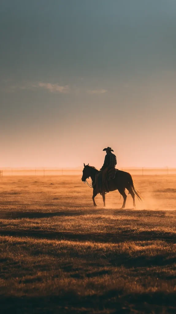
Faith, Strength, And Quiet Confidence In Design
Some wallpapers don’t need words to say something meaningful. I’ve found that many Texas aesthetic designs lean into strength and grounding without adding text. Instead, they rely on visual cues that speak softly but clearly. Strong lines, open space, and steady colors do the work. That kind of restraint always gets my attention.
These designs resonate with women who carry a lot, whether they admit it or not. They don’t need slogans or reminders shouting at them. They appreciate calm reinforcement that sits quietly in the background. I tend to notice that these wallpapers act like visual anchors during busy days. They don’t demand anything. They just stay steady.
Without quotes, the design stays open to interpretation. You bring your own meaning to it, depending on the day. That flexibility keeps the wallpaper relevant longer. One morning it reads as strength. Another day it reads as peace. I’ve found that this openness matters more than clever wording.
At the same time, the structure of these designs stays intentional. Nothing looks accidental. Balance matters here. Color choices stay warm but muted. Space stays generous. Everything feels considered without feeling stiff (which is a fine line, honestly).
Elements that support this quiet confidence include:
- Balanced composition that doesn’t crowd the screen
- Warm but controlled tones that stay easy on the eyes
- Simple structure that feels stable
- Visual consistency that doesn’t distract
Because of that balance, your phone screen stays calm even when life isn’t. Meanwhile, apps remain readable and uncluttered. I’ve found that once someone chooses this type of Texas aesthetic wallpaper, they rarely switch back to louder styles. Strength works best when it doesn’t announce itself. That quiet confidence is exactly what these designs capture.

How To Change Your Wallpaper On iPhone And Android
Once you’ve picked a Texas aesthetic wallpaper you actually love, setting it up should stay low-stress. I’ve found that people enjoy their wallpaper more when the process feels quick and painless. Nobody wants friction after making a good visual choice. This part should feel like a small win, not a task.
On an iPhone, the steps stay pretty straightforward. Save the wallpaper to your photos first. Then head into Settings and tap Wallpaper. From there, choose Add New Wallpaper and select your image. You can adjust the placement slightly if needed. After that, decide where it lives. Lock Screen, Home Screen, or both. Done. Easy enough to do while waiting in line somewhere.
Android phones follow a similar rhythm, although menus can look different. Save the wallpaper image to your gallery. Open Settings and look for Wallpaper or Wallpaper and style. Choose your image, adjust the placement, and apply it. Some phones offer extra options, while others keep things minimal. Either way, it stays intuitive.
I tend to notice a few small choices make a big difference once the wallpaper is set. These aren’t rules, just helpful nudges I’ve picked up over time.
Things that usually help:
- Choose designs with visual space near the center
- Avoid images that are too dark behind app icons
- Preview both screens before committing
The goal isn’t perfection. It’s enjoyment. These wallpapers already do the heavy lifting for you. A Texas aesthetic design should look good the moment it lands on your screen. Once it’s set, let it be. You don’t need to fuss with it. Just unlock your phone and enjoy that quiet, confident backdrop doing its thing.


Final Thoughts
I’ve found that phone wallpapers quietly shape how the day starts and ends. They sit there through texts, reminders, and late-night scrolling. Because of that, the background matters more than we admit. Choosing a Texas aesthetic wallpaper isn’t about location or trends. It’s about choosing steadiness when everything else moves fast.
Sometimes I notice that I unlock my phone just to check the time. Other times, I unlock it because I need a pause. A grounded wallpaper gives me that pause without asking anything back. It doesn’t compete for attention. It just exists in a supportive way. That kind of presence adds up.
Living in Orlando means my surroundings stay bright, busy, and loud most days. Because of that, I gravitate toward wallpapers that bring visual quiet. Texas-inspired designs give me space and balance on a small screen. They offer calm strength without turning dramatic (which I respect). That contrast keeps my phone from feeling overstimulating.
Pinterest plays a role here too, although not in a pushy way. Scrolling through designs becomes more about noticing patterns than hunting for perfection. I tend to notice which wallpapers make me linger. Those are the ones that usually stick. Trusting that reaction matters more than picking what looks impressive.
In the end, this choice stays personal. Your phone background doesn’t need to impress anyone else. It just needs to support you during the day. Pick the wallpaper that gives you a small sense of calm when you unlock your screen. That quiet moment is worth choosing on purpose.