I’m picky about what lives on my phone screen. Not in a dramatic way. More in a quiet, judgmental way. That background sits there all day, staring back at me while I answer texts, scroll mindlessly, and pretend I’m not checking the time again. So yes, it matters. And lately, Scotland wallpaper has been the only thing that feels right. Moody without being gloomy. Calm without being boring. Pretty without trying too hard. That balance is rare.
I’ve found that Scotland wallpaper changes the tone of my phone instantly. Everything slows down a notch. Notifications feel less chaotic. Even my lock screen looks like it has better boundaries. There’s something about mist, stone, and wide green space that makes a tiny screen feel intentional. Almost thoughtful. Which is funny, considering it’s still just a phone.
Living in Orlando means my real life is loud with color and sunshine. Palm trees everywhere. Blue skies on repeat. And while I love that, my phone wants contrast. Scotland gives me that. It brings fog where there’s heat. Stone where there’s glass. Quiet where there’s constant motion. Sometimes your digital space doesn’t need to match your real one. Sometimes it balances it.
This post exists so you can linger. Scroll. Pause. Choose. These Scottish wallpaper designs aren’t about instructions or creative projects. They’re here to be selected. To live on your device. To set a mood. Take your time. Wallpaper choice is personal. Slightly dramatic. And honestly kind of fun.
Some of the links on this page are affiliate links, which means that if you click on them and buy something, I might get a small commission. But don’t worry; it never costs you more. You can peek at my full disclosure if you’re curious about the fine print.
Why Scotland Wallpaper Looks So Good On Phones
There’s a reason Scotland wallpaper behaves so well on a phone screen, and I notice it immediately. Scottish scenery understands restraint, which sounds dramatic, but it’s true. Nothing shouts. Nothing crowds. Everything knows its place, which matters on a small screen.
I’ve found that space does most of the heavy lifting here. Big skies leave room for icons. Rolling hills guide your eye downward instead of everywhere at once. Castles sit heavy and confident without stealing attention. Because of that, the screen stays calm, even when notifications stack up.
Color matters too, and Scotland handles it quietly. Greens stay soft instead of neon. Grays layer instead of flattening. Blues remain steady instead of loud. As a result, app colors stay readable during busy days.
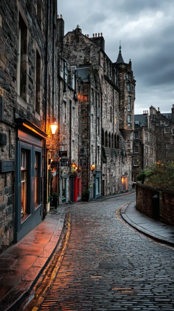
Texture plays a role as well, which people rarely talk about. Stone, fog, grass, and water add depth without clutter. You get interest without chaos, and honestly, that balance feels rare.
Here’s what consistently works best with Scotland wallpaper on phones:
- Wide landscapes with simple horizons
- Foggy scenes that soften contrast
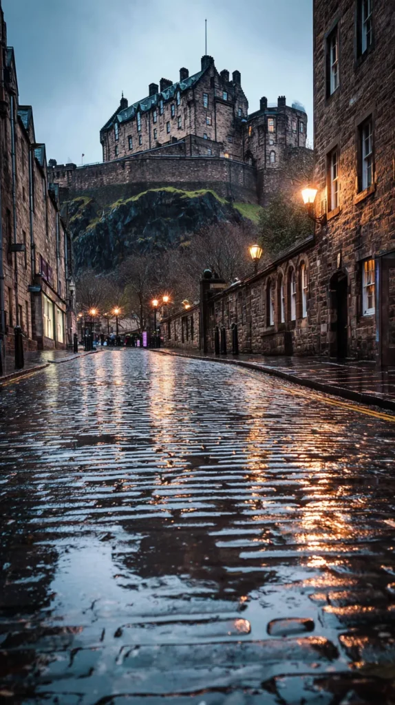
- Castles placed lower in the frame
- Muted greens paired with gray skies
I tend to notice three things every time I choose one:
- The icons stay readable
- The screen feels calmer
- The image still looks good days later
What seals it for me, though, is longevity. Scotland wallpaper doesn’t chase trends. It doesn’t rely on novelty. Weeks later, it still looks intentional (which matters more than people admit!).
So yes, Scotland wallpaper works because it exists quietly. It supports your screen instead of competing with it. That’s exactly what a background should do.
Moods I Rotate Through
Not all Scotland wallpaper brings the same energy, which is honestly the fun part. Some designs whisper quietly in the background. Others brood a little. A few stand tall and confident. I rotate between them based on my mental weather, not my calendar.
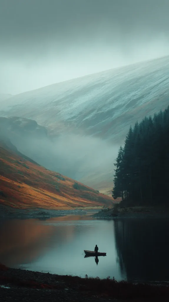
Foggy landscapes always come first for me, and I notice the shift immediately. Fog softens everything without erasing detail. It creates visual quiet when my brain runs loud. On hectic days, that softness helps more than I expect (and yes, that surprised me).
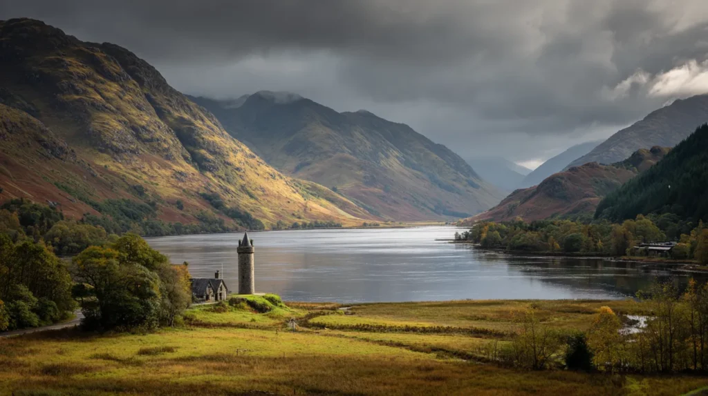
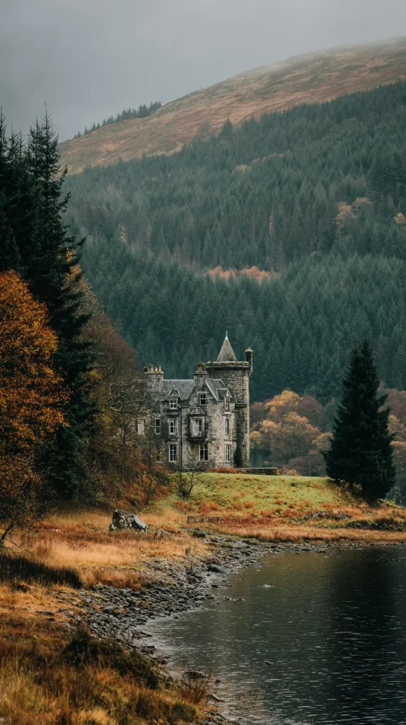
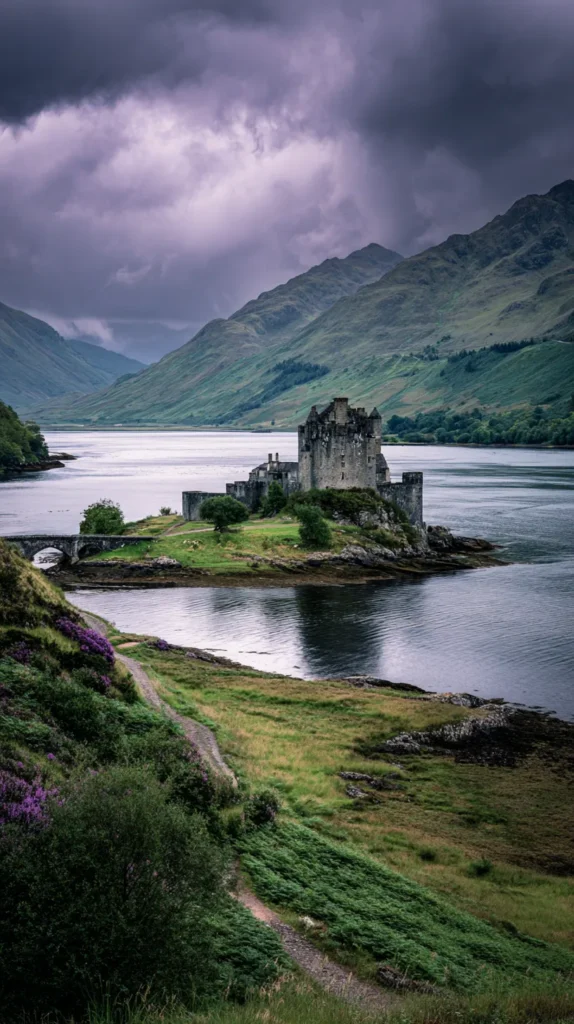
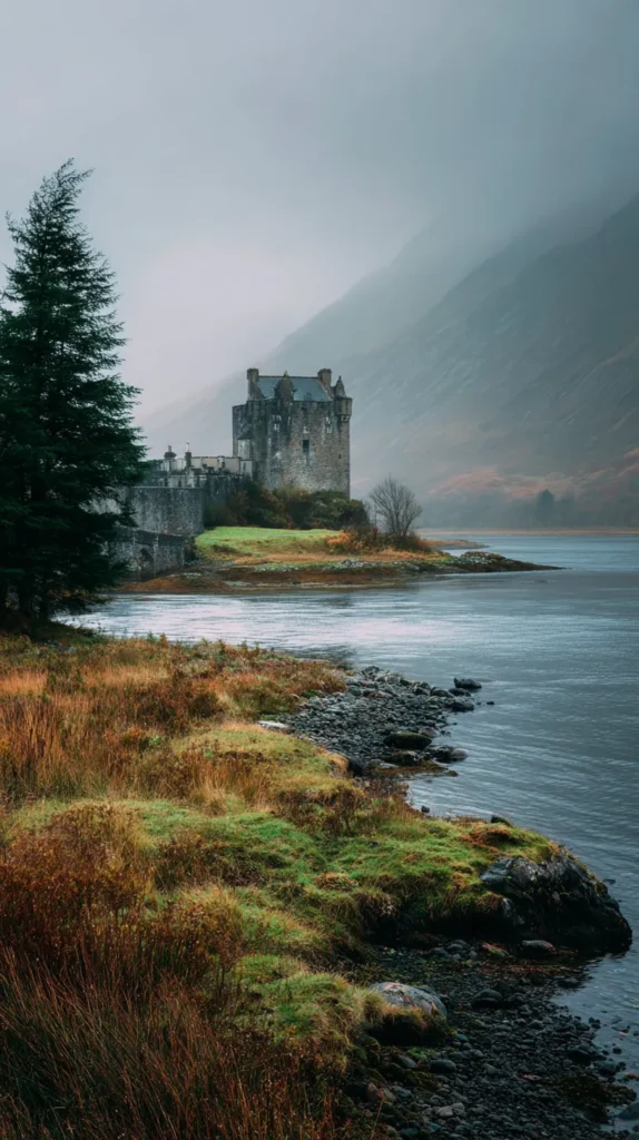
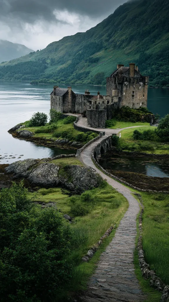
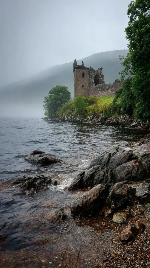
Castle-focused designs bring structure when I need it. Stone walls feel steady. Solid silhouettes ground the screen. They don’t feel aggressive or flashy. Instead, they project calm confidence, which works well during decision-heavy days.
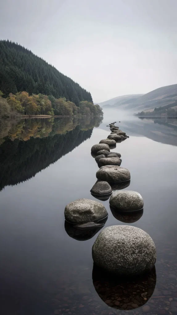
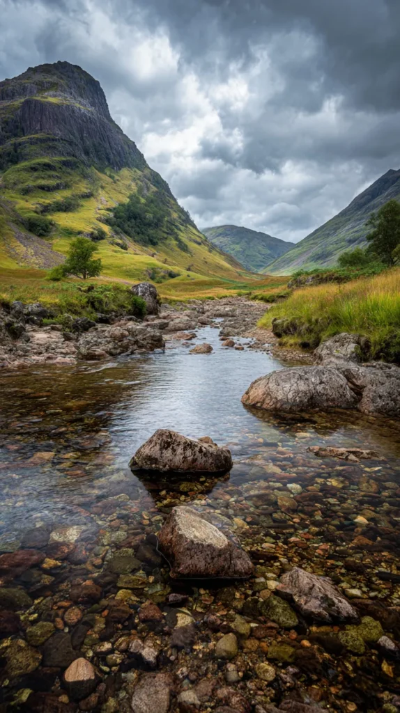
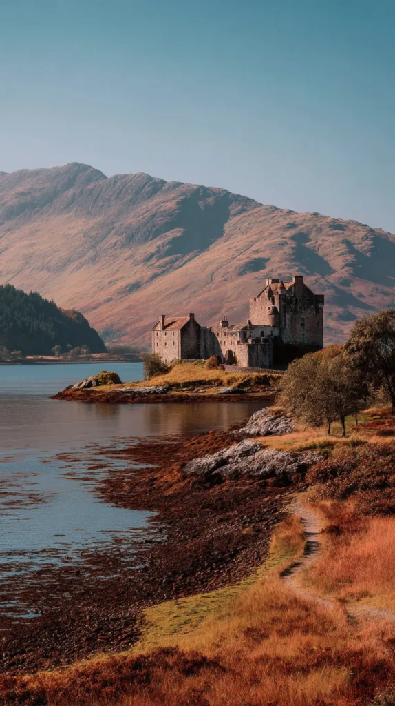
Loch scenes land somewhere in the middle. Still water adds calm. Gentle reflections add depth. Nothing looks busy. Yet, the image never feels boring. These designs sit beautifully behind app grids without fighting attention.
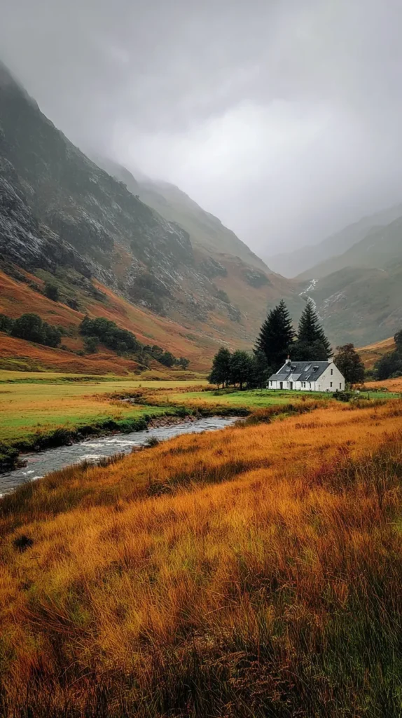
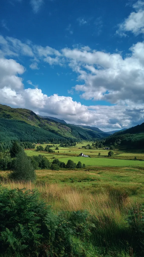
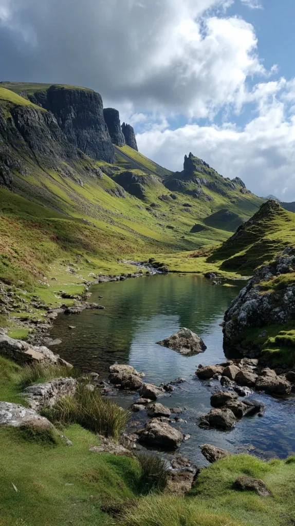
Highlands wallpapers bring space, which I crave often. Wide hills stretch the screen visually. Open skies give everything room to breathe. Somehow, the phone feels larger, even though it obviously isn’t!
Here’s how I tend to think about mood shifts:
- Foggy scenes for quieter days
- Castles for structure and focus
- Lochs for balance and calm
- Highlands for openness and clarity
I usually ask myself three questions before choosing:
- Does this calm the screen?
- Can I read icons easily?
- Will I still like it tomorrow?
What I love most is consistency. Scotland wallpaper lets me change moods without changing personalities. Everything stays cohesive, just tuned differently. That flexibility makes rotating wallpapers enjoyable instead of annoying, which matters more than people admit.

Choosing The Right Scotland Wallpaper Without Overthinking
Choosing Scotland wallpaper shouldn’t feel like a personality test, yet it can sneak into that territory fast. I’ve found that a little intention goes a long way without turning the process into homework. When a wallpaper works, it works quietly, which matters more than people admit.
Brightness usually comes first for me, even before the image itself. Dark designs look stunning at first glance, but icons can disappear later. Lighter, misty scenes tend to balance beauty and function better. I usually land somewhere in the middle because extremes rarely age well.
Focal points start to matter once you pay attention. When the main subject sits lower, icons stay clear. Centered castles shine on lock screens. Wide landscapes stretch naturally across home screens. After noticing this pattern, choosing gets easier.
Color temperature plays a sneaky role too. Cooler tones calm the screen instantly. Slight warmth adds energy without chaos. Scotland wallpaper offers both, which helps when moods shift faster than seasons. I tend to notice how quickly color changes the screen’s tone.
Longevity always enters my thinking, whether I plan it or not. Bold designs thrill quickly, then fade just as fast. Subtle drama sticks around longer. Scotland does subtle exceptionally well, which explains the lasting appeal.
My process stays intentionally simple, almost stubbornly so. One quick scroll gives me a first impression. Then I leave the page and do something else. Later, I come back with fresh eyes. The images I still remember usually win, which feels telling (and oddly satisfying).
I trust my reaction more than rules. If one Scotland wallpaper makes me stop scrolling and think, “Yep, that’s it,” I don’t argue. Overthinking rarely improves a good choice, and phones already demand enough attention.

Setting Scotland Wallpaper On iPhone
Once I choose a Scotland wallpaper from this post, I save it straight to my Photos app. That step alone already makes it feel real, like the decision is officially happening. From there, I keep things simple, because complicated wallpaper steps ruin the mood fast.
I head into Settings, tap Wallpaper, and select Add New Wallpaper. After that, I choose the saved image and adjust it gently. Heavy zooming usually backfires, so I keep the scene natural (Scotland doesn’t need micromanaging). Before committing, I always pause to check readability.
A few things matter most at this stage:
- The clock stays easy to read
- Notifications don’t disappear into dark corners
- The main image still looks balanced
- Icons don’t fight the background
Once that looks right, I decide where the wallpaper lives. Lock Screen works well for dramatic castles. Home Screen suits wider landscapes better. Sometimes I use both for consistency. Other times I mix it up for variety. Either way works, which feels refreshing.
Before finalizing, I take one more second to scan the screen. That quick check saves regret later. Tiny adjustments make a big difference, especially with moody images.
After setting it, I stop touching things. Extra apps rarely improve the result. Filters distract from the image instead of helping. Tweaks tend to overwork a good scene. The wallpaper should quietly do its job without asking for attention. When it works, the screen looks calmer immediately.
That’s honestly it! Setting Scotland wallpaper on an iPhone shouldn’t feel technical or serious. It’s a small choice, but it shapes how your phone looks all day. When the background feels intentional, everything else on the screen seems to fall into place naturally.

Setting Scotland Wallpaper On Android
Setting Scotland wallpaper on Android stays refreshingly simple, which I appreciate more than I should. Once I choose a design from this post, I save it directly to my Gallery. That small step makes the choice feel settled, like I’m committing without overthinking it.
From there, I open the image and tap the menu option to set it as wallpaper. Android usually gives a clear preview screen, which helps. I take my time here, because Scotland designs shine when they’re left mostly untouched. Over-zooming flattens the scene, so I let the landscape breathe (it knows what it’s doing).
A few things always guide my decision at this stage:
- Icons remain easy to spot
- The main image doesn’t compete with notifications
- The horizon line feels balanced
- Dark areas don’t swallow text
Next, I decide where the wallpaper should live. Lock Screen works beautifully for castles and dramatic skies. Home Screen favors wider landscapes with softer contrast. Sometimes I use the same image for both. Other times, I mix things up for variety. Android makes that flexibility feel effortless.
Icon contrast matters more on Android than people admit. App styles vary wildly, so lighter Scotland wallpaper often plays nicer. That said, darker castle scenes still work when the composition stays clean.
I always skip motion effects. Static images keep the screen calmer and more focused. Movement distracts from the scenery instead of enhancing it.
After setting everything, I pause for a second and just look. If the screen feels settled and intentional, I’m done. Scotland wallpaper shouldn’t demand attention. It should quietly elevate the phone, which Android handles beautifully when the image is chosen well.
Scotland Wallpaper Styles That Age Well
Some wallpapers thrill for a day or two, then quietly annoy you. Others settle in and become part of the background in the best way. Scotland wallpaper usually lands in that second category, which is why I keep coming back to it. I’ve found that the styles with restraint last longer than anything flashy.
Minimal landscapes tend to age the best over time. One hill, one sky, and soft contrast go a long way. Those designs never overwhelm the screen, even after weeks of constant use. Because nothing fights for attention, the image stays pleasant instead of tiring.
Moody greens also hold their ground beautifully. Scotland’s greens stay muted instead of neon, which helps. They pair well with almost any app color and don’t clash with notifications. As a result, the screen stays calm during the day and easy on the eyes at night.
Stone textures add another layer of staying power. Castle walls, old bridges, and worn cobblestones bring depth without clutter. I tend to notice how these textures add interest without stealing focus. The screen feels grounded rather than busy, which matters more than it sounds.
Heavy saturation usually causes problems later. Loud skies impress quickly, then fatigue sets in. Scotland wallpaper thrives in restraint, so softer tones keep working long after the novelty fades. That quiet confidence makes a difference.
Designs with distant horizons also age well. When the main elements sit farther back, the screen feels more open. Space matters more than detail on small screens, even when the image itself feels dramatic.
These styles don’t demand constant change. They settle in comfortably and stay relevant. That reliability makes choosing Scotland wallpaper easier, especially when you want something that lasts.
Last Few Thoughts
I don’t treat wallpaper like decoration anymore. Instead, I see it as atmosphere that quietly shapes my day. I’ve found that the background I choose affects how my phone behaves in my hands. When the image stays calm, everything else follows.
Scotland wallpaper brings that calm without asking for attention. Nothing shouts or fights for focus. The image simply sits there, steady and composed, doing its job well. That kind of quiet confidence matters more than I realized at first.
Even living in Orlando, where everything leans bright and busy, I want contrast on my screen. Fog against sunshine feels refreshing. Stone against glass feels grounding. That visual shift gives my phone its own lane, separate from real life.
I tend to notice how quickly I stop scrolling once the right wallpaper lands. The urge to keep searching fades. The screen feels settled. That moment of “oh, this works” is oddly satisfying (and a little relieving).
Choosing wallpaper doesn’t need drama, yet it deserves attention. Letting yourself pause, compare, and choose intentionally turns a small decision into a pleasant one. I like that process more than rushing through it.
If Pinterest brought you here, that tracks. Moody landscapes, thoughtful aesthetics, and strong visuals thrive there for a reason. This style resonates because it lasts.
I always remind myself that a phone gets looked at constantly. Giving it a background that feels steady makes sense. Scotland wallpaper does that quietly, without fuss. When the screen feels finished, everything else feels easier.