I love how something small can completely change a screen. That is exactly why retro wallpaper has such a strong pull for me. It brings color, pattern, and personality back into a space we stare at all day. Phones and tablets feel so neutral now. However, a retro-inspired design adds charm without effort. I see it as instant mood-lifting decor for your pocket.
I approach digital wallpaper the same way I approach home decor. It should be fun, expressive, and a little nostalgic. Retro wallpaper works because it feels familiar yet fresh. The colors are bold but comforting. The patterns are playful but balanced. That mix keeps things interesting without being overwhelming.
I live in Orlando, where bright colors and sunshine shape how I see design. Because of that, I lean toward wallpaper styles that feel cheerful and energetic. Retro patterns fit that vibe perfectly. They echo warmth and optimism, even on busy days.
This post is built to help you browse, linger, and choose. I’m sharing curated retro wallpaper designs meant for phones and tablets. Nothing here requires editing, cropping, or creating anything yourself. Instead, you scroll, choose, and set. That’s it.
I’ll also walk through how to change your wallpaper on both iPhone and Android devices. That way, nothing feels confusing or rushed. You can read, scroll, and select at your own pace. By the end, your screen can look entirely different, without extra steps or tools.

Some of the links on this page are affiliate links, which means that if you click on them and buy something, I might get a small commission. But don’t worry; it never costs you more. You can peek at my full disclosure if you’re curious about the fine print.
Why Retro Wallpaper Works So Well On Digital Screens
Retro wallpaper translates beautifully to phones and tablets because it was built for visual impact. These designs rely on shape, color, and rhythm. That makes them perfect for small screens that need clarity. Busy photos often blur. Meanwhile, bold patterns stay crisp.
I’ve found that retro designs create contrast without chaos. For example, curved lines guide your eyes naturally. Geometric repeats create order. Because of that, icons stay readable and screens remain functional. That balance matters more than people realize.
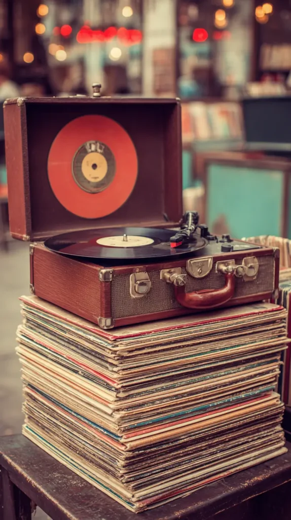
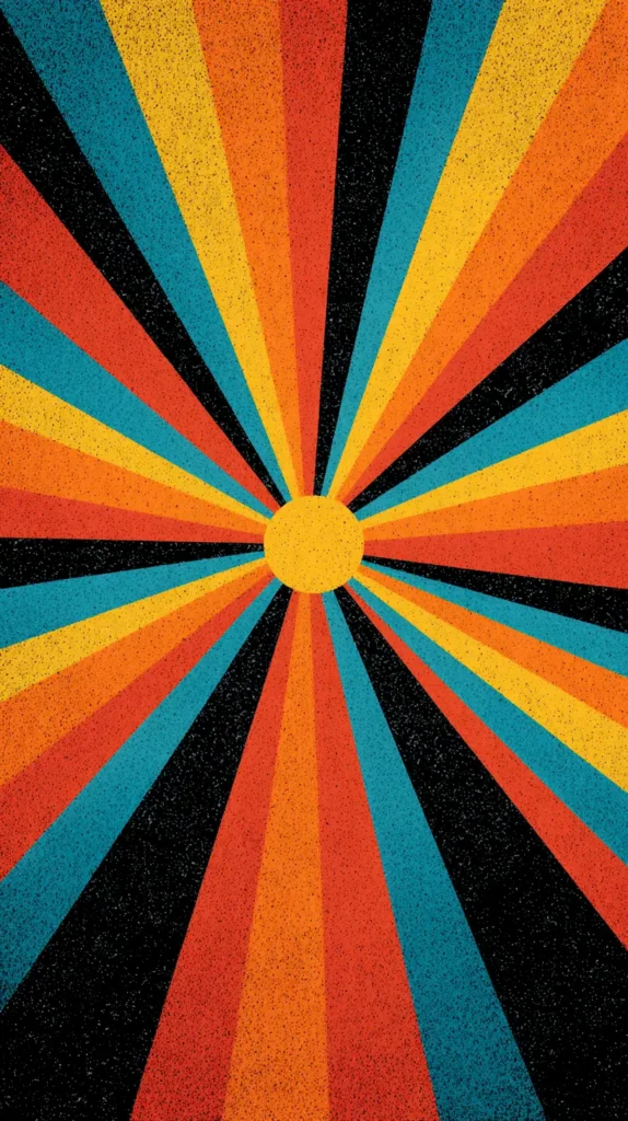
Another reason retro wallpaper shines is color confidence. Soft beiges had their moment. Now, people want warmth again. Retro palettes bring in mustard, teal, rust, coral, and avocado. These colors energize a screen without screaming for attention.
Retro wallpaper also carries emotion. It hints at eras associated with creativity and expression. Even if you never lived through those decades, the style still resonates. It feels intentional and styled, not random.
On digital devices, scale matters. Retro patterns often repeat cleanly, which avoids awkward cropping. That consistency makes them easier to use across devices.
Here’s why retro styles work especially well:
- Strong shapes stay sharp on high-resolution screens
- Repeating patterns avoid visual clutter
- Warm tones reduce harsh brightness
- Designs age well and don’t feel trendy overnight
Because of that, retro wallpaper becomes something you enjoy longer. It doesn’t tire your eyes quickly. Instead, it quietly enhances your everyday scrolling.
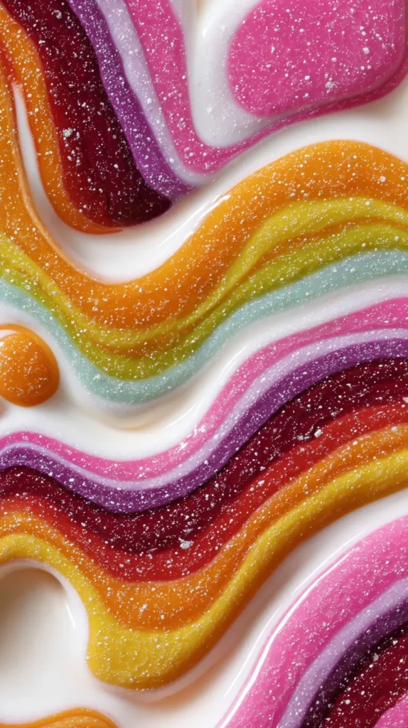
Color Palettes That Pop Without Overwhelming
Color is the heart of retro wallpaper. Yet not all palettes behave the same on screens. Some energize. Others calm. Knowing the difference helps you choose wisely.
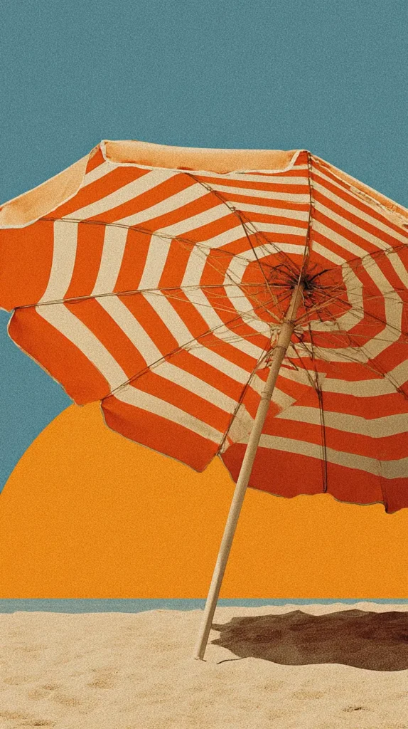
Muted retro palettes are especially popular right now. Think warm tan paired with burnt orange. Consider olive mixed with cream. These combinations feel grounded. They look good in bright or dark mode.
On the other hand, high-contrast palettes bring drama. Teal against mustard pops instantly. Pink paired with chocolate brown feels playful yet polished. These choices work well if you want your screen to stand out.
I’ve found that mid-tone backgrounds are easiest on the eyes. Very dark colors drain battery less, but can hide icons. Extremely light backgrounds can feel harsh. Retro palettes often sit right in the middle.
Popular retro wallpaper color styles include:
- Earthy 70s tones with soft contrast
- Pastel 60s shades with gentle warmth
- Bold 80s brights with clean separation
- Neutral bases with one standout accent
Another benefit is adaptability. Retro colors pair well with both light and dark icon themes. That flexibility matters if you switch modes often.
When browsing designs, notice how the background color frames the pattern. A good retro wallpaper supports the design rather than competing with it. That harmony keeps your screen pleasant all day.

A Micro Mood Shift You Can Control
I think of retro wallpaper as a tiny emotional dial you get to turn on purpose. Phones throw enough at us already. Notifications buzz. News scrolls fast. However, wallpaper just sits there quietly doing its job. When that design carries retro energy, it softens everything else on the screen.
I’ve found that retro wallpaper works almost like visual white noise, but prettier. The repetition calms the eye. The curves slow your focus. The color choices anchor your attention instead of pulling it everywhere. That matters when your phone opens a hundred times a day.
Unlike photos, retro designs do not drag in memories or comparisons. A photo asks questions. Who was there? When was that? A pattern asks nothing. It simply exists. Because of that, retro wallpaper becomes a neutral emotional reset rather than a mental detour.
There’s also something oddly grounding about using a design language that predates smartphones. Retro wallpaper reminds your brain that not everything needs to be new. Familiar shapes signal safety. Repeated motifs create rhythm. As a result, your screen feels intentional instead of chaotic.
Another overlooked benefit is decision fatigue reduction. When your wallpaper stays visually stable, your brain works less. That means fewer micro-stressors layered onto an already busy day. It’s subtle, but it adds up.
I treat retro wallpaper like digital furniture. It frames everything else without stealing attention. That approach changes how often I switch apps and how long I linger. The screen becomes supportive rather than demanding.
That’s why choosing the right retro wallpaper isn’t just about style. It’s about giving your phone a job that actually helps you.
Icon-Friendly Patterns For Everyday Use
A wallpaper can be beautiful but impractical. Retro wallpaper avoids that problem when patterns are chosen well. Many classic designs were meant for repeated viewing. That makes them ideal for daily phone use.
Mid-scale patterns work best. Tiny details disappear. Oversized shapes get cropped awkwardly. Retro designs often land right in the middle, which is perfect.
Curves are another advantage. Rounded shapes soften screens visually. They create movement without distraction. Straight lines can feel rigid. Retro wallpaper often blends both for balance.
Here are pattern styles that work especially well:
- Arched rainbows with spacing between shapes
- Daisy repeats with simple outlines
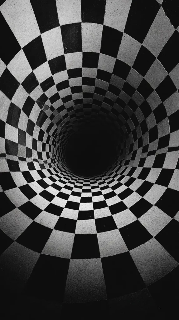
- Checkerboard variations with softened edges
- Abstract blobs with clear separation
Spacing matters more than people expect. Good retro wallpaper leaves breathing room. Icons sit comfortably without getting lost.
Another thing I always notice is directional flow. Patterns that move diagonally feel dynamic. Vertical repeats feel calming. Horizontal lines feel stable. Retro designs offer all three options.
Because of that, you can choose based on how you want your screen to function. Busy days might call for calmer visuals. Creative days might welcome energy. Retro wallpaper gives you that choice without complexity.
Styles Inspired By Different Decades
Retro wallpaper covers more than one era. Each decade brings its own mood. Knowing the difference helps narrow your favorites faster.
The 60s leaned playful and optimistic. Think simple florals, soft pastels, and repeating motifs. These designs feel light and cheerful.
The 70s brought earthiness. Colors became warmer. Patterns grew bolder. Shapes leaned organic. This era works beautifully for cozy screens.
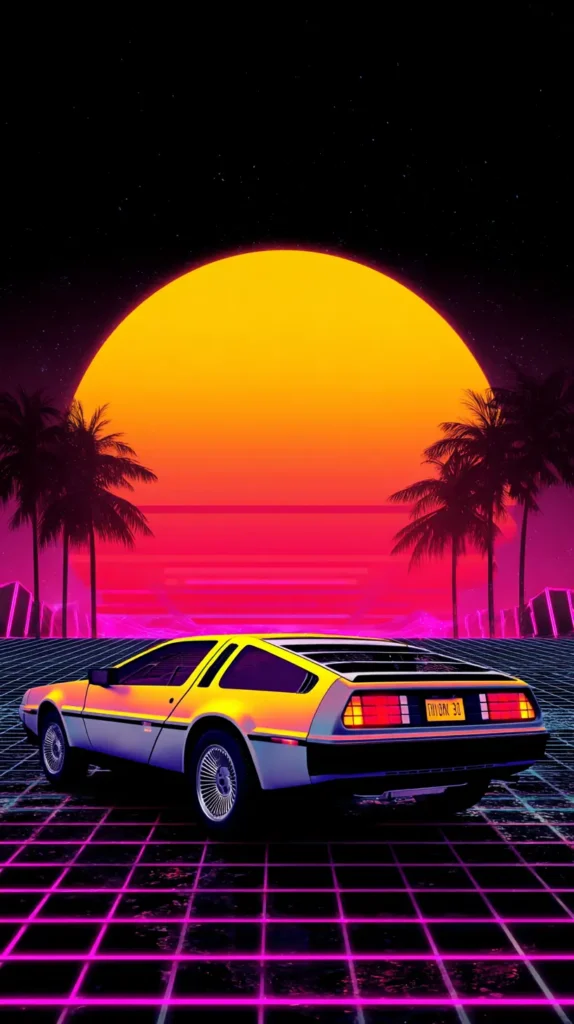
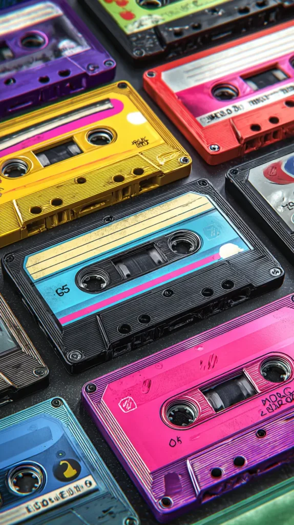
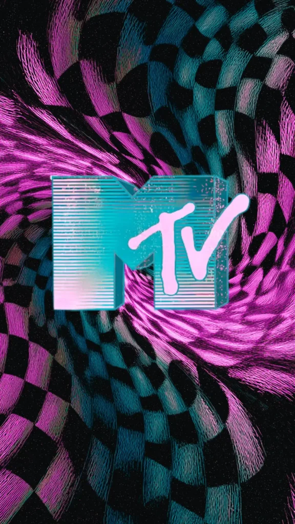
The 80s embraced contrast. Bright colors met sharp geometry. Designs felt graphic and confident. These wallpapers stand out instantly.
The 90s softened things again. Muted tones returned. Patterns became simpler. There’s a quiet nostalgia there.
You’ll often see these decade cues in:
- Color combinations
- Line thickness
- Pattern symmetry
- Overall energy
I’ve found that mixing eras across devices feels cohesive. For example, a 70s-inspired phone wallpaper pairs nicely with an 80s tablet design. They share spirit without matching exactly.
Retro wallpaper lets you choose a mood, not just a look. That’s what makes browsing fun. You aren’t just decorating a screen. You’re setting a tone.
Retro Wallpaper As Visual Rhythm For Busy Screens
Retro wallpaper can act like visual rhythm instead of decoration. That idea sounds abstract, but it’s actually very practical. Your phone screen is a fast-moving place. Apps open and close. Alerts slide in. Text stacks quickly. A retro pattern creates steady visual pacing underneath all that motion.
I’ve noticed that repeating shapes help the brain settle faster. Circles, waves, and arches give your eyes a predictable path. Because of that, the screen feels calmer, even when activity stays high. Retro wallpaper excels here because repetition is baked into the design style.
Modern photos often fight the interface. Faces compete with icons. Backgrounds clash with widgets. Retro wallpaper avoids that tension. Patterns stay neutral while still being interesting. They support what happens on top instead of interrupting it.
There’s also a timing benefit most people miss. Retro designs slow scrolling just enough. Your eye pauses briefly on color and shape before moving on. That pause reduces frantic tapping. Small pauses matter during busy days.
Another reason this works comes down to contrast control. Retro wallpaper usually sticks to limited palettes. Fewer colors mean fewer visual decisions. As a result, your brain processes information faster and with less effort.
This makes retro wallpaper especially helpful during work hours or heavy phone use. The design creates structure without rules. It holds space without asking for attention.
I think of retro wallpaper as background music for your phone. It sets tempo. It supports flow. And it never steals the spotlight. When chosen well, it quietly improves how your screen works all day.
That’s a powerful job for something that seems so simple.
How To Change Retro Wallpaper On An iPhone
Changing your wallpaper should feel simple. Thankfully, iPhones make the process straightforward. Once you choose a retro wallpaper design, the rest takes moments.
First, save the wallpaper image to your Photos app. Make sure it downloads fully. Partial downloads can cause blurry results.
Next, open Settings. Scroll until you see Wallpaper. Tap that option. Then choose Add New Wallpaper.
Select Photos. Pick your saved retro wallpaper. Adjust positioning if needed. However, most designs fit well without zooming.
Before setting, preview both Lock Screen and Home Screen views. Some patterns work better on one than the other. You can assign the same design to both, or mix styles.
Steps in short:
- Save the wallpaper image
- Open Settings and tap Wallpaper
- Choose Add New Wallpaper
- Select your image
- Set Lock Screen, Home Screen, or both
Once applied, check icon visibility. If something feels crowded, try a different design. That flexibility is part of the fun.

How To Change Retro Wallpaper On An Android Device
Android devices vary slightly by brand. However, the process stays similar across models. The goal is quick access and easy adjustment.
Start by saving the retro wallpaper image to your device. Open your Gallery or Photos app to confirm it saved correctly.
Then, press and hold on an empty area of your home screen. A menu will appear. Tap Wallpaper or Wallpaper and Style.
Choose Gallery or My Photos. Select your wallpaper image. Adjust cropping if needed. Many retro wallpaper designs scale nicely without adjustment.
Preview the result before applying. Android lets you assign wallpapers to the Home Screen, Lock Screen, or both.
Easy steps include:
- Save the image
- Long-press the home screen
- Tap Wallpaper
- Select your image
- Apply your choice
If icons blend too much, switch to a lighter or darker design. Android themes often pair beautifully with retro wallpaper colors.

Choosing Retro Wallpaper That Matches Your Daily Rhythm
Your phone sees you at every hour. Because of that, your wallpaper should support your routine. Retro wallpaper offers options for every mood.
For mornings, lighter designs energize without glare. Pastels and soft patterns ease you into the day. During work hours, balanced designs help maintain focus. Even spacing and muted tones reduce distraction.
Evenings often call for warmth. Earthy retro colors feel calming. They soften screen time without dimming everything completely.
Here’s how to match wallpaper to rhythm:
- Morning: light backgrounds with gentle patterns
- Daytime: mid-tone colors with structure
- Evening: warm hues with softer contrast
- Night: darker palettes with minimal detail
I’ve found that rotating wallpapers seasonally also helps. Retro designs adapt easily. Autumn tones feel cozy. Spring pastels feel fresh. Summer brights feel joyful.
Because these designs are curated, switching doesn’t require effort. You simply choose another option already sized and styled.

Last Few Thoughts
I see digital wallpaper as personal space. It’s the one design choice you see constantly. That’s why retro wallpaper makes so much sense. It adds joy without demanding attention. It decorates without clutter.
I like that retro styles invite you to slow down visually. They remind you that design can be playful and practical at once. That balance matters in daily life.
Living in Orlando keeps me surrounded by color and warmth. That influence shows up in how I choose screen designs. Bright yet grounded always wins for me.
If you enjoy browsing and saving ideas on Pinterest, this kind of content fits right in. Scrolling through designs should feel inspiring, not overwhelming. This post is meant to be a place you linger.
Choosing a wallpaper might seem small. However, small choices shape daily experiences. Retro wallpaper brings charm back to the most-used screen in your life. And that, to me, is always worth a moment of attention.