Red wallpaper can fix my phone mood faster than coffee, and that annoys me. I’ll pick up my phone, see a dull screen, and instantly want to toss it. That reaction feels dramatic, yet it happens. So I started keeping a stash of bold red backgrounds ready to go. No DIY projects. Personal photos aren’t the plan. Just designs in this post that you can choose and use.
Some days I want my phone to look calm and expensive. Other days I want it to look like a tiny runway. Either way, red does something other colors don’t. It looks confident without trying too hard. Plus, it makes everything else on the screen look sharper, which seems unfair.
Living in Orlando keeps color in my face all day, so bland screens stand out. Bright murals, neon signs, and sunset skies all make my phone look sleepy by comparison. I tend to notice that contrast the second I unlock my screen. So I treat wallpapers like lipstick. I don’t overthink it, yet I still want the right shade.
In this post, I’m sharing a scrollable set of red designs for digital devices. You’ll spot styles that match different moods, and you can grab the ones that click. Then I’ll show the quick way to set them on iPhone and Android. One design in particular looks simple, until you set it. That’s the one people keep coming back for, and it’s coming up soon.
Red Wallpaper That Looks Expensive On Purpose
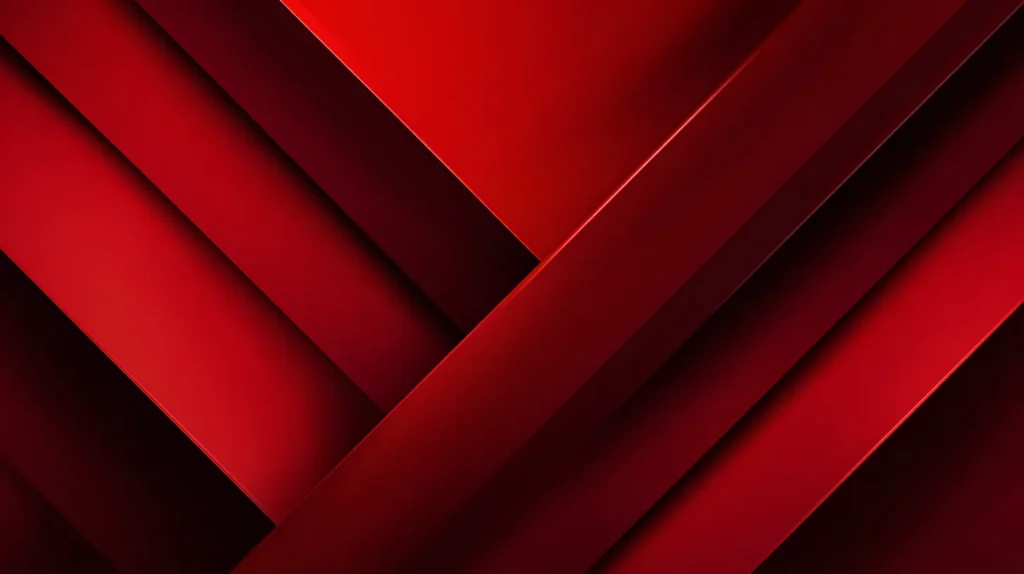
If a phone background looks cheap, it ruins the vibe in seconds. I don’t mean bright or bold by default. Instead, I mean that flat, plastic red that makes icons look like stickers. Turns out, the expensive look comes from texture and restraint, not loud color.
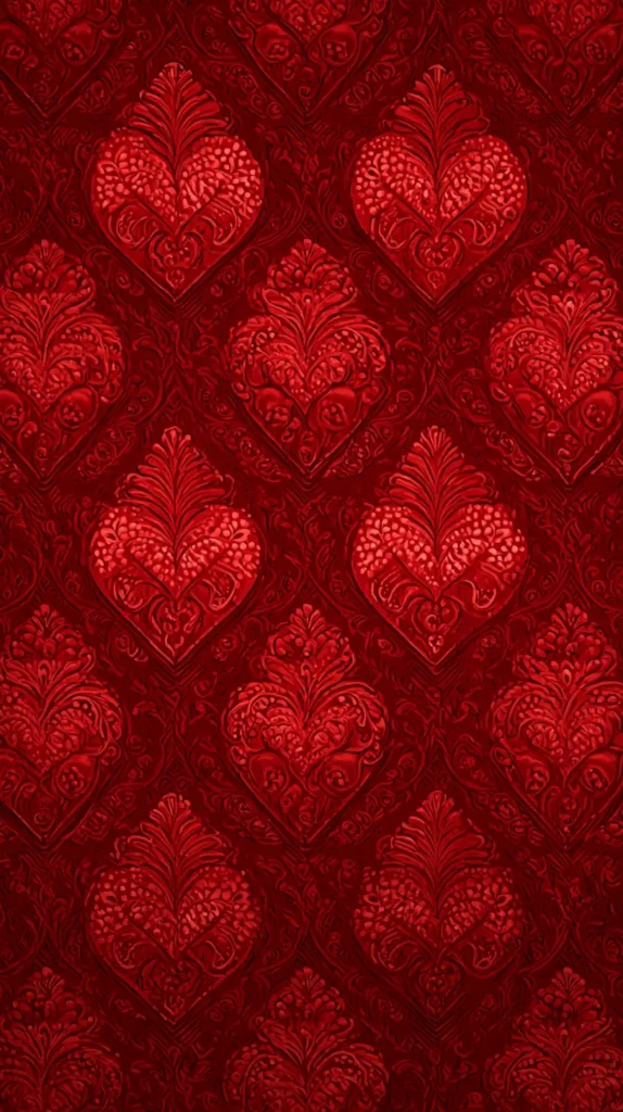
Deep reds with soft shadows read like velvet. Wine gradients read like satin. Subtle marble reads like a hotel lobby counter you’re not supposed to touch. Those tiny details add depth, and depth makes the screen look intentional. Meanwhile, a pure cherry red can look harsh, especially in bright light.
Here’s what I look for. I want the fancy look without the effort.
- Dark red tones with one quiet highlight.
- Texture that looks real, not glittery.
- Negative space that lets icons breathe.
- Clean shapes that don’t crowd the center.
- A detail that looks designed, not random.
Most people assume red has to shout. I don’t buy that. A burgundy background can whisper and still command attention. So can a red-on-black line design that stays minimal. The trick is contrast that stays controlled.
Here’s the sneaky part. Expensive screens usually look edited. So I skip busy designs and pick ones with one focal area. Then I let the clock sit there like it belongs. If you love widgets, choose smoother texture. For widget haters, choose bold texture and enjoy the drama.
Try this before you commit. Open the image in bright light, then check it again in dim light. Strong reds stay red. Weak ones drift into brown and look tired. If you want a safe bet, choose a red wallpaper with darker edges. That choice keeps the clock readable and still looks luxe.

Soft Reds That Don’t Scream
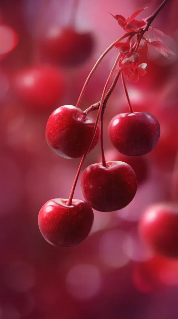
Not every day needs a power color moment. Sometimes I want red that acts polite. Dusty rose, muted terracotta, and soft cranberry tones still count as red, yet they behave. I’ve found these shades work especially well when my screen already has a lot going on.
Soft reds also play nice with white icons. They calm neon app colors down. That makes the whole screen look cohesive instead of chaotic. So you get color, yet you don’t get visual noise.
These designs usually hit the gentle sweet spot:
- Watercolor washes with feathered edges.
- Simple gradients that fade like sunset.
- Paper textures with tiny speckles.
- Minimal florals that stay modern.
- Small arches or dots that repeat quietly.
People treat softer shades like they’re less stylish. I think they’re harder to do well. A muted red looks current when the tone stays warm and clean. Meanwhile, harsh red can look dated fast.
Also, some designs look plain in the preview. Then you set them and notice the texture. That delayed payoff keeps you happy longer, which sounds silly but works. If you want calm with personality, pick a red wallpaper that has lots of breathing room. Notifications look less bossy on soft backgrounds. I also like soft reds when I need my screen to stop yelling at me.
Some designs use a faint border or vignette. That little frame makes everything look tidier. If you want a playful option, choose tiny repeating shapes. They look cute, yet they don’t turn childish.
One more thought. Soft reds look amazing with warm-toned photos widgets. So if you use family pictures, the screen looks cohesive. If you don’t, the background still reads cozy and clean. Either way, you win.
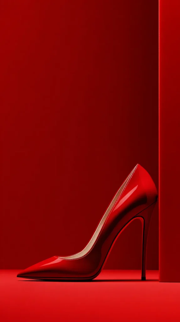
The Red Wallpaper Color-Coding System That Matches Your Life
Most red wallpaper posts act like one design fits every mood. That’s cute, but real life changes by the hour. So I sort my red backgrounds by screen job, not by style. It sounds picky, yet it keeps my phone useful and pretty.
Here’s the idea: each red design earns a role based on what you need that day. I keep one red wallpaper that reads calm and quiet for busy mornings. I keep another that feels bold and sharp for errands and decision-heavy afternoons. Then I keep a darker red for nights, when my eyes want less glare.
What makes this different is the matching rule. I match the undertone of the red to the kind of content I’ll see most. Warm reds pair better with photos and family widgets, because skin tones stay flattering. Cool reds pair better with calendars and notes, because text looks cleaner. Neutral reds, like brick or clay, sit in the middle when your screen does everything.
This system also fixes the most annoying problem: notification mood swings. When the background matches the job, alerts feel less chaotic. A calm red makes badges look like information, not emergencies. A bold red makes badges blend, so you don’t get tempted to tap.
I don’t overcomplicate it with folders and rules. I just name the saved images by role in my camera roll. Still, I test each option for one day before committing. Then I rotate based on what I need, not what looks trendy. Suddenly my phone feels curated, even on messy weeks. That’s the point, and it works without extra effort.
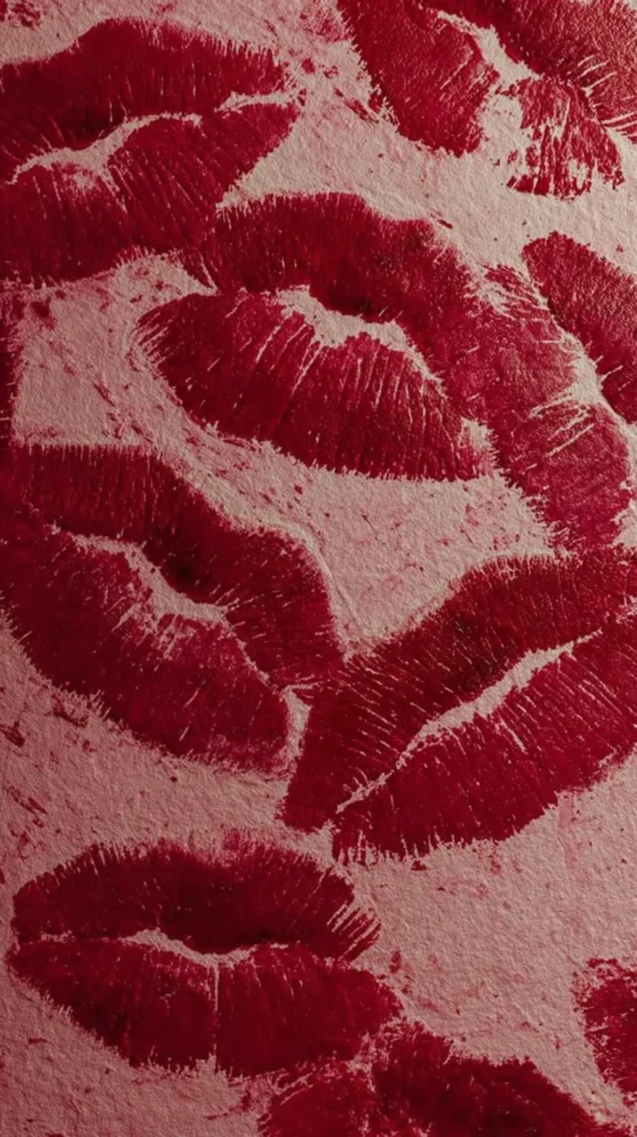

Patterns That Actually Behave
Patterns can be adorable or exhausting, and the line is thin. I like patterns when they add personality without hijacking the screen. The best ones repeat cleanly. Your eyes recognize the rhythm, so they stop searching.
Busy patterns can still work if they use two tones only. A strong red plus a quiet neutral keeps the design readable. Once the pattern adds three or four loud colors, the icons start fighting for attention. That fight never ends well.
Here are pattern styles that usually look great on real phones:
- Muted checkerboard with cream squares.
- Thin stripes that look retro, not cheesy.
- Abstract blobs that resemble modern prints.
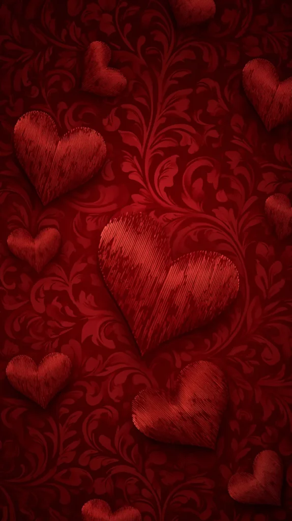
- Tiny hearts that don’t scream holiday.
- Houndstooth for instant attitude.
- Scallops that look preppy and clean.
People assume patterns always distract. I disagree. A steady repeat can calm the brain, because it feels predictable. That’s why some prints feel soothing, like steady rain on a window. Meanwhile, a random pattern can make you tired in ten minutes.
One small thing matters here: cropping. When you set a red wallpaper pattern, adjust the zoom until the repeat looks even. That tiny tweak makes the screen look designed, not accidental. If you want to test it first, use the pattern on your lock screen. Then watch it for a day. You’ll notice if the repeat starts annoying you.
A good pattern stays friendly, even after fifty unlocks. Also, avoid patterns with tiny text or quotes. Those get messy fast, and they distract from your apps.
Here’s the fun twist. Patterns age better than plain colors, because your brain keeps noticing little details. So if you get bored fast, pick a pattern with tiny imperfections. It feels more real, and it stays interesting longer.

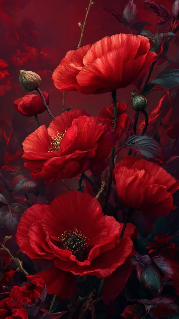
Night Mode Reds With Real Mood
Bright wallpapers look cute at noon, then they attack you at midnight. If you use dark mode often, deep reds can be the perfect middle ground. They keep the screen moody, yet they still look rich. I’ve found they also hide smudges better, which feels like a tiny blessing.
These designs tend to work best after dark:
- Burgundy gradients with charcoal edges.
- Maroon marble with low shine.
- Red waves on a near-black base.
- Minimal red line art on dark gray.
- Shadowy florals that stay almost black.
Here’s the assumption to toss: dark equals boring. Dark can look cinematic. A deep wine background can read like a movie poster, minus the text. It adds drama without adding clutter.
Undertone matters a lot. Some reds turn brown in low light. Cooler reds usually stay red. Warmer reds can drift toward brick, especially on older screens. So if you want that crisp vibe, choose a cooler red wallpaper.
A simple setup trick helps too. Set a darker design for the lock screen, then choose a slightly lighter red for the home screen. That contrast keeps icons readable. It also looks intentional, like you planned it, even if you absolutely did not.
If you wake up early, this style feels extra good. The screen won’t glare at you. Instead, it looks calm and moody, like coffee shop lighting. That’s the vibe. Early scrollers will appreciate the softer glow too.
One more trick helps with readability. Place your time and widgets on the darkest area. If your phone lets you move the clock, use it. Otherwise, choose designs with darker top space. That choice keeps the night look moody, not muddy.
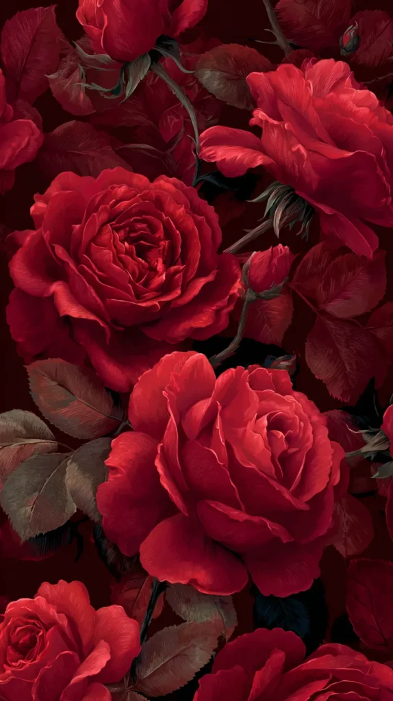
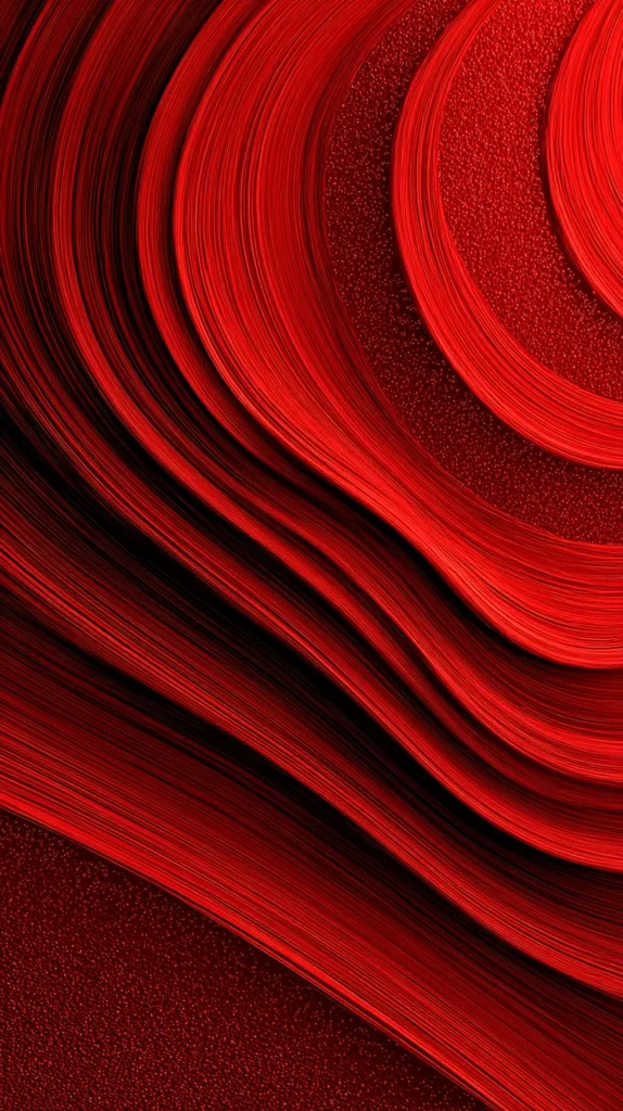
Backgrounds That Don’t Fight Your Icons
A beautiful wallpaper can still fail if it makes icons unreadable. I refuse to live like that. Icon-friendly designs either stay simple, or they place detail in corners instead of the center. Your icons need a stage, not a wrestling match.
These features usually help the most:
- Darker edges with a lighter center.
- Soft texture with low contrast.
- Try a gradient that stays calmer near app rows.
- Keep a blank middle that looks intentional.
- Gentle shapes that fade behind widgets.
Here’s my opinionated rule: if the wallpaper fights the icons, it loses. Always. A home screen should look cohesive, not like a scrapbook explosion. So I choose backgrounds that support the layout.
Use this quick check after you set it. Take a screenshot of your home screen, then squint at it. If labels stay readable, you nailed it. When labels disappear, switch designs and save yourself the annoyance.
Halo designs help a lot. A subtle glow behind icons makes the screen look cleaner. Corner texture also works, because the center stays calm. If your first screen looks crowded, move the busiest apps to page two. Then let page one breathe. Also, I avoid busy centers every time.
After that, the background can do its job. If you keep app labels on, pick a calmer design. Without labels, you can pick a bolder texture. That tradeoff is simple, yet it changes everything. I also like backgrounds with one soft diagonal sweep. They guide the eye without adding clutter.
More detail doesn’t equal more style. Often, less detail looks more premium. That’s why a simple red wallpaper with soft texture can beat a busy collage.

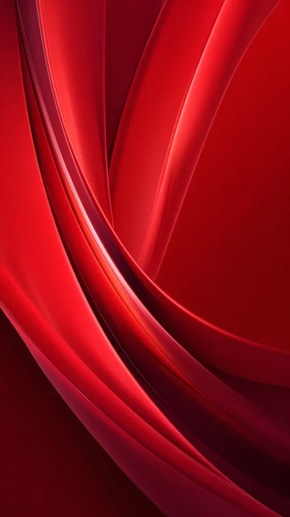
How To Set Red Wallpaper On iPhone And Android
Once you choose a design from this post, setting it should take seconds. The decision takes longer than the taps. So here are the clean steps, with no lecture voice.
On iPhone, this path works:
- Save the wallpaper image to Photos.
- Open Settings, then tap Wallpaper.
- Tap Add New Wallpaper, then choose Photos.
- Select the saved image and adjust the crop.
- Tap Add, then set Lock Screen, Home Screen, or Both.
On Android, the wording varies, yet this flow is common:
- Download the wallpaper image to your device.
- Open Settings, then tap Wallpaper and style.
- Tap Change wallpaper, then choose Gallery or Photos.
- Pick the saved image and adjust the crop.
- Set it for Home, Lock, or both screens.
People assume wallpaper settings take forever. The setup part is fast. Zoom and blur cause most issues. If the image looks too zoomed, adjust the crop first. On phones that add blur, turn it off when possible. Blur can make red look dusty, and that defeats the purpose.
For a cleaner look, disable perspective motion if it warps patterns. Then consider a simple pairing. Use one red wallpaper for daytime, and a darker one for night. That rotation keeps the look fresh without constant tinkering.
If you want extra polish, match your lock screen and home screen styles. So pick two designs from the same family. That way the phone looks curated, not random. If your phone offers separate lock screen effects, keep them simple. Heavy filters can dull red tones.
Clean color usually wins. Shadows can dull red fast. Also, double-check that the image saved at full size. Some browsers compress images, and compression can blur crisp lines.
A Little Drama, On Purpose
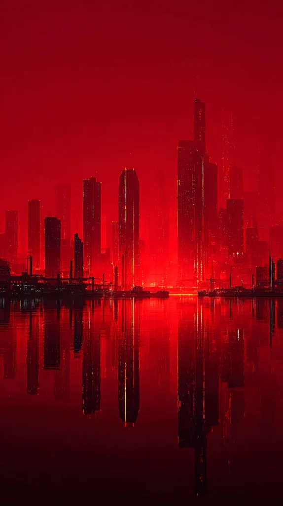
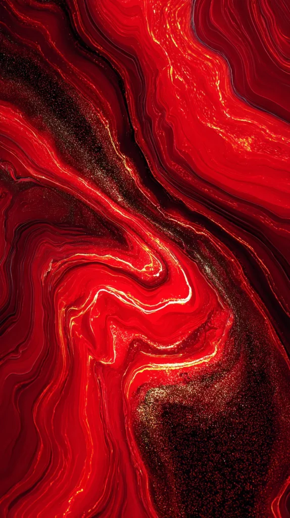
This section is for the days you want your phone to look like a statement piece. Think bold contrast, sharp shapes, and red that leans theatrical. I like this style when I want my screen to look awake and decisive.
These drama-forward designs usually land well:
- Red and black geometric blocks.
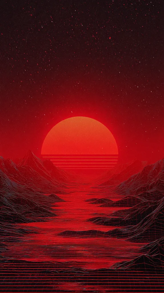
- Neon red glow on a dark base.
- Abstract paint strokes with sharp edges.
- Crimson lightning over deep shadows.
- Grids that look architectural and clean.
- Smoke swirls with one bright streak.
Here’s the reframe. Drama doesn’t always equal stress. Sometimes drama equals focus. A high-contrast design can snap you into do-the-thing mode. It’s like putting shoes on indoors. The energy shifts immediately.
Still, there’s a limit. If the design irritates you, drop it. Bold should energize you, not annoy you. So trust your reaction after a full day, not after two minutes.
These backgrounds also pair well with dark mode apps. Light mode icons can look like stickers on top, which can be cute or chaotic. If it looks messy, reduce widgets or simplify your first screen. Then let the background be the star.
I also love a design with one sharp red stripe. It looks sporty and sleek at once. If you want extra edge, pair it with a monochrome icon pack. Black icons look great here. That combo looks intentional, even if you picked it on a whim.
Now for the delayed payoff. The neon styles look intense at first glance. Then they start looking clean and modern after a day. Your brain adjusts, and the look becomes normal. That’s why a dramatic red wallpaper can stick around longer than you’d expect.

A Tiny Reset That Takes Zero Effort
Some days I want one small thing to look put together. I can’t control every task, yet I can control my screen. That’s where this gets sneaky. A clean red wallpaper can act like a tiny reset button, without becoming a whole project.
Here’s what nobody says. A calmer screen can change how you unlock your phone. Your eyes stop fighting clutter, so you start the moment less irritated. That sounds dramatic, yet it’s real. I’ve found visual noise adds tension, even when you don’t notice it.
These designs help when you want calm color:
- Soft red linen texture with blank space.
- Minimal dots on cream with warm red.
- Gentle gradients with smooth corners.
- Paper grain with simple shading.
- Tiny shapes that stay low contrast.
People assume productivity comes from planners. Sometimes it comes from removing one annoyance. A cluttered home screen annoys you every unlock. So fixing that background can help more than you’d expect.
Don’t pick the prettiest design first. Choose the one that makes your shoulders drop. Then save two backups. Three favorites is enough: one bold, one soft, one dark. After that, you rotate based on mood.
Here’s the last reframe. Changing wallpaper isn’t shallow. It’s a small choice that signals care. You’re telling your brain, “I can curate one thing today.” That quiet message matters. I treat it like making my bed. It doesn’t fix the whole day. Still, it signals order.
If your brain loves routines, set a Monday wallpaper. Then swap to a bolder red on Friday. That tiny rhythm makes your phone look fresh all week. A red wallpaper can give you that quick win, without asking for more time.
Last Few Thoughts
My phone background changes more often than my living room decor, and that’s the honest truth. A red wallpaper rotation keeps my screen from looking stale. I treat it like a tiny style choice I can control. That control matters when everything else runs loud.
I’ve found red wallpaper works when I want my screen to look awake and polished. It gives icons a confident backdrop. Even better, it makes the whole phone look sharper, which still surprises me. So I keep a small rotation saved, because boredom shows up fast.
Living in Orlando keeps reminding me color can look fun and tasteful at once. Neon can look clean. Sunsets can look calm. So I like bringing that energy onto my lock screen, especially on busy days.
If you grab a favorite, save this post on Pinterest so you can come back later. Then you can swap designs when your screen starts looking stale. That tiny refresh takes seconds, yet it changes the whole vibe. I keep a little album for favorites, so I don’t hunt later.
Then I rotate when my screen starts looking tired. Some weeks I want soft reds. Other weeks I want graphic drama. Both moods can be true. Try a soft red for daytime, then switch to deep wine at night. That pairing looks coordinated without trying.
Also, pick the design that makes you smirk. Set it, unlock your phone, and act like you meant to do that. That’s the whole point, and you know it.


![FireNova Magnetic for iPhone 17 Pro Max Case, Compatible with MagSafe, [Integrated Silicone Camera Control Button] [Camera Protection] Anti-Scratch Microfiber Lining Phone Case, 6.9", Deep Red](https://m.media-amazon.com/images/I/41fn3rrdpjL._SL500_.jpg)
