Patriotic tattoos can turn gorgeous or goofy faster than almost any other tattoo idea. That’s the whole tension, right? One sketch looks timeless, sharp, and quietly meaningful. Another one looks like a truck decal that learned cursive.
I’ve found that women usually want something deeper than a loud flag moment. Meaning matters. Memory matters too. A little pride with a little edge tends to land better than something that screams from across the parking lot. Better yet, the right design still looks good with sandals, gold hoops, or a messy bun.
Living in Orlando, I tend to notice patriotic style everywhere once summer rolls around. It pops up in swimsuits, porch decor, party napkins, and, yes, tattoo inspiration. Sometimes it looks chic. Other times, it looks like a firecracker exploded in a craft aisle. That gap is way smaller than people think.
That’s why this topic gets interesting fast. Patriotic ink can be tiny, soft, bold, sentimental, vintage, modern, or beautifully stripped down. The strongest ideas don’t always use the loudest symbols. In some cases, one word lands harder than a whole eagle scene. Elsewhere, color changes everything. Placement can even save a design that felt doomed five minutes earlier. And that’s where this starts getting good.
Some of the links on this page are affiliate links. That means if you click and make a purchase, I may earn a small commission at no extra cost to you. If you’re curious about the fine print, you can check out my full disclosure.
Patriotic Tattoos That Never Look Boring
The best patriotic tattoos don’t try to prove anything. They don’t beg for attention, either. They carry meaning with a little swagger, then let the details do the talking. That’s the sweet spot. Once a design starts shouting, it usually loses its charm.
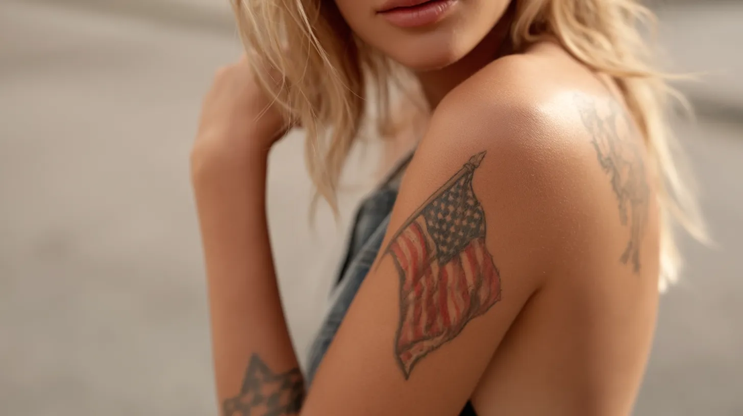
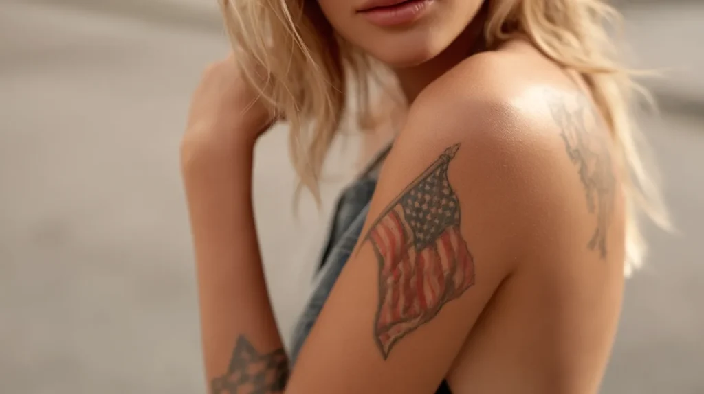
I tend to notice that the strongest pieces lean specific, not crowded. A single waving ribbon can work better than a giant flag sleeve. One clean star can beat a whole star cluster. A subtle outline of the United States can look thoughtful. Add ten extra elements, though, and suddenly it gives souvenir shop.
That surprises people, because most assume patriotic means bigger, brighter, and more obvious. I don’t buy that at all. Patriotic ink can look softer than people expect. It can read personal instead of performative. That’s a huge difference, and it changes the whole mood.
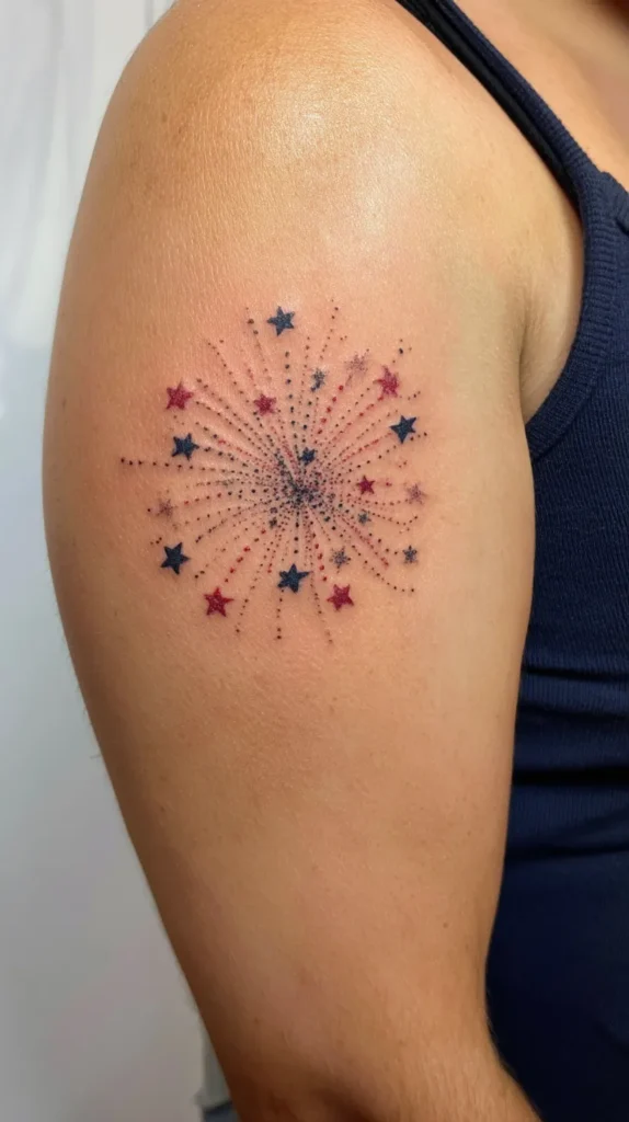
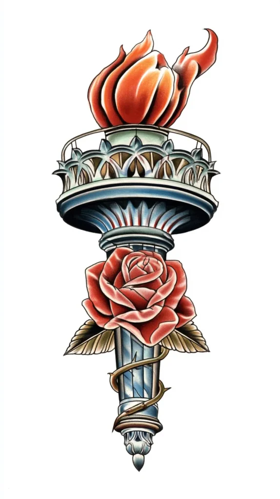
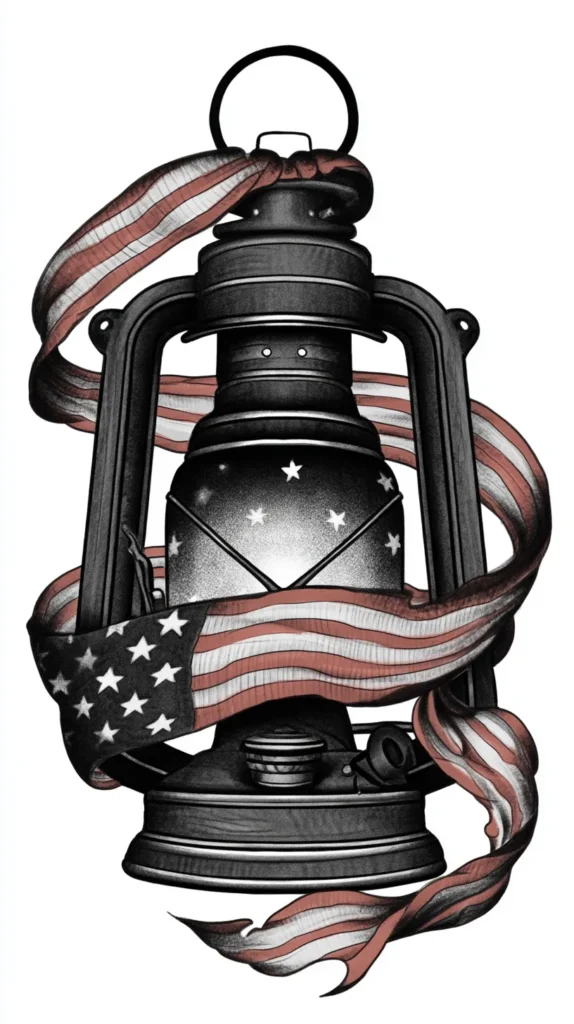
The most stylish designs usually pull from symbols with room to breathe. Think script, stars, olive branches, vintage banners, tiny fireworks, ribbons, maps, or meaningful dates. Add restraint, and they stay classy. Skip restraint, and things get weird fast. That’s not me being dramatic. Well, maybe a little. Still, the design with one strong idea almost always wins.

Small Patriotic Tattoos With Big Personality
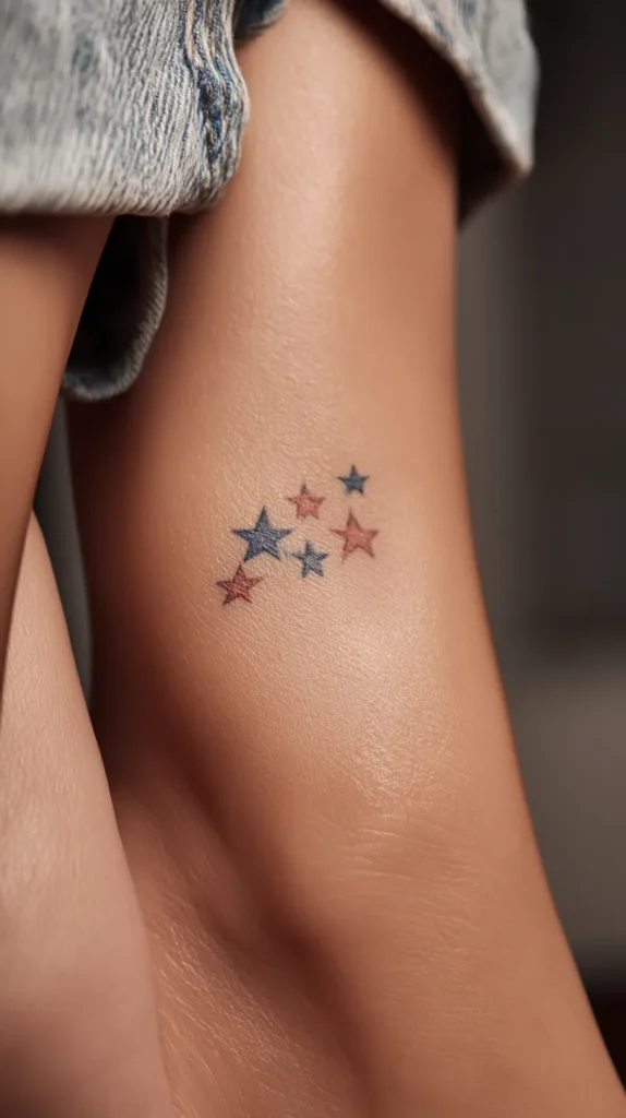
Small patriotic tattoos have a sneaky advantage. They don’t need much space to look polished. Better yet, they age more gracefully when the design stays clean. Tiny doesn’t mean boring, either. It just means every line matters more.
I’ve found that small pieces work best when they carry one mood. Pick sentimental, bold, vintage, or playful. Don’t try to cram all four into a stamp-sized space. That’s where things start fighting each other. Cute can turn cluttered in a hurry.
Some of the best small design ideas include:
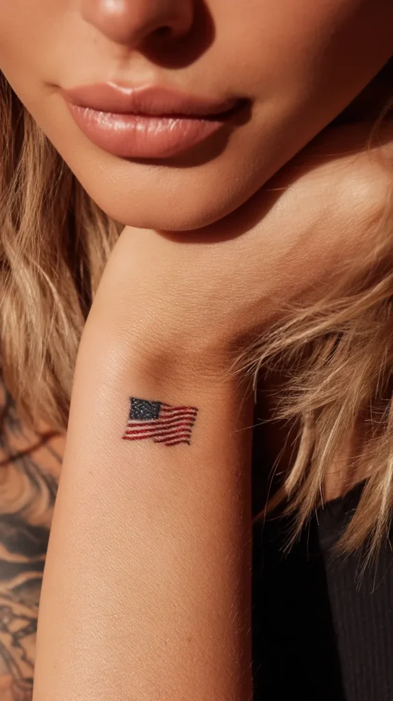
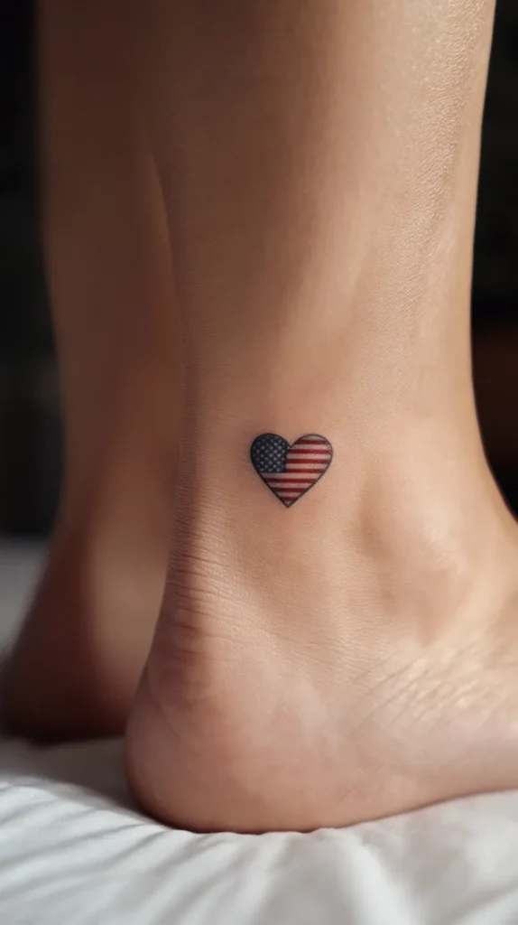
- A single five-point star on the wrist or ankle
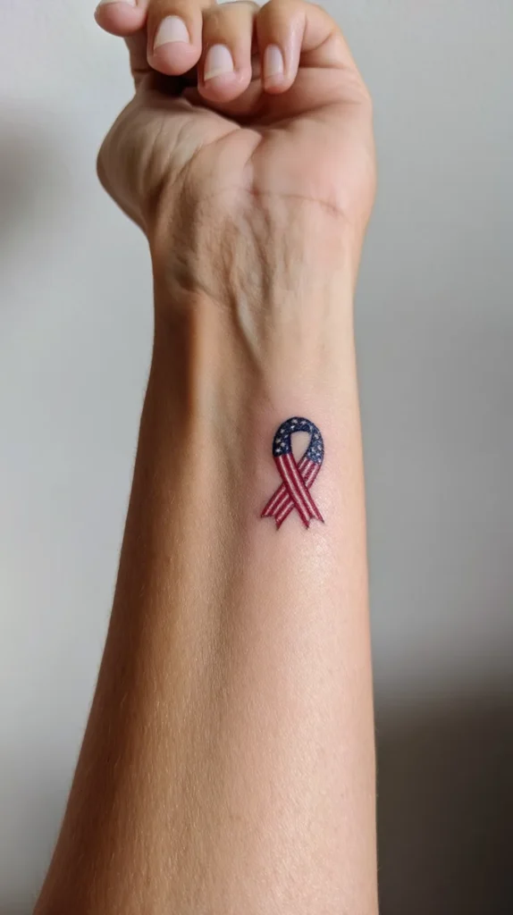
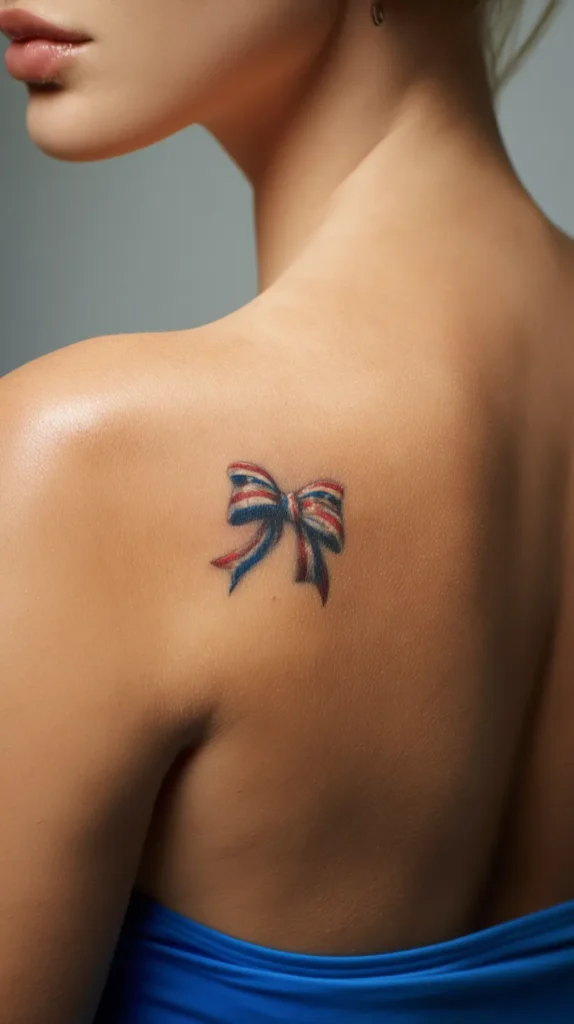
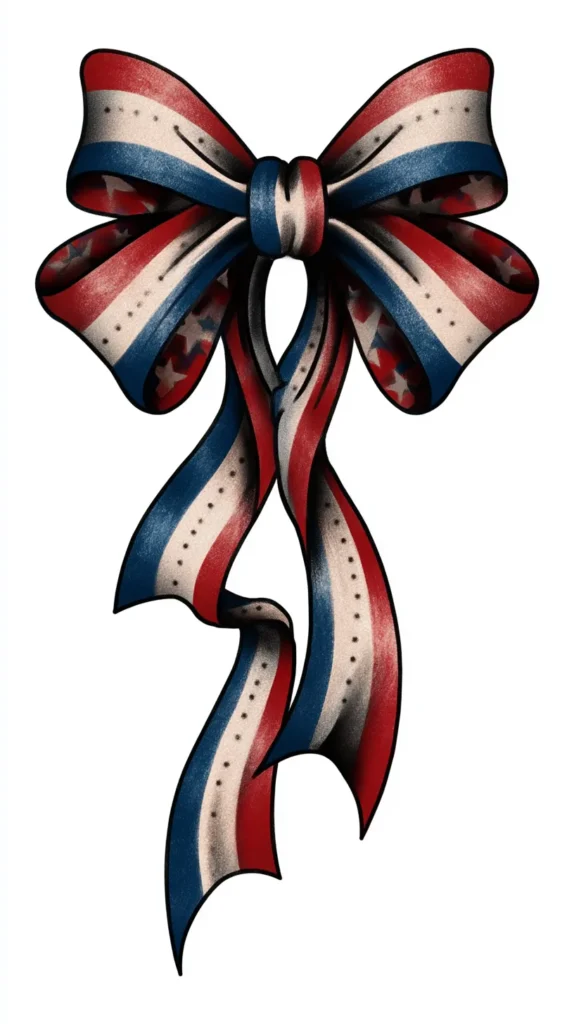
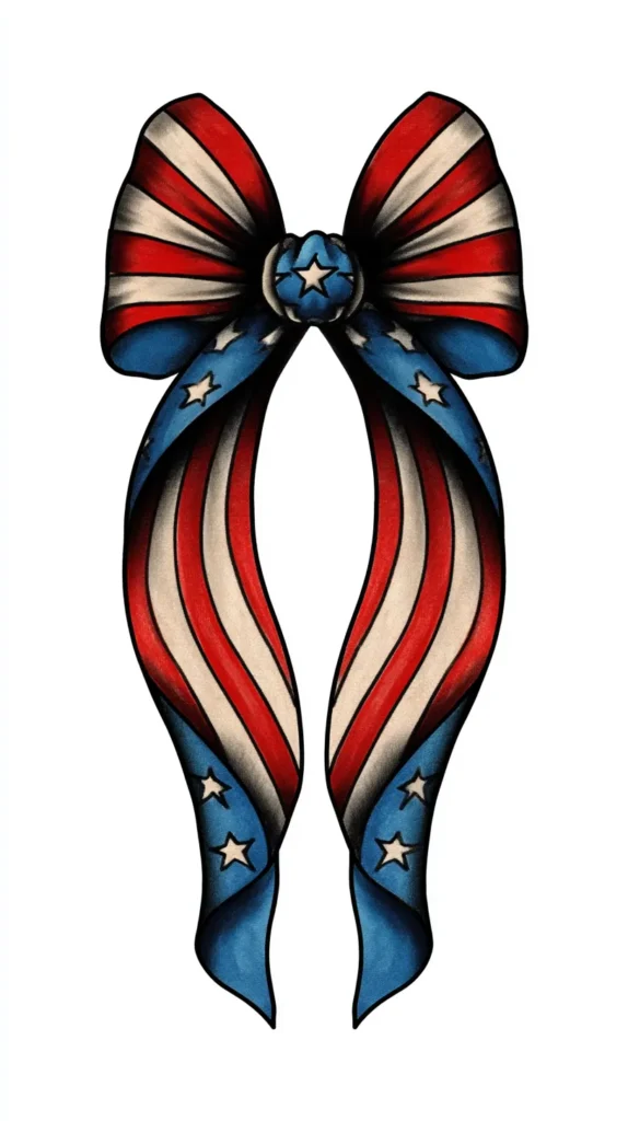
- A tiny ribbon in red, white, and blue on the shoulder
- A mini flag heart on the inner arm
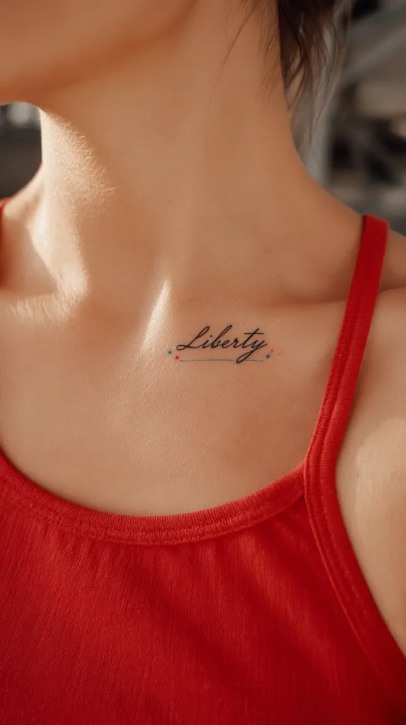
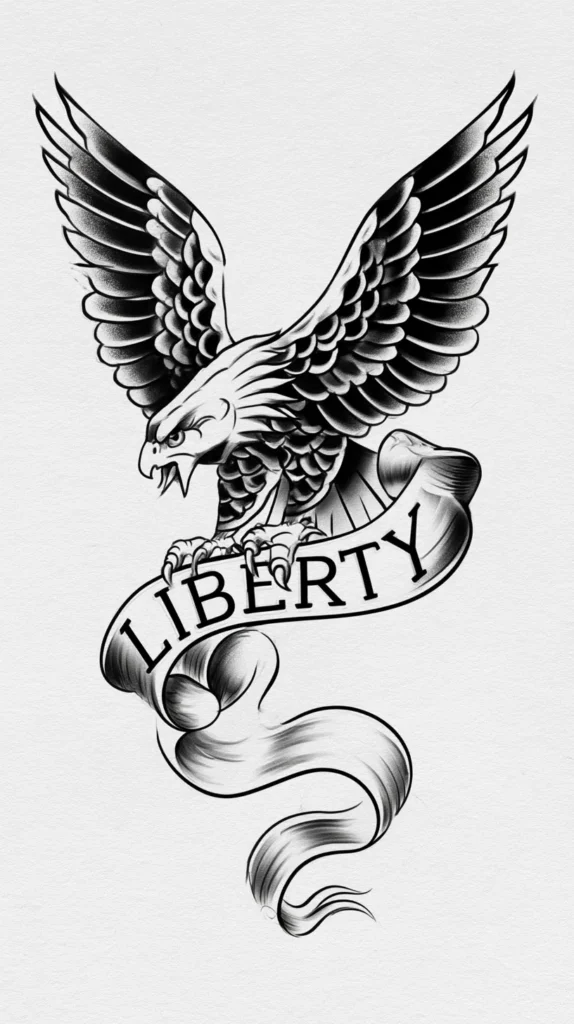
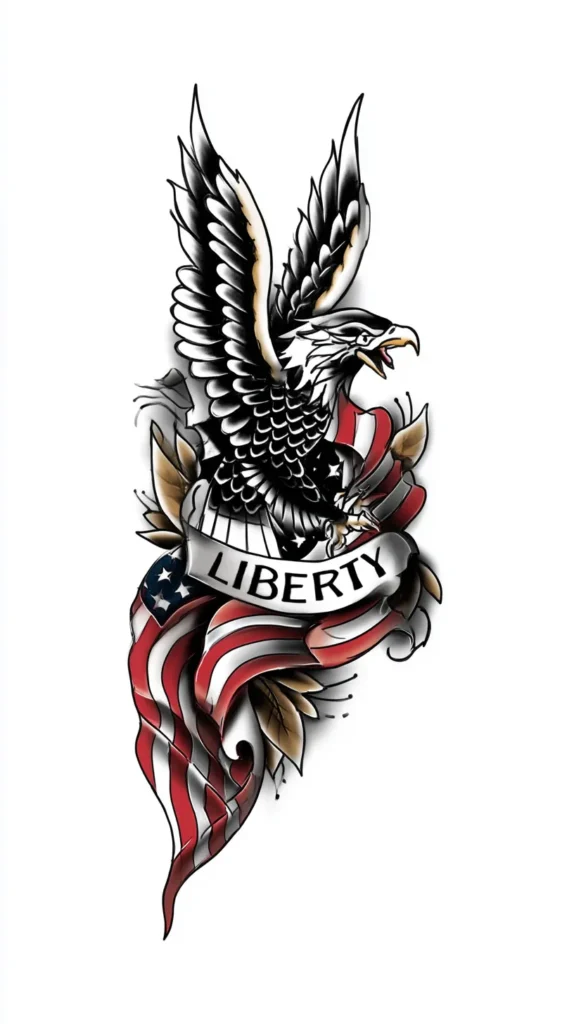
- A cursive “liberty” near the collarbone
- A date in Roman numerals under a small star
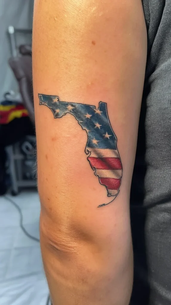
- A simple outline of America with one marked state
Notice what these ideas don’t do. They don’t stuff in fireworks, boots, banners, and a bald eagle for good measure. Small patriotic tattoos need editing. They need intention. They need the tattoo version of knowing when to stop talking at dinner.
Placement matters here too, but I’ll get to that in a minute. For now, the bigger point stands. Tiny patriotic pieces can look expensive, even when the design stays simple. That’s the trick. They whisper, instead of yell. And somehow, that lands harder.

Words And Phrases That Carry Real Weight
Words can make patriotic ink hit harder than pictures. They can also ruin it faster than almost anything else. That sounds dramatic, yet it’s true. Script tattoos live or die by tone. One phrase feels timeless. Another one sounds like it belongs on a foam koozie.
I’ve found that the best wording stays short, grounded, and a little personal. It shouldn’t sound forced. It also shouldn’t sound like it came from a discount party banner. A few strong words can do the whole job. You do not need a paragraph wrapped around a star.
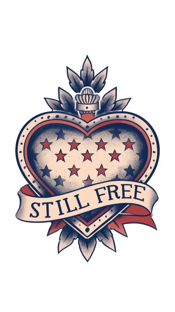
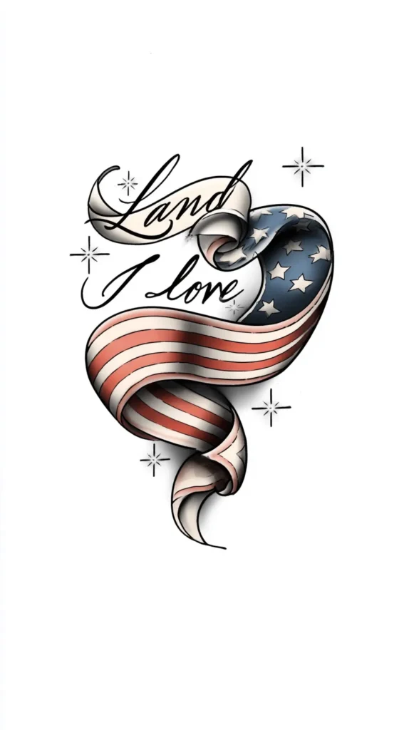
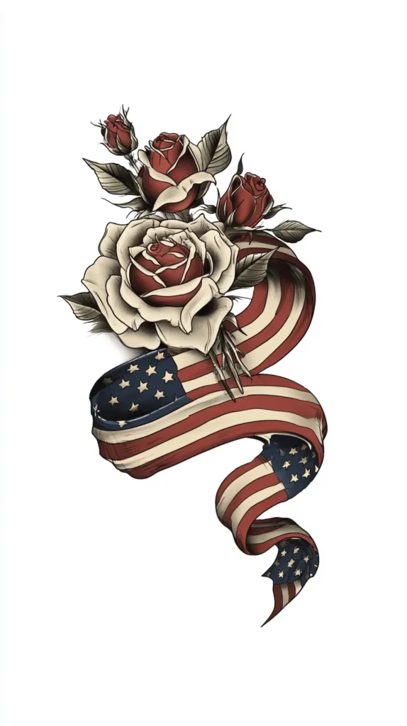
Some phrases that work beautifully include “land I love,” “freedom rings,” “brave,” “homegrown,” “one nation,” “still free,” or “liberty.” Dates work too, especially when they mean something to you. Coordinates can look chic. Initials under a banner can turn sentimental fast, in a good way.
The font changes everything here. Delicate script looks softer and more feminine. Block letters bring strength. Vintage serif fonts add a classic Americana mood. Thin cursive can look gorgeous, but only if the artist keeps it legible. Tiny unreadable script is a heartbreak waiting to happen.
Here’s the reframe people miss. Patriotic tattoos don’t need a slogan. Sometimes one word says more than a full quote. Sometimes a phrase paired with a symbol says enough. That lighter touch often looks better years later too. A tattoo should age like good denim, not a novelty T-shirt.

Patriotic Tattoos In Red, White, Blue, And Better Ideas
Color can make patriotic tattoos look rich, soft, bold, or a little chaotic. Most people jump straight to bright red and navy. That can work. Still, it’s not the only lane. In some cases, it’s not even the prettiest one.
I tend to notice that women often assume patriotic ink must use every obvious color. That’s the trap. You can nod to the theme without going full parade float. A color story with restraint usually looks more stylish. Once again, editing saves the day.
Some color directions that work beautifully:
- Classic red, white, and navy for a crisp Americana look
- Muted denim blue and dusty red for a vintage vibe
- Black and gray with one red accent for a sharper finish
- Cream, faded blue, and soft rose for a gentler take
- Gold linework with tiny red details for something dressier
- All black ink for a patriotic symbol that stays subtle
This is where a common assumption falls apart. Patriotic does not require bright fireworks colors. In fact, softer tones can look more personal. Faded shades also pair better with feminine designs, especially script, florals, bows, or fine-line stars. That softer palette keeps the tattoo from looking costume-y.
If you love bold color, go for it. Just keep the balance tight. Let one shade lead. Let another shade support. Give skin space room to breathe. Patriotic tattoos look strongest when the colors work like accessories, not noise. That tiny shift changes the whole finish, and it’s a good one.

Patriotic Tattoos That Start With Your Own Map
I’ve found that the freshest patriotic tattoos often start with geography, not flags. Instead of grabbing the usual eagle, I’d start with your own American map. That could mean your state outline, your hometown coordinates, or the curve of a favorite coastline. Suddenly the design says pride without looking like a Fourth of July beach towel. It reads personal first, patriotic second, which usually makes it far more interesting.
That idea gets better once you layer in one regional detail. Maybe Texas gets a bluebonnet stem through the outline. For Florida, try an orange blossom, a tiny star, or a ribbon over your city. A mountain range can replace a plain border. Even a highway number can work if it carries real meaning. Now the tattoo looks rooted, not generic, and that changes everything. That softer route looks richer, and it usually ages with more grace.
I tend to notice that most patriotic tattoos online chase national symbols before local ones. That’s backwards for a lot of women. Your lived-in version of America is usually more stylish than the stock version. A fine-line map with one marked town can look elegant on the forearm. Coordinates under a tiny state silhouette can look clean on the ankle. Add muted red or navy if you want color, but black ink works beautifully too.
This is also a smart way to keep the design timeless all year. State shapes age better than fussy flag folds. Local flowers hold up better than tiny fireworks blobs. Plus, the meaning stays clear without needing a long explanation. Patriotic tattoos hit differently when they point home instead of performing patriotism for strangers.

Where Chic Placement Saves The Whole Look
Placement can rescue a design that felt questionable on paper. It can also wreck a lovely idea. That’s why I never treat location like an afterthought. The same tattoo looks delicate on one body part and deeply chaotic on another. Yes, placement carries that much power.
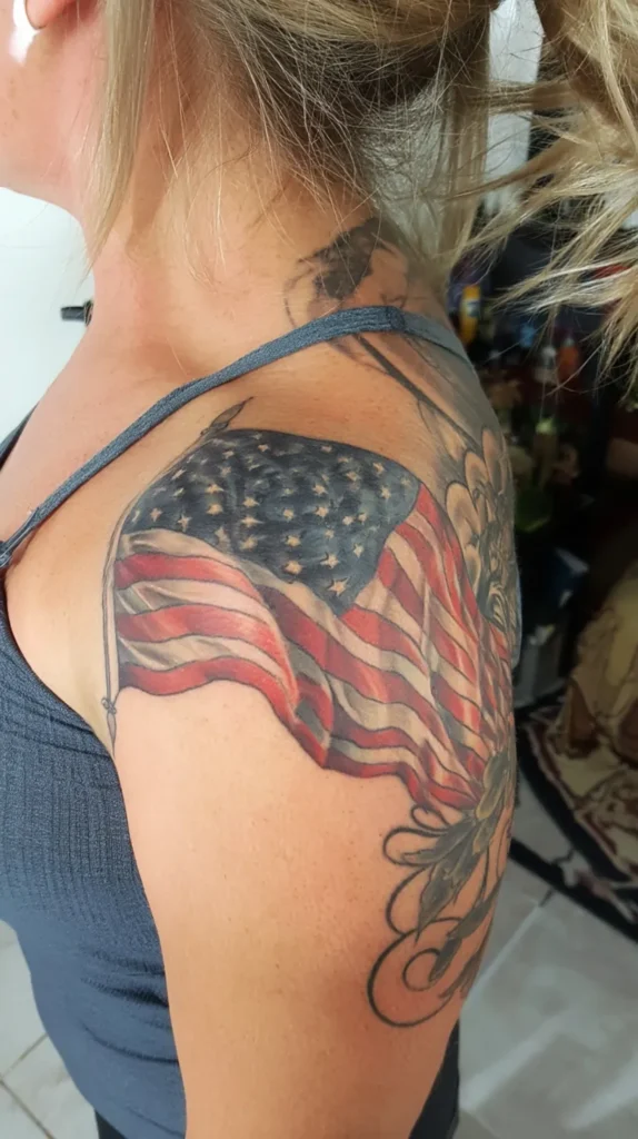
I’ve found that feminine patriotic pieces look especially strong on the collarbone, forearm, shoulder blade, ribs, ankle, and back of the arm. Those spots give the design room without making it too loud. They also let the tattoo peek out instead of dominating every outfit. That matters more than people think.
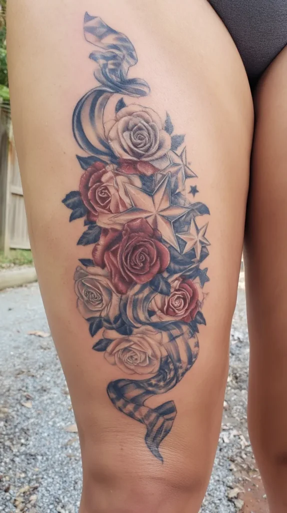
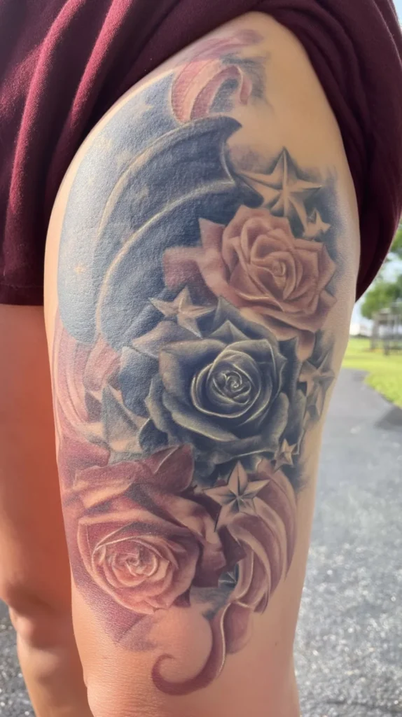
The wrist can work, but only for very clean shapes. Tiny script, one small star, or a mini ribbon fits there nicely. Meanwhile, the thigh suits larger vintage pieces beautifully. A banner with florals can thrive there. The upper arm handles bolder designs well too. It reads classic instead of crowded.
Here’s the thing people miss. Placement changes the tattoo’s personality. A flag heart on the ankle feels cute and playful. Put that same design on the center chest, though, and the whole energy shifts. Suddenly it becomes a statement piece. Maybe that’s your goal. Maybe it isn’t.
I tend to notice that women often want patriotic ink to blend with everyday style. That usually means choosing a spot that feels wearable. You want the tattoo to work with sundresses, swimsuits, cardigans, and real life. Not just July photos. That softer, smarter placement often makes the design sing.
Patriotic Tattoos For Moms, Minimalists, And Soft Hearts
This is where patriotic tattoos get more interesting. Not every woman wants bold military symbols or loud Americana art. Some want meaning without the full fireworks finale. Some want something family-centered. Others want something that barely reads patriotic at first glance. I love that lane.
I’ve found that the best designs often come from identity, not trends. Are you sentimental? Clean-lined? Quietly proud? Drawn to vintage style? Once you know the mood, the design stops looking random. It starts looking like you. That’s the difference between a saved pin and a tattoo worth keeping.
If you want a softer direction, these ideas work beautifully:
- A tiny cluster of stars for each child
- A ribbon wrapped around birth flowers
- A handwritten family word under a small banner
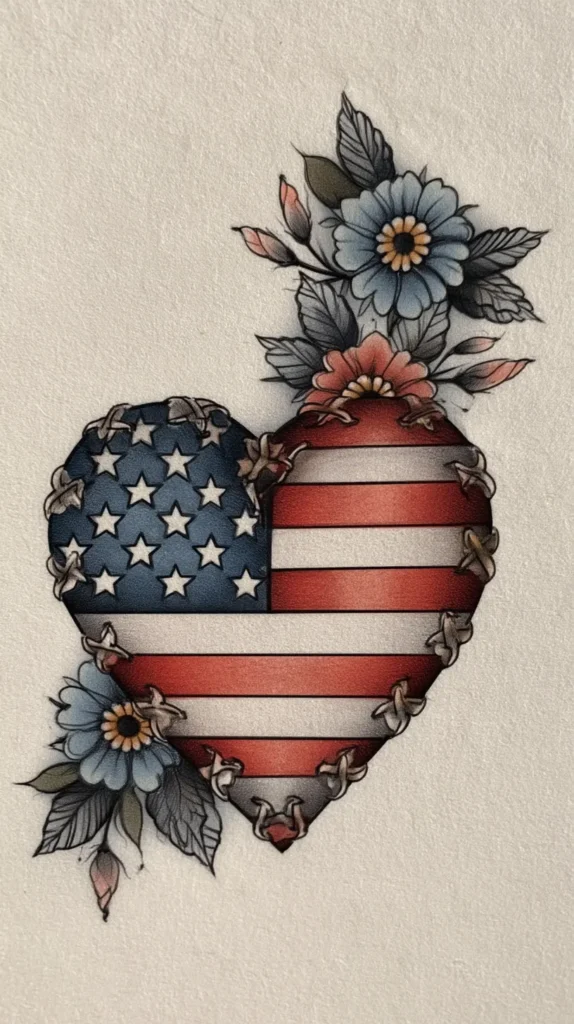
- A state outline with a heart over home
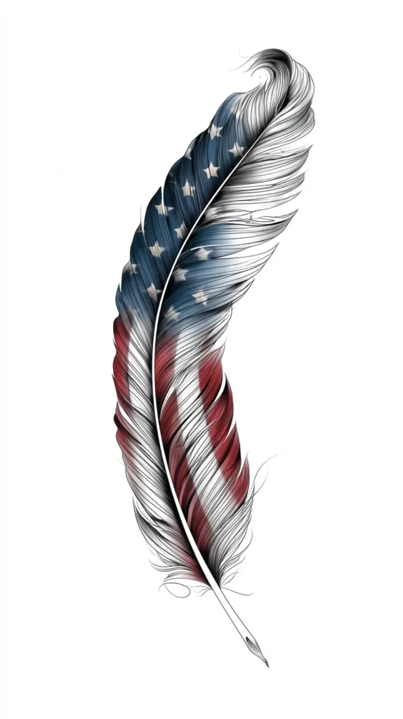
- A delicate eagle feather in fine-line black ink
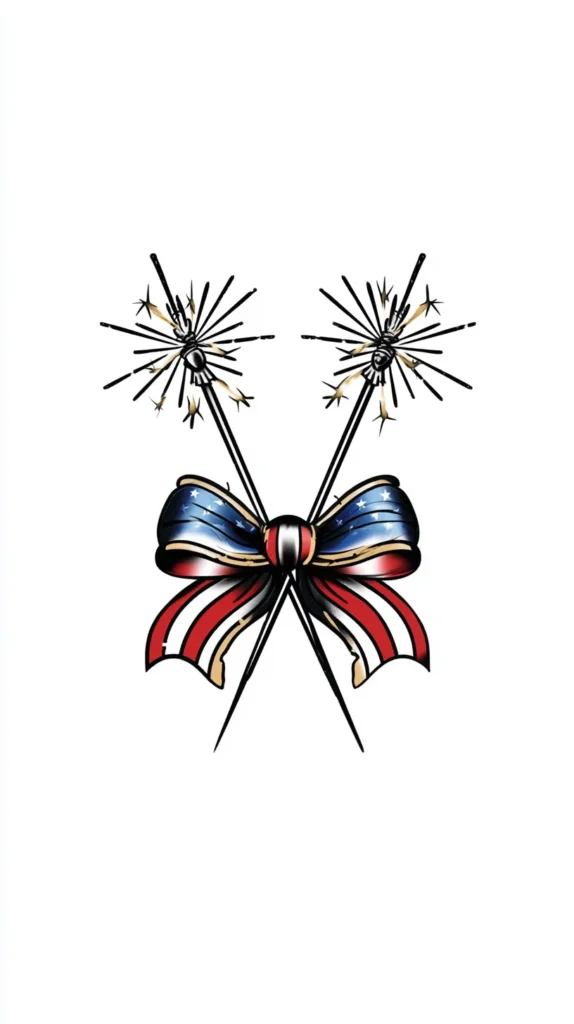
- A simple bow in patriotic colors
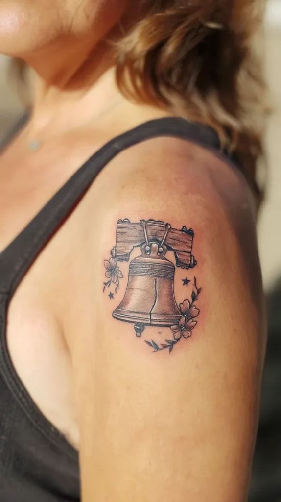
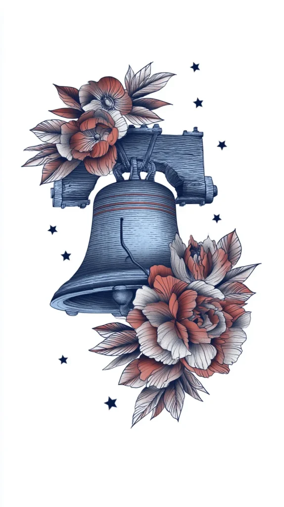
- A liberty bell with florals instead of flames
That last part matters. Florals, bows, soft script, and tiny symbols can bring warmth to patriotic tattoos. They keep the design from leaning too stiff. They also make the tattoo more wearable if your style runs feminine, polished, or understated. That doesn’t make the design less meaningful. It makes it more personal.
A lot of women think patriotic ink must look tough. I don’t agree. Some of the strongest pieces look tender. They carry pride through memory, place, family, or heritage instead of volume. That approach lands with more staying power. Quiet can look powerful. Sometimes it looks even stronger.
Patriotic Tattoos FAQs I’d Read Before Booking
Do patriotic tattoos always need red, white, and blue? No, and that’s one of the best design truths here. Black ink can look cleaner and more timeless. Muted tones can look softer too. Patriotic meaning comes from the symbol, not only the palette.
Do patriotic tattoos age well? They can, if the design stays simple enough. Fine details blur faster than people expect. Tiny script and crowded color work need extra care. Clean lines, solid spacing, and smart scale usually age better.
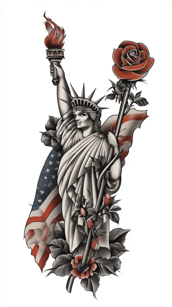
What symbols work best for women? That depends on style more than gender. Stars, ribbons, florals, maps, banners, dates, and script tend to look especially versatile. Still, if you love an eagle, wear the eagle. Just make it art, not mascot energy.
Should I use a quote or keep it short? I’d keep it shorter almost every time. One phrase usually carries more elegance than a long sentence. Legibility matters. Mood matters too. A tattoo should read clearly without needing a dramatic monologue.
What makes a patriotic tattoo look cheesy? Usually, it’s too many obvious elements shoved together. The design starts competing with itself. Oversized symbols, extra shading, random fonts, and loud color clashes create that problem fast. Edit ruthlessly, and the tattoo gets stronger.
Can I make patriotic ink look sentimental instead of loud? Yes, and that’s often the most beautiful choice. Use names, dates, coordinates, soft florals, or one meaningful symbol. Let the pride sit inside the design quietly. It doesn’t have to wave a megaphone.
Before You Book, Check These Details
The best tattoo idea can still flop with weak execution. That part isn’t glamorous, but it matters. I tend to notice people obsess over the symbol, then rush the artist choice. That’s backwards. A clean design in the wrong hands can still go sideways.
Before booking, I’d check these details:
- Make sure the artist has healed photos, not only fresh tattoos
- Look for crisp lines, balanced spacing, and readable script
- Ask how the colors will age on your skin tone
- Avoid packing tiny details into a very small tattoo
- Bring reference ideas, but don’t force a copy
- Double-check every date, word, and spelling choice
- Ask the artist to simplify before they add extra elements
That last point matters more than people think. Simplifying is not losing. It’s refining. The sketch that looks slightly too plain on paper often becomes the best tattoo later. Skin changes things. Time changes things too. Strong tattoos leave room for both.
One more thing deserves a little side-eye. Don’t choose a design just because it looks cute on Pinterest. Save the pin, sure. Then ask whether it matches your style, your wardrobe, and your long-term taste. That question saves a lot of regret. Patriotic ink should look good after the holiday glow fades.
The Kind Of Ink That Still Looks Good Later
I’ve found that the best tattoos stay interesting because they say something without saying everything. That’s the real charm. They leave a little mystery. They carry meaning, but they don’t oversell it. Patriotic tattoos work the same way when they’re done well.
Living in Orlando, I see plenty of red, white, and blue style once warm weather rolls in. Some of it leans adorable. Some of it leans “someone got carried away near a Cricut.” That contrast always makes me appreciate thoughtful design more. The quieter choices usually linger in my mind longer.
That’s probably why this topic works so well for Pinterest too. A great design catches the eye first. Then the details keep you looking. A tiny script word. A faded navy ribbon. A soft black star cluster. Those choices keep the tattoo from becoming a costume piece. They let it become part of someone’s style.
So, if I were sorting through ideas, I’d chase the one that still looks good after the fireworks, the cookout, and the themed tank top. I’d pick the design with memory, shape, and restraint. Give me meaning with style. Give me pride without the visual shouting. That’s the tattoo version of having taste, and I’m not mad about it.