I can spot the difference between store-bought cards and handmade Mother’s Day cards in about two seconds. One looks polite. The other looks like somebody sat down, got sentimental, and made a tiny paper event out of it.
That difference matters more than people admit. A handmade card can be sweet, funny, pretty, dramatic, or a little chaotic. I support all of that. Still, the best ones usually share one thing. They look personal before anyone reads a word.
That’s why this topic gets me. People think a good card starts with craft supplies, but I don’t. I think it starts with a mood, a voice, and a tiny bit of nerve. Otherwise, the whole thing turns into random stickers, confused ribbon, and handwriting that suddenly looks guilty.
As a mom in Orlando, I’ve found that the most meaningful gifts rarely look expensive. They look considered. A card like that lands differently. It says, “I stopped what I was doing and made this.” That carries more weight than people expect.
Also, a lot of homemade cards go wrong in the exact same ways. Colors compete. Then the front gets crowded. Sometimes the inside message sounds like it came from a scented candle. None of that means the idea was bad. It just means the card needed a better plan.
And that’s where this gets fun. A few small shifts can make a card look thoughtful, warm, and honestly hard to throw away. The sneaky part is that the most charming fix usually isn’t the most obvious one.
Some of the links on this page are affiliate links. That means if you click and make a purchase, I may earn a small commission at no extra cost to you. If you’re curious about the fine print, you can check out my full disclosure.
Mother’s Day Cards Should Start With a Vibe
I tend to notice that most people start with supplies, and that’s where the wobble begins. They grab paper, markers, stickers, and ribbon, then hope a card appears. Sometimes it does. Usually, though, it turns into a polite rectangle with no real personality.
I like starting with the vibe instead. Do I want the card to look soft and sweet? Funny and cheeky? Pretty enough to sit on a dresser for weeks? That one choice fixes almost everything else. Suddenly, the colors make sense. Even the handwriting looks more intentional.
For soft cards, I’m thinking blush, cream, tiny florals, and rounded shapes. When I want funny, I’m using bolder lettering and one playful line. With sentimental cards, I’m leaving room for the message to do more work. That mood board in my head matters more than a full craft cart.
Here’s the part people skip. Handmade does not need to look busy. In fact, busy usually looks cheaper. A simple folded card with one strong idea almost always wins. That might mean painted flowers in one corner. Maybe one row of hearts. Sometimes one short front message in bold lettering.
And yes, mothers notice details. Not in a scary way. More in a “why is this neon orange next to dusty pink?” way. The card does not need to whisper luxury, but it should stop shouting confusion.
I’d pick the mood before scissors come out. That tiny decision saves time, saves supplies, and saves you from panic-gluing fake pearls onto cardstock at midnight. It also makes Mother’s Day cards look more personal. The design starts speaking before the inside message gets its turn. That shift helps fast.
Why Slightly Imperfect Always Looks More Expensive
Perfection sounds lovely, but it can make handmade cards look stiff. I’d rather see a real line, a tiny wobble, or an uneven brushstroke. That’s where the charm sneaks in.
Still, “imperfect” does not mean chaotic. There’s a difference. One feels warm. The other looks like the craft drawer exploded during an argument. I think a good card needs structure first, then softness.
A few details help that happen fast:
- Keep the main design in one area, not everywhere.
- Use two or three colors, not seven.
- Repeat one shape, like flowers, hearts, or dots.
- Leave blank space so the front can breathe.
- Pick one texture, like ribbon, twine, or pressed paper.
- Let one mistake stay if the rest looks balanced.
That blank space matters more than people think. Empty space makes the pretty parts look prettier. It also makes simple Mother’s Day cards look calmer, which weirdly reads as more polished. Clean space also gives the eye somewhere to rest.
Another opinion I fully stand by: fancy supplies are not the hero. A clean layout beats expensive embellishments every time. I’ve seen plain kraft paper look adorable with white ink and one tiny flower. Meanwhile, glitter cardstock can still look like a party favor from 2009.
Here’s the reframe. The tiny wobble can become proof that somebody actually made the card. That shifts the whole mood. Suddenly, the card feels warm instead of manufactured, which is exactly what most people want anyway.
So yes, let the card look handmade. Just don’t let it look panicked. That’s the line. Once you notice it, you really can’t unsee it. That changes everything.
Easy Mother’s Day Cards You Can Make Without a Craft Crisis
Some card ideas sound cute until you actually try them. Suddenly you’re cutting tiny petals, rethinking your life, and looking for tape like it owes you money. I prefer designs that look thoughtful without demanding inner peace.
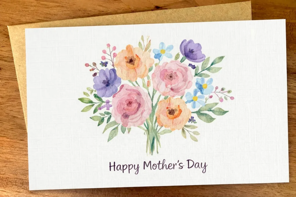
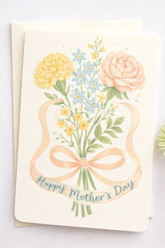
A few reliable handmade Mother’s Day cards work almost every time:
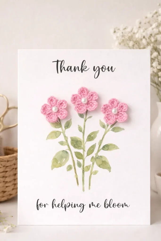
- A bouquet card with drawn stems and small paper flowers
- A heart collage card with pink and red paper scraps
- A fold-out card with short reasons she matters
- A watercolor front with one simple gold phrase
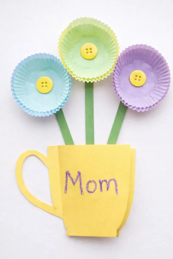
- A teacup card with flowers or hearts “spilling” out
- A photo card with one printed picture and handwritten notes
The trick is choosing a design with one obvious focal point. That way, the card looks finished before you start second-guessing everything. It also gives you a visual anchor, which sounds serious, but mostly keeps you from adding nonsense.
Smaller cards help too. A compact card gives you less room to overwork the front. That sounds limiting, yet it usually creates better decisions.
Now here’s the twist. The easiest card often ends up looking the most special. Why? Because simple designs leave room for handwriting, little details, and actual emotion. A packed design can crowd out the whole reason the card exists.
I also think folded cards beat flat ones most of the time. They give you a front moment and an inside moment. That little reveal adds drama, and I’m never against tasteful drama.
So no, you do not need a craft room, a paper cutter, or saint-level patience. You just need one good idea and the willpower to stop before adding three extra bows. That stopping part matters more than people think.

The Color Trick That Makes Any Card Look Better
Color can save a card, and color can absolutely ruin it. That sounds dramatic, yet it’s true. I’ve found a fast fix for flat cards. Use one color family, then add one contrast shade.
For example, soft pink, blush, and cream look sweet together. Add a little sage, and suddenly the whole thing looks fresher. Lavender, pale blue, and white look dreamy. Add a tiny bit of gold, and the card looks dressed up. That contrast does a shocking amount of work.
What usually trips people up is going too loud too fast. They want cheerful, so they grab every bright marker in reach. Then the card starts looking like a birthday sign at a trampoline park. Not the same mood. It isn’t even close.
This is where restraint gets powerful. A muted palette can still look happy. It can also look grown-up, which matters for Mother’s Day cards that need warmth without looking babyish. That balance is harder than it sounds, but color handles most of it.
I also like repeating the accent color inside the card. Maybe the front has green leaves, and the inside has a green border. Or the front uses gold dots, and the inside gets one tiny gold heart. That small repeat makes the whole design look pulled together, even if the artwork stayed simple.
White can help more than people think too. A little clean space beside pretty color keeps the whole card from turning sugary. That tiny contrast adds polish fast.
So if a card looks flat, I wouldn’t add more stuff first. I’d fix the color story. Nine times out of ten, that’s the real problem. It’s also easier to fix than people expect.

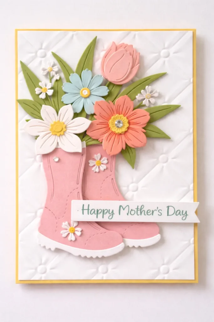
Mother’s Day Cards With Flowers, Hearts, and Pretty Extras
People love to act above flowers and hearts, and I just don’t buy it. Those shapes became classics for a reason. They work. The problem is not the idea. Trouble starts when a card throws every pretty detail at the page at once.
I like floral designs when they stay a little restrained. One corner bouquet looks charming. A border of tiny blooms can look lovely too. Covering the whole front with giant flowers, butterflies, gems, lace, and glitter? That’s not romance. It’s crowding.
The same thing happens with hearts. One layered heart in the center can look sweet and clean. A little trail of tiny hearts can look playful. Twenty hearts in five sizes stops looking thoughtful fast. It starts looking like a craft store clearance bin.
Texture can help here, but only when it stays subtle. A raised flower center, a stitched edge, or one tiny pearl can look lovely. Too many raised pieces make the card bulky, and then the envelope starts having a bad day.
Here’s the reframe I keep coming back to. Pretty extras should support the idea, not become the idea. Handmade Mother’s Day cards shine when the sweet detail feels chosen, not dumped. That’s why one ribbon bow near the fold works better than ribbon on every edge.
I also think patterned paper works best in small doses. A floral strip, a gingham heart, or a pretty inner flap can do enough. Too much pattern can start a fight with your message, and the message should win.
So yes, use the flowers. Use the hearts. Add the pretty touch. Just let one thing take the lead, and let the rest behave. A card can still look soft, feminine, and lovely without turning into a full paper parade.

What to Write When Your Brain Goes Blank
Inside messages can cause the real panic. At first, the front looks pretty. Eventually, the glue finally dries. Then the pen hovers, and every sentence sounds like it belongs in a department store ad.
I’ve found that the best message is usually shorter than people expect. It should sound like a person, not a ceremony. That means no giant speech unless you truly want one. A few sincere lines often hit harder.
These prompts help when words refuse to cooperate:
- Thank her for one specific thing.
- Mention a habit, phrase, or kindness you notice.
- Say what being her child means to you.
- Add one funny line if that fits your relationship.
- End with warmth, not performance.
- Keep the message short enough to sound real.
A simple opening can carry the whole thing. “I’m so lucky you’re mine” works. “Thank you for making ordinary days special” works too. Plain words often land better because they sound lived in.
Specific beats fancy every single time. “Thank you for always noticing the little things” says more than a dramatic paragraph. So does “You make ordinary days better.” Those lines sound human, which is the whole goal.
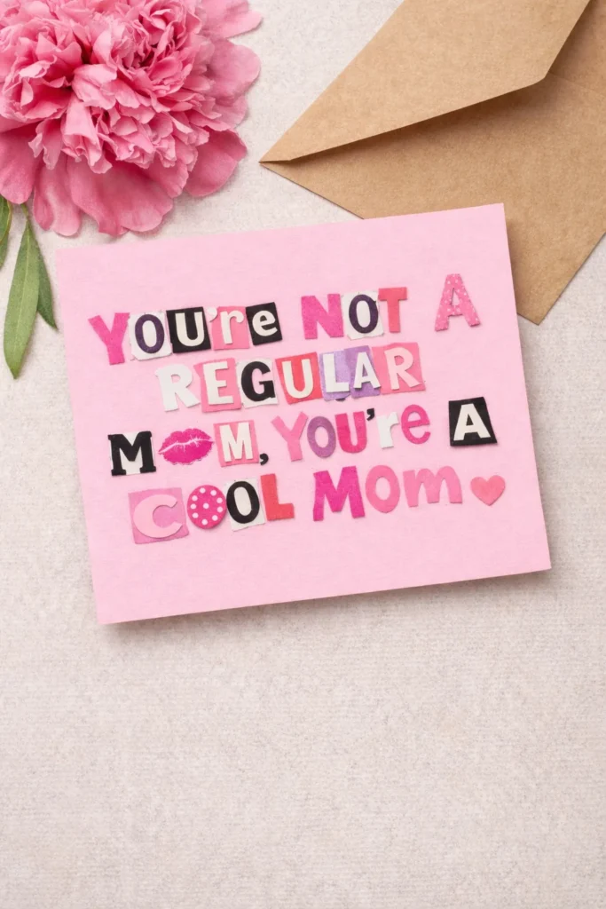
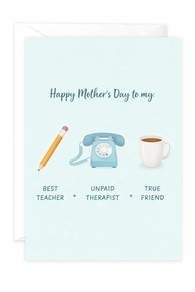
And yes, funny cards count. Not every Mother’s Day card needs tears and violin music. A playful message can still feel loving. In some families, that works better because it sounds more true.
I also like writing the inside before decorating too much. That way, the whole card still serves the message. Otherwise, the design becomes the main event. Then the words end up cramped in a corner.
If the message sounds like something you’d never actually say, cut it. That one test fixes almost everything.

Mother’s Day Cards FAQs
A lot of the same questions pop up every year, which makes sense. Card-making sounds simple until paper starts curling and the cute idea in your head suddenly looks… less cute.
A few answers clear up the usual stress fast:
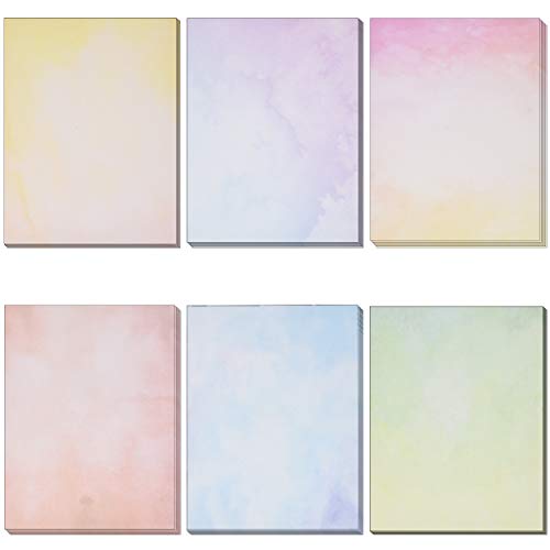
- What paper works best for handmade cards? Cardstock works best. It holds shape. Printer paper folds easily, but it can look flimsy fast.
- Do handmade cards need lots of decorations? No. A clean front with one strong detail often looks more thoughtful than a card packed with embellishments.
- What if my handwriting is messy? Larger, looser writing can look charming. Short lines help too, and you can glue a handwritten shape inside.
- Can kids make Mother’s Day cards that still look nice? Absolutely. Limit the colors and shapes, and the whole thing looks more polished right away.
- How do I make Mother’s Day cards more personal? Add something specific. Try a favorite color, shared phrase, or tiny photo.
That’s the real dividing line. Personal beats perfect every single time. People assume a “good” card needs more supplies, more time, or better drawing skills. I don’t think that’s true. Most problems start with too many choices, not too few.
The card usually gets better when the idea gets clearer. Once the message, mood, and layout line up, the rest gets much easier. That’s also why simple cards often end up being the keepers. They leave room for the person, not just the project.
So if you’re second-guessing your card, don’t throw more at it yet. Check the basics first. Better paper, fewer colors, and one personal detail can rescue a lot.
The Little Handmade Detail Nobody Forgets
I think the most memorable part of a card is rarely the fanciest part. It’s usually the tiny thing tucked in almost by accident. A note on the back. Maybe a little flap inside. Sometimes a joke in the corner. Some detail that quietly says, “Yes, I thought about this.” That tiny signal matters.
That’s why I love finishing touches that feel small. Sometimes the envelope gets a matching doodle. Other times, the inside has a tiny border in the same colors. I also love a little tag that says “open me” with one extra sentence hidden underneath. Those details linger.
Dating the card can help too. A tiny note on the back with the year makes it sweeter later. That sounds minor, but memory loves specifics.
Most people assume big effort creates the big reaction. I’m not convinced. I think thoughtful effort wins more often. Handmade Mother’s Day cards do not need to perform. They need to connect. That’s a very different job.
And here’s the sneaky part. Small details slow the reader down. They make someone look twice. Then they create that lovely beat where a card stops being paper and starts feeling like a keepsake. That shift matters more than another layer of decoration.
I’d rather make one lovely card with a tiny surprise than one overloaded card. A card should leave a little room. Not confusion. Just room. Enough for the person holding it to bring their own emotion to the moment.
That’s when the card really works. Not when it looks expensive. When it feels impossible to toss away. That’s the little handmade trick people remember long after the glue dries. It sticks.

The Card That Quietly Steals the Whole Day
I’ve found that handmade Mother’s Day cards carry more weight than they seem to at first. They look small. Yet they take up almost no space. Still, they hold a weird amount of emotion for one folded piece of paper.
Maybe that’s why I like them so much. They aren’t trying to be a huge event. Instead, they show care in a way people can see immediately. That matters now, when so much stuff looks quick, copied, or auto-filled into existence.
Living in Orlando, I’m surrounded by big gestures and polished experiences, which can be fun. Even so, a handmade card still cuts through all that noise. It feels personal on contact. No giant budget. Not even dramatic production. Just a real thought, shaped by hand.
That’s also why people save them. Not every card, obviously. Some cards live fast and die in a kitchen drawer. But the good ones? Those stay. The sweet, funny, slightly imperfect ones end up tucked into boxes, books, and memory bins.
So if I were making one this year, I wouldn’t chase flawless. I’d chase recognizable. Then I’d make it look like it came from a real person with a real point of view. That kind of card plays beautifully on Pinterest, sure, but it matters even more in actual hands.
And that’s my favorite part. The card starts as paper, glue, and a slightly bossy opinion about ribbon. Then it turns into proof.
The best card says, “I know you.” Then it sits there and refuses to be forgotten.