I swear the calendar flips to March and my phone suddenly looks… too serious. Like it’s wearing a beige blazer to a shamrock party. So yes, I’m officially in my St Patrick’s Day iPhone wallpaper era, and I’m not apologizing.
I’ve found that a tiny screen change can shift my whole mood. Not in a cheesy way. More in a “why do I keep opening my phone?” way.
Maybe you’re the same. You want festive, but not childish. Green is great, but not neon slime green.
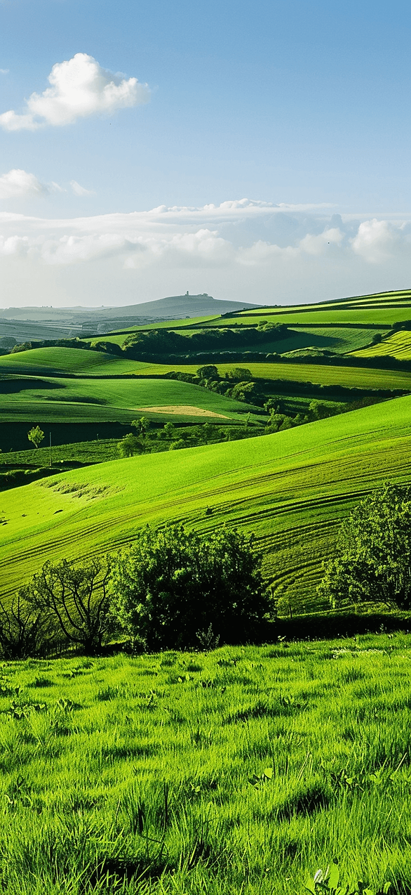
Also, I live in Orlando, which means spring starts early and loud. The light gets brighter, the palms look smug, and I want my lock screen to match.
This post is basically a little parade of wallpapers you can grab, stare at, and rotate like outfits. Some are sweet. Others are bold. A few are slightly dramatic, because I am.
I tend to notice that the best wallpapers do two things. They look good at a glance. Then they look even better when you actually stop. Plus, I like when icons don’t disappear into the background. That detail matters more than people admit.
And if you’re thinking, “It’s just wallpaper,” I get it. Still, the right one can make Monday less rude. It can also make your group chat screenshots look way cuter.
I’ll show you the designs in this post first. Then I’ll share the quick phone steps later. However, there’s one style I saved for the middle, because it’s the one people fight over.
Some of the links on this page are affiliate links, which means I may earn a small commission if you purchase through them. It never costs you extra. You can always peek at my full disclosure if you’d like the details.
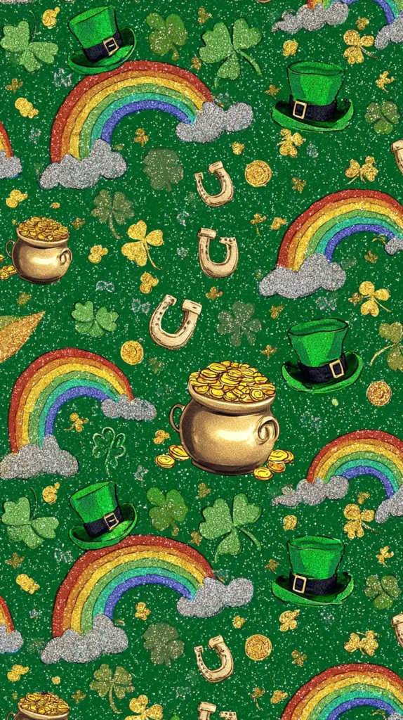
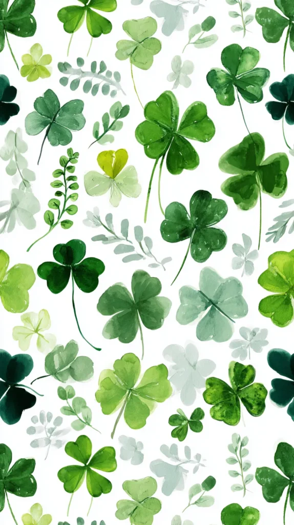
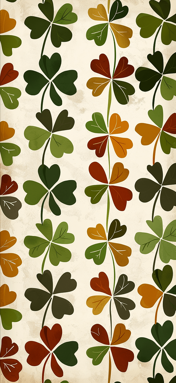
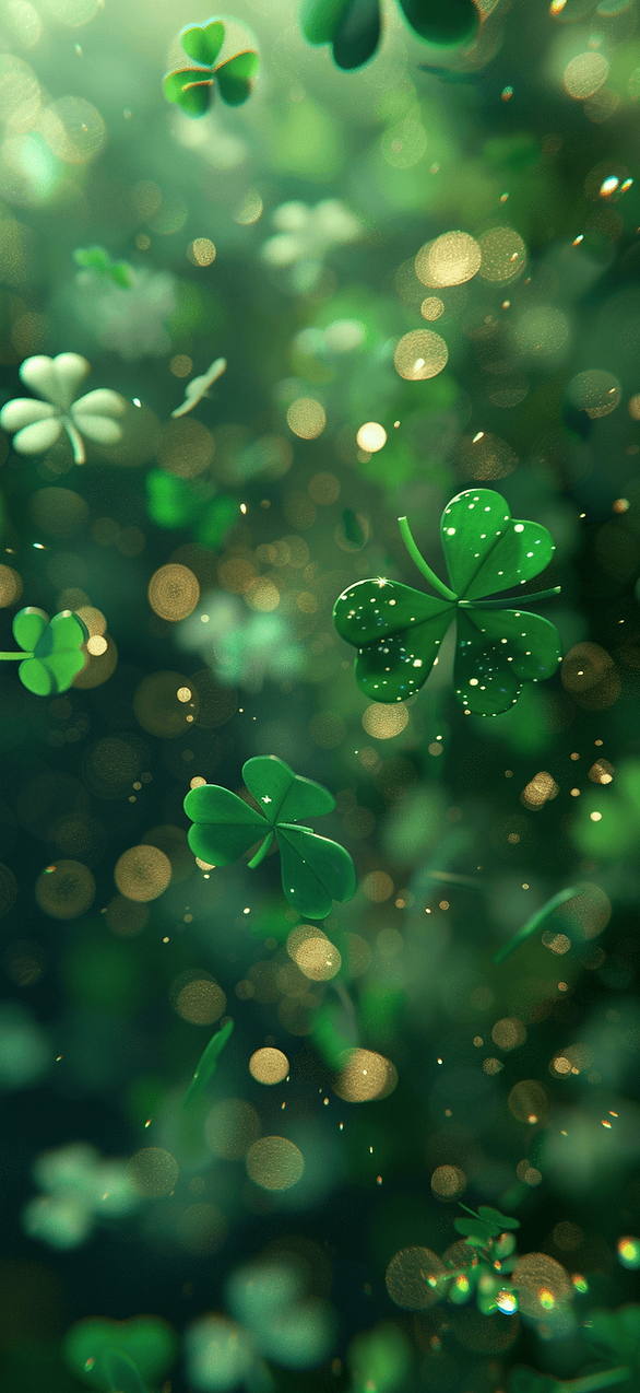
The Cute Stuff First: Soft Green, Zero Clutter
I’m starting with the wallpapers that whisper, not shout. You know the ones. They don’t attack your eyeballs at 7 a.m.
Most people assume St. Patrick’s Day has to look like a party store aisle. I disagree. A soft sage background with tiny gold dots can read festive without screaming.
I’ve found that simple doesn’t mean boring on a phone. It means your widgets don’t look like they’re drowning. That also means you can keep this wallpaper past March 17.
Here’s what to look for as you scroll these designs. Notice how the green stays muted. Watch how the background leaves space around the time.
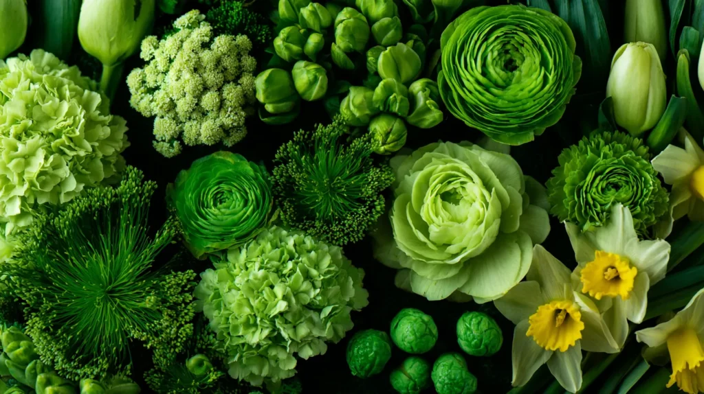
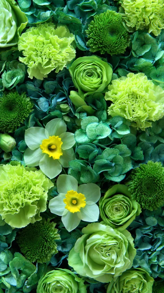
Some designs in this post lean into watercolor clovers. Others use clean shapes that look modern and calm. And yes, a few sneak in a tiny rainbow, but in a tasteful way.
I tend to notice one detail separates pretty from I’m saving this. It’s the texture. Paper grain, soft gradients, and tiny speckles look expensive on screens.
Try this quick gut check. If the wallpaper would look cute on a notebook cover, it usually works. When it would look loud on a notebook, it’ll look louder on your phone.
If you want a St Patrick’s Day iPhone wallpaper that works for work meetings, start here. Then keep going, because the next style gets a little more bold.
One more thing before you pick. Tap the design and stare at it for five seconds. If your brain relaxes, it’s a keeper. When your brain gets busy, skip it.
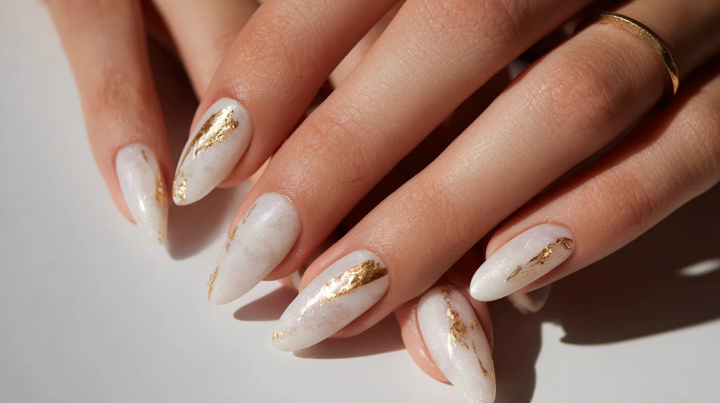
And if you wonder if cute can look grown, watch for the metallic one.
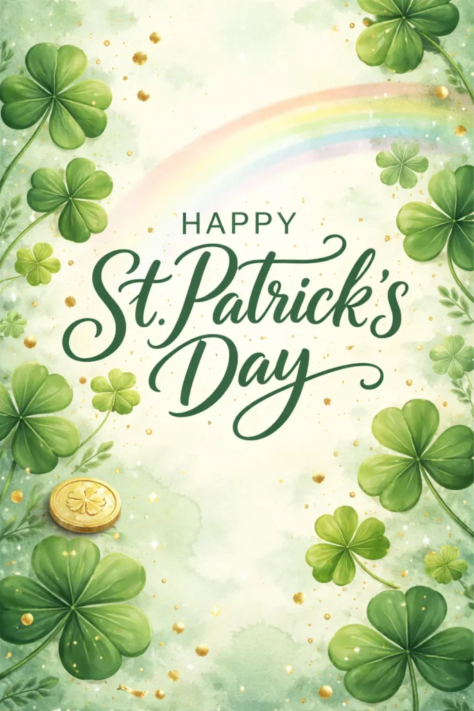
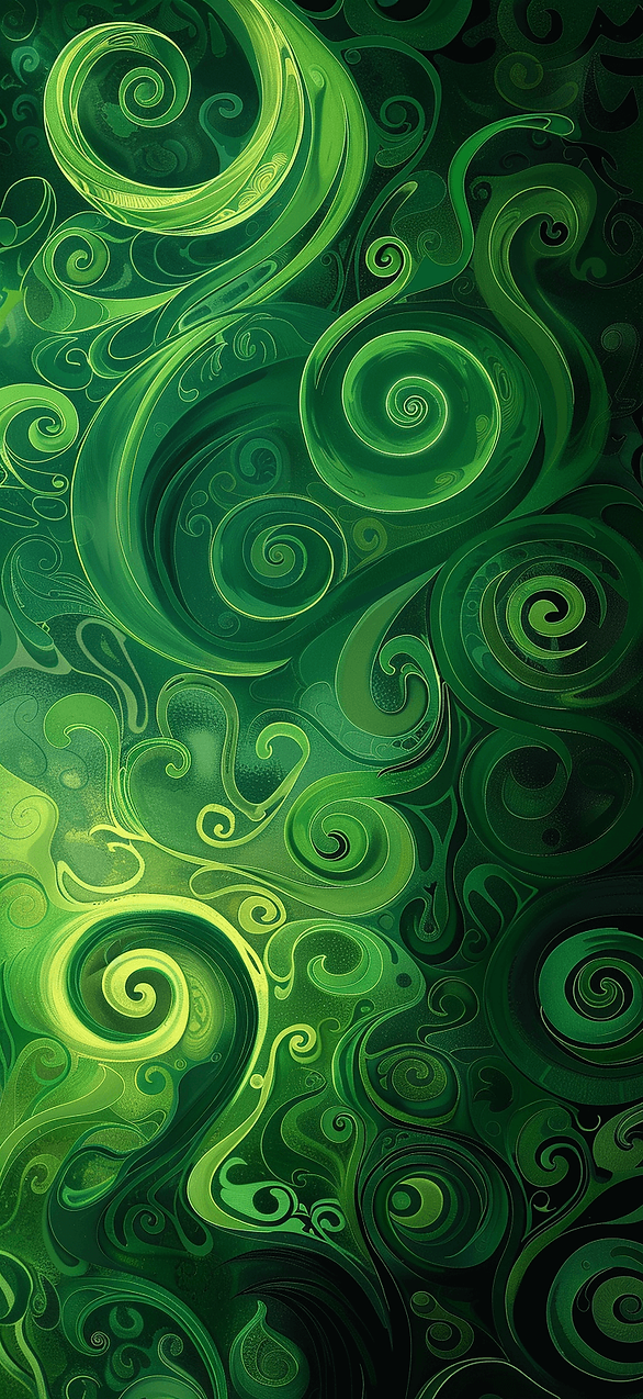
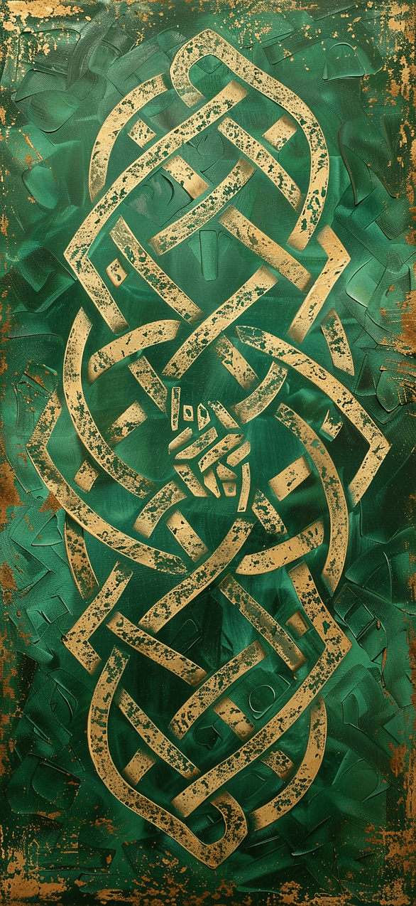
St Patrick’s Day iPhone wallpaper That Looks Expensive
Okay, now we’re flirting with fancy. These are the wallpapers that look like you bought a chic digital print. They also make your phone look like it has its life together.
Most people think holiday wallpaper means cartoons or cheesy slogans. However, the clean luxe styles win, especially on newer screens.
I’ve found that metallic accents and deep emerald tones read rich fast. They also make simple lock screens look intentional. Yes, I just called your lock screen intentional.
As you scroll these designs, keep an eye on the little designer cues. They’re small, but they change everything.
- Deep emerald backgrounds with subtle shine, not glitter.
- Thin gold line art clovers that look like jewelry sketches.
- Marble or terrazzo textures with tiny green flecks.
- A single bold shamrock centered, with lots of breathing room.
- Minimal typography that stays readable behind icons.
If you want a St Patrick’s Day iPhone wallpaper that photographs well, choose one of these. Screenshots, reels, and Pinterest pins all look cleaner.
I tend to notice these also solve a practical problem. Your app icons stay easy to see. The time stays readable. So your phone looks styled, not cluttered. And yes, your battery will survive the fancy look.
Here’s the reframe that surprised me. Busy patterns can look cheaper, even when they’re cute. Meanwhile, one strong shape can look high-end.
Also, don’t worry if you can’t pick one. I rotate these like earrings. Some days I want glossy emerald. Other days I want soft gold lines and calm.
Next up, I’m talking about the lock screen mistake almost everyone makes, including me.

The Lock Screen Test Nobody Talks About
Here’s the thing nobody says out loud. A wallpaper can look perfect in a big preview. Then it turns into chaos once the clock shows up.
Most people blame the wallpaper when the issue is actually contrast. The time needs space. Your notifications need space. Even your eyes need space.
I’ve found that the best wallpapers frame the top area. They either stay lighter behind the clock, or they stay darker on purpose. Random mid-tone backgrounds cause the most drama.
Try this as you scroll: imagine the time sitting on top. If it looks fuzzy in your head, it’ll look worse in real life. That’s the moment to keep scrolling.
I tend to notice the same trap with cute patterns. Tiny clovers everywhere look adorable, right? However, they can compete with icons and widgets.
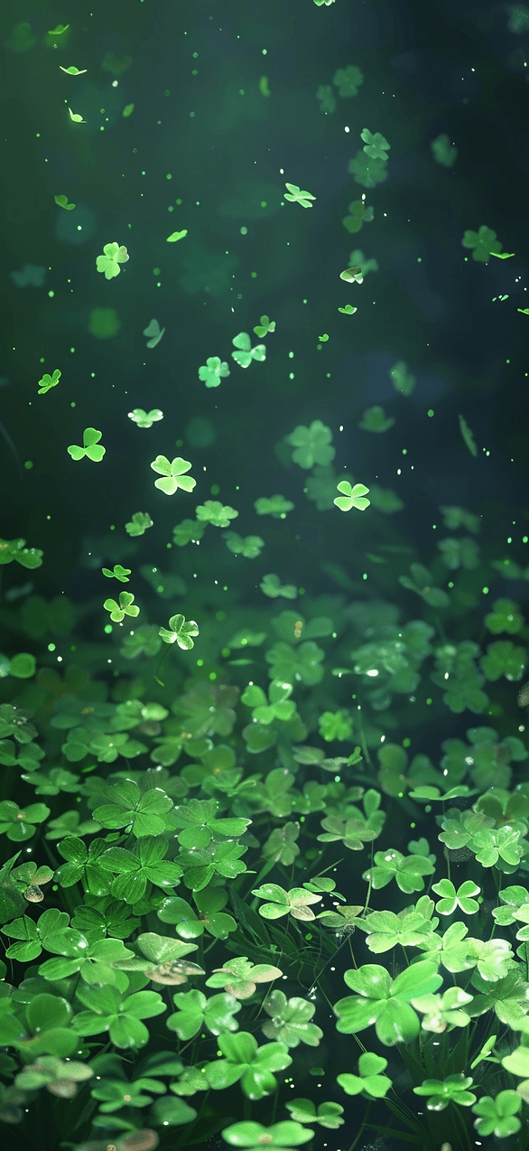
Dark mode changes the game, too. A soft green can look gray at night. Meanwhile, deep emerald can look almost black, which I love.
Plus, a wallpaper should look good in screenshots. You don’t want the clock to disappear.
If you’re picking a St Patrick’s Day iPhone wallpaper from this post, zoom in once. Check the top third. Then check the bottom third. Those zones matter more than the middle.
Here’s the assumption flip. People think wallpaper should fill every inch with design. Actually, empty space is the design. Empty space makes your phone look calm.
Also, you can play favorites depending on your layout. Heavy widget person? Choose cleaner designs. Minimal app screen? You can pick the busier ones.
In the next section, I’m showing the green styles for people who hate loud green. And yes, I saved a sneaky neutral one.


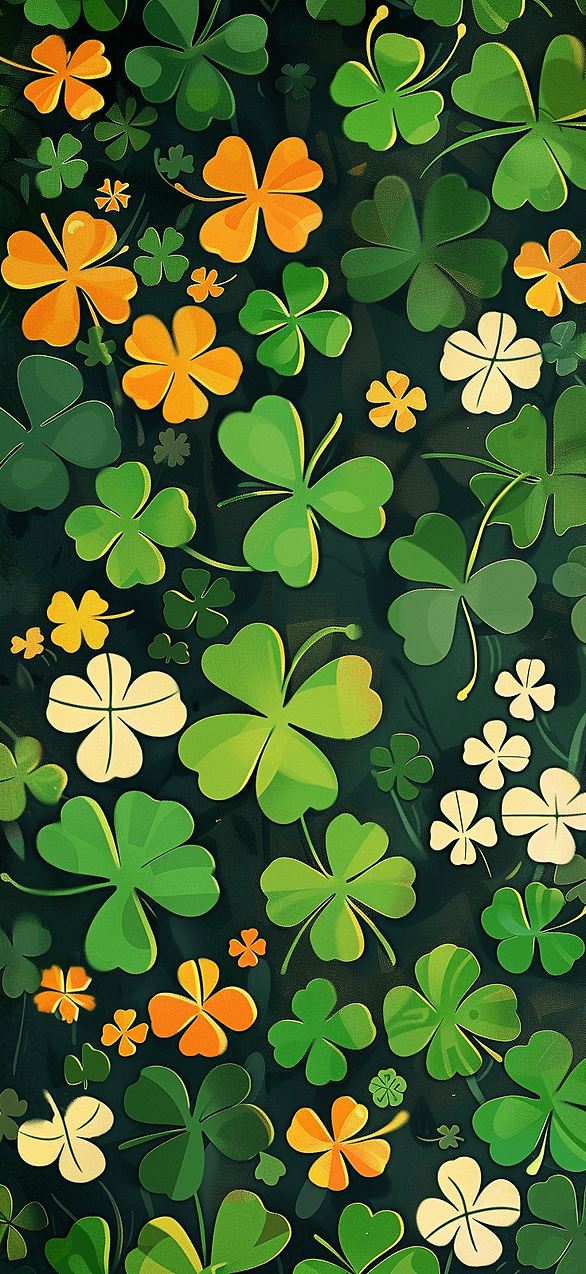
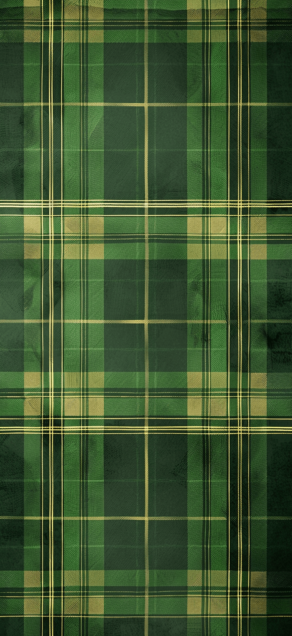
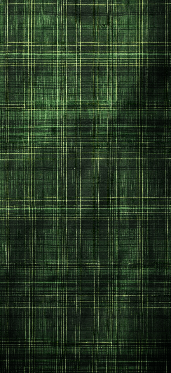
St Patrick’s Day iPhone wallpaper For People Who Hate Loud Green
Let’s talk about the I don’t do neon crowd. I see you. You want St. Patrick’s Day vibes, but you don’t want your phone to look radioactive.
Most people assume the only choices are bright green or sad beige. However, there’s a whole middle lane that looks classy.
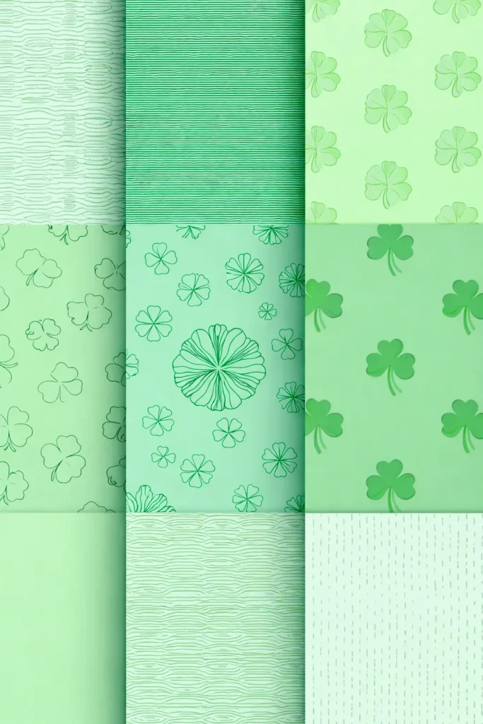
I’ve found that muted palettes still read festive if the shapes do the work. Clovers, knots, tiny gold coins, or a crisp stripe can carry the theme.
Here are the designs in this post that hit that sweet spot. They keep the vibe, but they calm the volume.
- Sage and cream with small clover accents.
- Deep forest green with thin white line art.
- Soft mint with a single centered shamrock.
- Warm ivory with tiny green confetti dots.
- Charcoal with emerald details for a moody look.
Want a St Patrick’s Day iPhone wallpaper that won’t clash with icons? Pick one of these. They play nice with your screen.
I tend to notice these also match more phone cases. Clear case? Cute. Neutral case? Still cute. Even the chunky protective case looks less like a brick.
Here’s the reframe. Festive doesn’t have to look childish. Sometimes the grown-up version looks more fun, because it feels intentional.
Also, don’t skip the moody options. A dark background makes notifications pop. It also hides smudges, which is a gift.
In a minute, I’ll share an icon trick that makes any wallpaper look cleaner.
Then again, if you love loud green, I won’t judge. I just keep it off my lock screen. Your eyes will thank you.

Little Icons, Big Drama: Contrast Tricks
Let me be dramatic for a second. Your wallpaper can be gorgeous, and your home screen can still look messy. The culprit is usually icon contrast.
Most people pick a wallpaper like they’re framing art on a wall. However, phones are more like cluttered desks. You need a background that forgives the mess.
I’ve found that mid-tone greens cause the most fights. They sit right between light and dark, so everything looks slightly off. Meanwhile, high contrast backgrounds make everything click.
Here’s what I tend to notice when a wallpaper looks clean. The top area stays calm. Next, the middle area carries the fun detail. Then the bottom area leaves room for your dock.
If you’re using one of the designs in this post, try the quick switch test. Set it, unlock, then look away. Come back and glance for one second. If your eyes grab the time instantly, you nailed it.
The assumption flip is simple. People think more detail makes a wallpaper more interesting. Actually, the right negative space makes it more interesting.
I’m also going to say something mildly controversial. White backgrounds look cute, but they show every smudge. Dark backgrounds hide smudges and look fancy.
Widgets add another layer, too. A busy widget on a busy wallpaper looks like a yard sale. So I match bold widgets with calmer backgrounds, every time. And yes, Focus mode icons count as clutter. They add noise fast.
Want a St Patrick’s Day iPhone wallpaper that stays readable? Choose one with a clear quiet zone. In the next section, I’m talking about lucky details, because tiny details run this holiday.

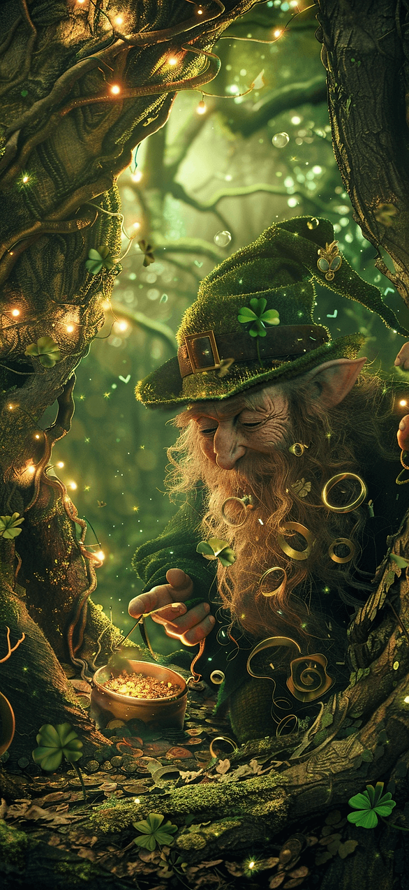
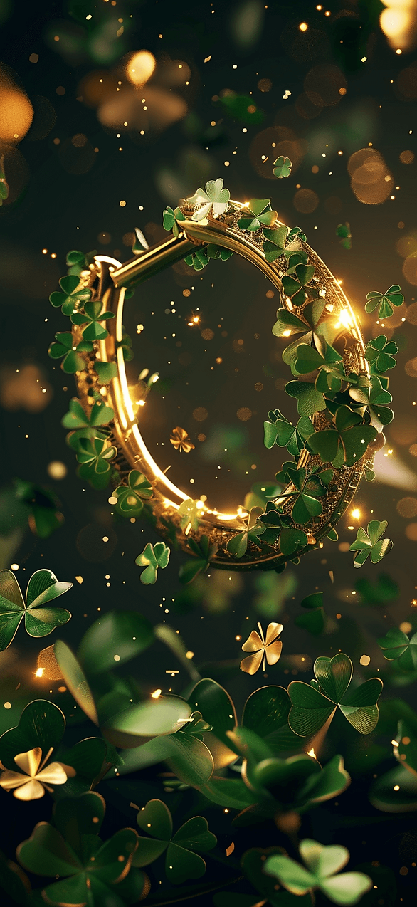
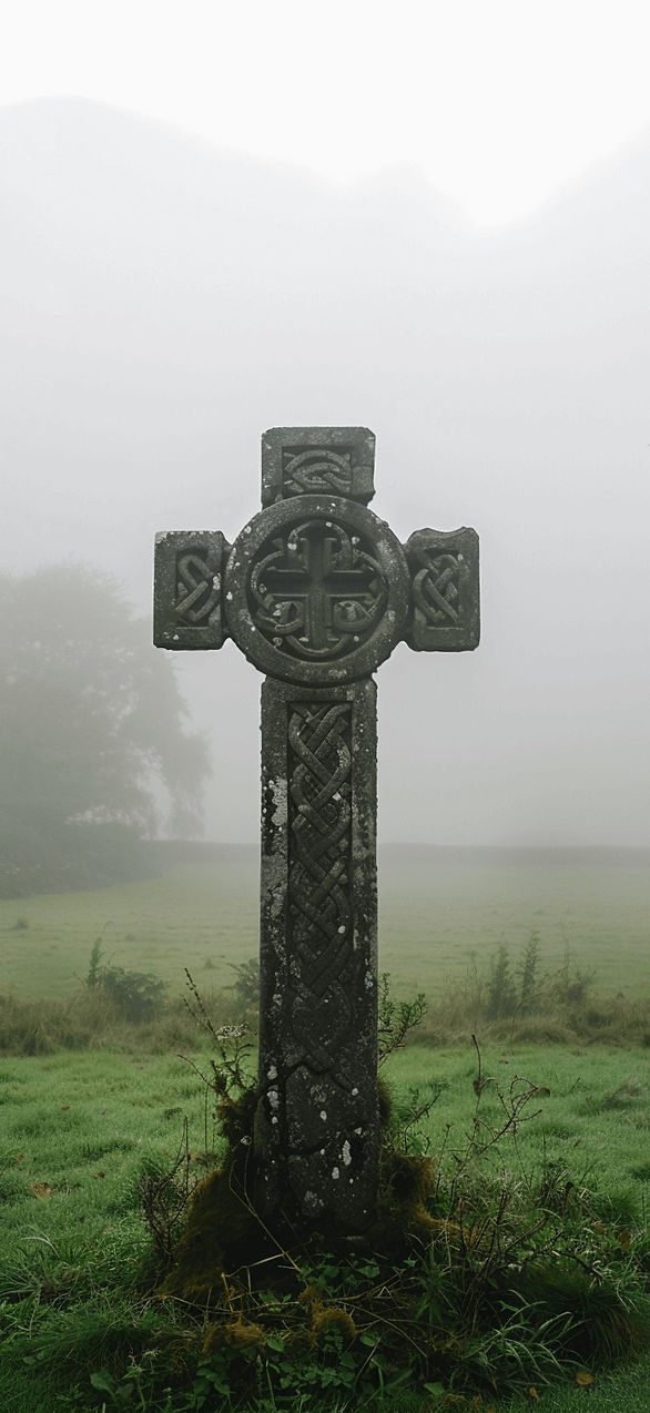
St Patrick’s Day iPhone wallpaper With Lucky Details
This is the section where the details get sneaky, in the best way. These wallpapers have tiny lucky elements that you only notice after a day. It’s like finding an extra fry in the bag.
Most people think a wallpaper has to look obvious from three feet away. However, the subtle ones keep you interested longer.
I’ve found that tiny icons create that wait, what is that moment. A mini horseshoe in the corner. Hidden four-leaf clover in a pattern. Or a little gold coin that looks like a button.
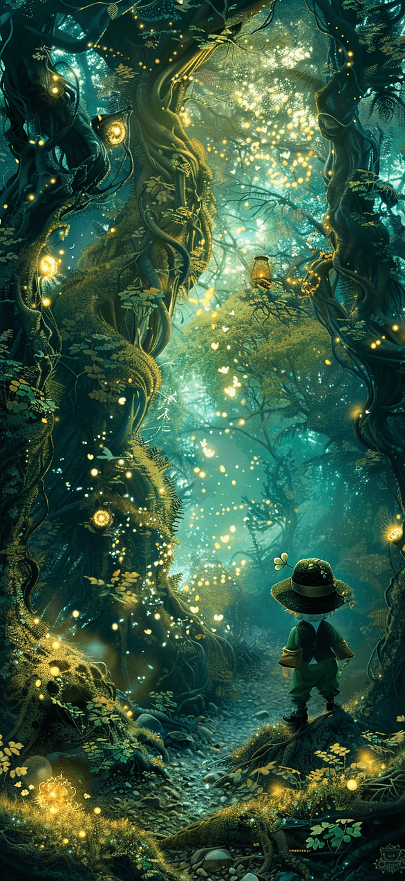
Some designs in this post use Celtic knot lines that weave softly. Others hide clovers inside a geometric print. A few place a small rainbow arc behind the time, so it looks intentional.
I tend to notice these work best on lock screens. Your eyes land on the clock first. Then your brain spots the detail later, like a delayed punchline.
Here’s my favorite trick. Pick a wallpaper with one hidden detail, not ten. One hidden detail makes you smile. Ten hidden details makes your phone look busy.
Want a St Patrick’s Day iPhone wallpaper that keeps you looking? Choose the one with a secret element. I’m not talking about scavenger hunts. Instead, I mean little visual rewards.
Also, you can save two or three from this post and rotate them. That keeps the vibe fresh without changing your whole home screen layout.
The assumption flip is this: more obvious doesn’t mean more festive. Sometimes subtle reads more confident.
Next, I’m getting practical. I’ll show you exactly how to swap wallpapers on iPhone, without the usual settings maze.

How To Change Your iPhone Wallpaper Without Getting Annoyed
You already picked your favorite design from this post. Now you just need your phone to cooperate. Because iPhones love to hide simple things behind pretty menus.
Most people think changing wallpaper is one tap. Then they end up three screens deep, questioning reality. So I’m keeping this super clean.
I’ve found the fastest route starts right on the image. Save the wallpaper you want to Photos first, just once. Then do the switch.
- Open Photos and tap the wallpaper image you saved.
- Tap the share icon, then choose Use as Wallpaper.
- Pinch to zoom, then drag to place it how you like.
- Choose Customize if you want to adjust the clock style.
- Press Add, then choose Set as Wallpaper Pair or Set Home Screen.
You can also go through Settings if you like the long way. Open Settings, tap Wallpaper, then tap Add New Wallpaper. Pick Photos, then choose your saved design.
If you want your icons to stay readable, zoom out a tiny bit. That gives the clock more space. It also keeps the design from looking chopped.
Here’s the assumption flip. People think they need to edit the image first. You don’t. The built-in zoom and move tools do enough.
Also, if your lock screen widgets cover the cute part, move them. I know. It’s annoying. Still, it’s worth it.
Once you set it, lock your phone and look at it fresh. If it looks perfect, keep it. Otherwise, swap again.
That’s why this post has options. One St Patrick’s Day iPhone wallpaper even plays nicely with widgets.

St Patrick’s Day iPhone wallpaper Options That Also Work On Android
Yes, I know. The keyword says iPhone. Still, plenty of you have Androids, and I refuse to leave you out.
Most people assume the designs won’t translate across phones. However, a good background stays good, even when menus change.
I’ve found the main difference is cropping. Android screens vary more, so you might adjust the zoom slightly. That’s normal, not a you problem.
Some phones offer a shortcut from the home screen. Long-press an empty spot, then tap Wallpaper or Styles. Then pick your saved image and set it.
Here’s the quick Android route after you save a design from this post. The words may vary by phone, but the path stays similar.
- Download the wallpaper image to your device.
- Open the image, then tap the three-dot menu or share icon.
- Tap Set as wallpaper or Set picture as.
- Choose Home screen, Lock screen, or Both.
- Move or zoom the image, then tap Set.
You don’t need a theme pack for this, just the image you love.
Want a St Patrick’s Day iPhone wallpaper look on Android? Pick designs with extra border space. They crop better and keep the good parts.
Here’s the reframe. Android isn’t harder. It’s just more brands doing their own thing. Once you set it once, you’re done.
Also, some Android phones let you set different wallpapers for lock and home screens. That’s honestly fun. Pair a bold clover lock screen with a calmer home screen.
Keep scrolling and you’ll spot one. A St Patrick’s Day iPhone wallpaper looks shockingly good in dark mode.


Your Phone Deserves A Tiny Parade
I love how something this small can change the whole vibe of a day. A lock screen sits there quietly. Still, it sets the tone every time I check a text.
I’ve found that I reach for my phone less when it looks calm. Then again, I open it more when it looks cute. Yes, both can be true.
Some days I want soft sage and tiny clovers. Other days I want deep emerald and gold lines. Either way, the screen looks like it belongs to March.
Also, living in Orlando means I see green everywhere right now. Palms, lawns, and that sudden bright spring light all show off. So my St Patrick’s Day iPhone wallpaper just fits the season outside my windows.
If you grabbed more than one design, good. I tend to notice rotation keeps things fresh without creating chaos. You can swap in seconds once you’ve done it once.
In boring moments, a cute lock screen helps. Waiting rooms get less gloomy. Grocery lines get less awkward.
And if you’re saving this post for later, that’s smart. Pinterest loves a good seasonal swipe file, and so do I.
Pick the one that makes you smile when your screen lights up. Keep the one that makes Monday look less mean. Drop the one that makes your icons disappear.
That’s the whole point, right?
Let your phone look festive, polished, and a little cheeky, like you.