I didn’t expect an Earth Day iPhone wallpaper to shift my screen mood, yet here we are. Some backgrounds just exist. Others make your phone look prettier, calmer, and more put together before you even open a text. That tiny shift pulls more weight than people admit.
I’ve found that a good wallpaper can reset the tone of the whole day. Not in a fake, glittery “new me” way. More in a “my screen looks cute, so my brain stopped growling” way. I’ll take that kind of upgrade every time.
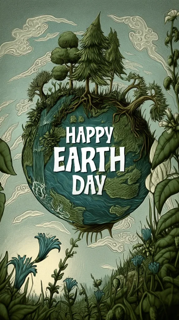
Because Earth Day leans green, fresh, bright, and hopeful, it works beautifully on a phone. You get leafy shapes, soft skies, little flowers, gentle oceans, and clean natural color. Nothing needs to shout. The best designs just sit there looking lovely. I like that energy.
As a mom in Orlando, I see bright sun and color everywhere this time of year. So muddy, dull wallpapers lose me fast. I want something cheerful, crisp, and easy on my eyes. Not chaotic. Definitely not gloomy. Definitely not one more thing yelling at me from my phone.
So this post keeps the focus where it belongs. Right here on the wallpaper designs in the post. No making your own. Forget digging through old photos. Just scrolling, choosing, saving, and landing on one that makes your lock screen look springy. A few feel sweet. A few look polished. One or two have that “wait, why is this so pretty?” thing going on. And that, to me, is where the fun starts.

Some of the links on this page are affiliate links. That means if you click and make a purchase, I may earn a small commission at no extra cost to you. If you’re curious about the fine print, you can check out my full disclosure.
Why Nature Looks Better on a Phone Than You’d Think
It’s funny how a simple leaf can look ordinary in real life, then chic on a lock screen. On a tote bag, it’s cute. Meanwhile, on a mug, it’s fine. On a phone with soft light and clean icons, it suddenly looks curated.
I tend to notice that nature designs work best when they don’t try too hard. Too many details can turn a pretty background into clutter fast. Then your notifications land on top. Next, your widgets pile in. Suddenly your lovely wallpaper looks like it lost a fight.
A good Earth Day iPhone wallpaper gives your phone personality without making it harder to use. That’s the sweet spot. You still want the clock readable. Plus, you want your apps clear. Yet you also want that tiny hit of delight when the screen wakes up.
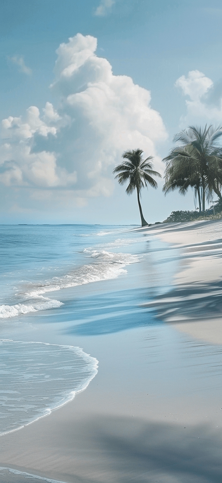
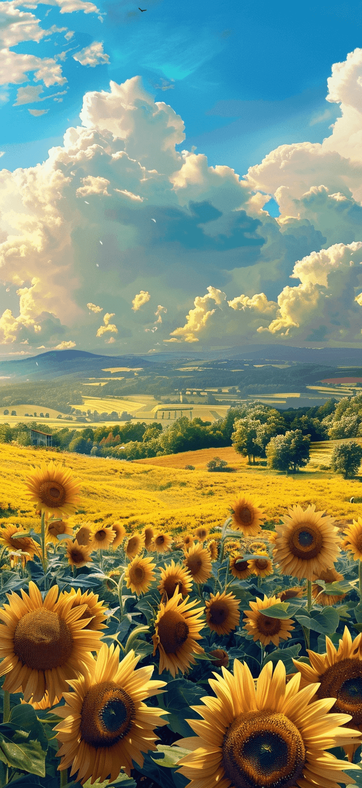
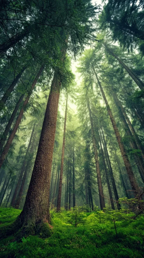
That’s why the strongest Earth Day iPhone wallpaper designs in this post lean simple first. Some use airy botanical shapes. Others use soft blue and green shades that read calm instead of loud. A few bring in daisies, clouds, or earth-toned curves. Basic? Maybe. Effective? Very.
Here’s the part people skip. A wallpaper does not need to impress strangers. It needs to make you happier when you grab your phone again. That’s a different test. Frankly, it’s the better one.
So while you scroll these designs, don’t chase the busiest option first. Look for the one that makes your screen breathe easier. That sounds dramatic, but it’s true. A cleaner mood changes the whole vibe faster than a new case ever will. That tiny surprise is half the charm. Plus, the quieter designs often last longer on your phone. You don’t get tired of them by Thursday. That matters more than people think.
Earth Day iPhone Wallpaper Designs That Instantly Freshen Your Screen
This is where things get fun, because not every Earth Day iPhone wallpaper gives the same energy. Some look soft and dreamy. Others look crisp and modern. A few land right in that happy middle spot, which I love.
I’ve found that most readers know their style once they see it. They don’t need a lecture. Instead, they need a little nudge and permission to choose what makes them smile. That’s the real job here. That part matters too.
Here are the wallpaper styles worth checking:
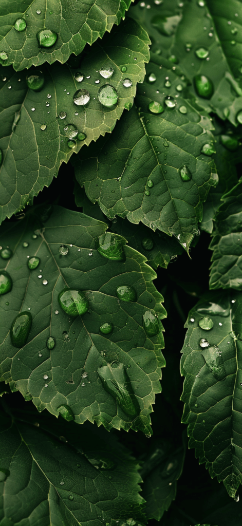
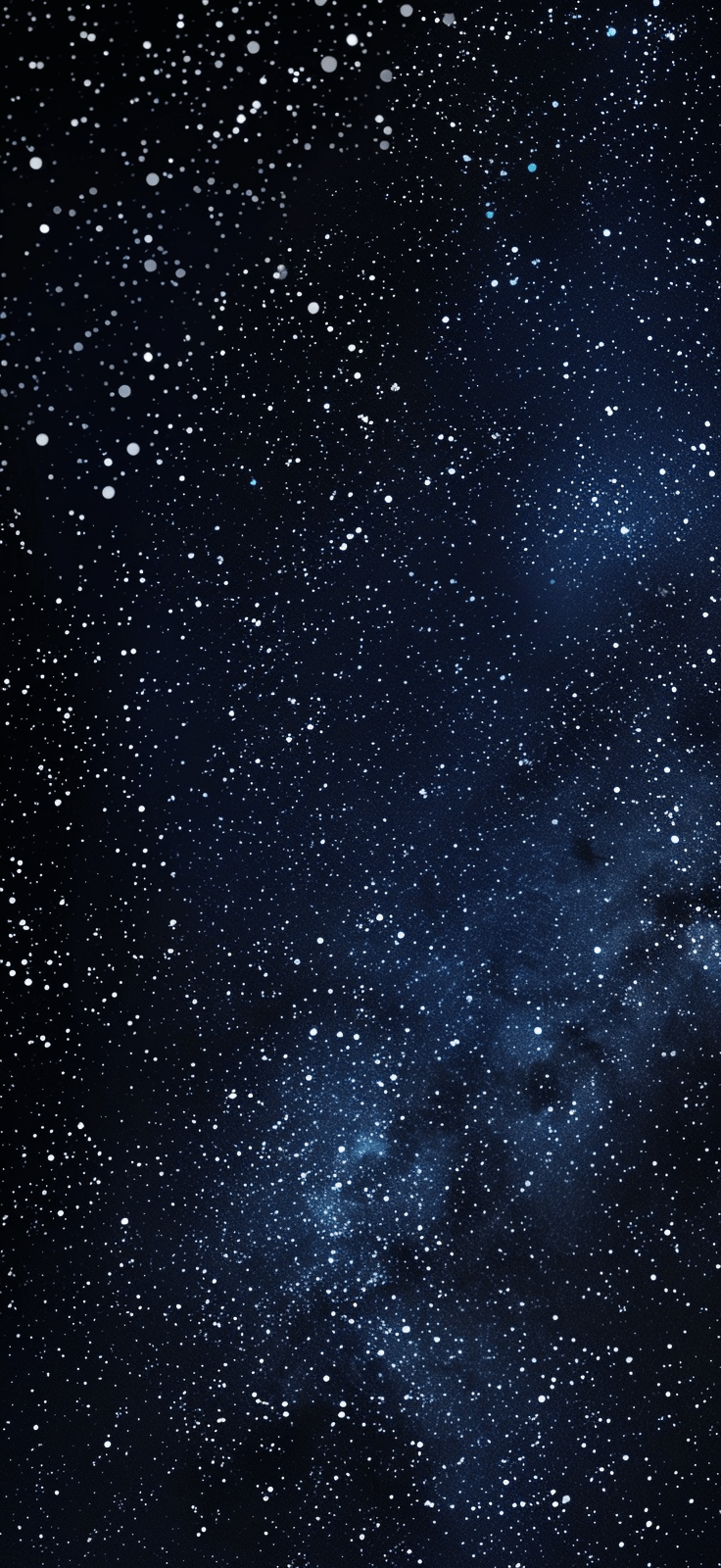
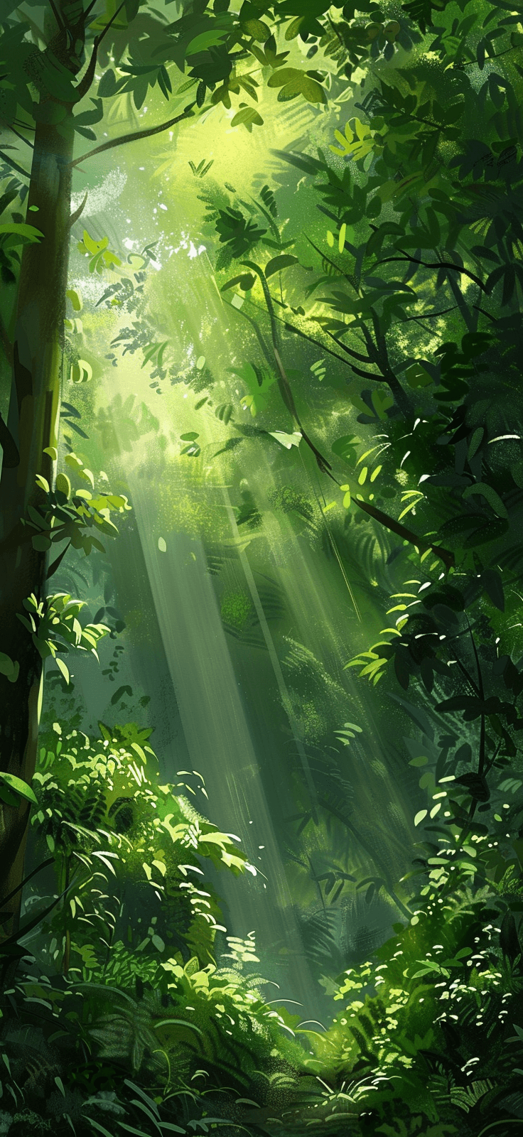
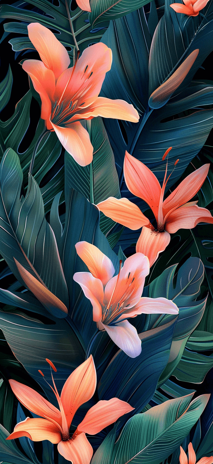
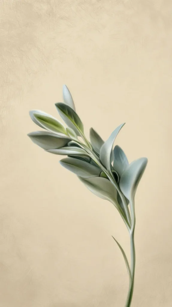
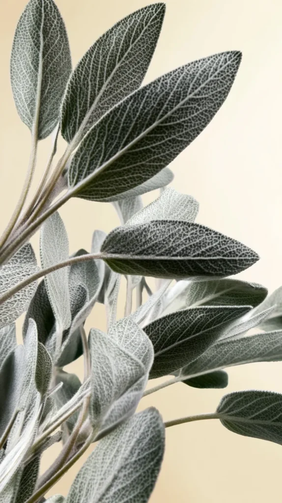
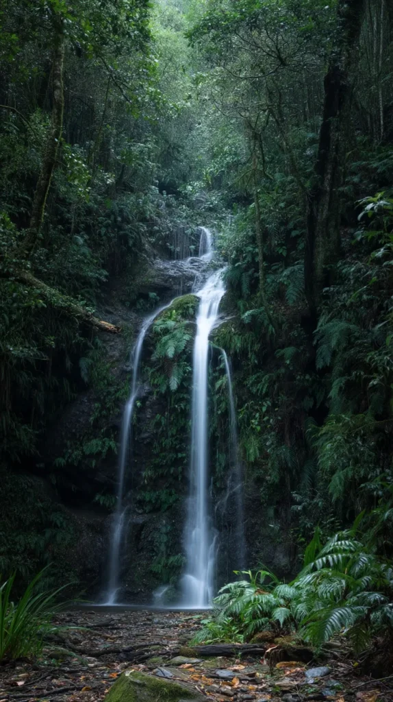
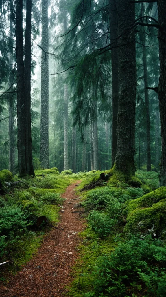
- Soft sage leaves on a creamy background for a calm, polished lock screen
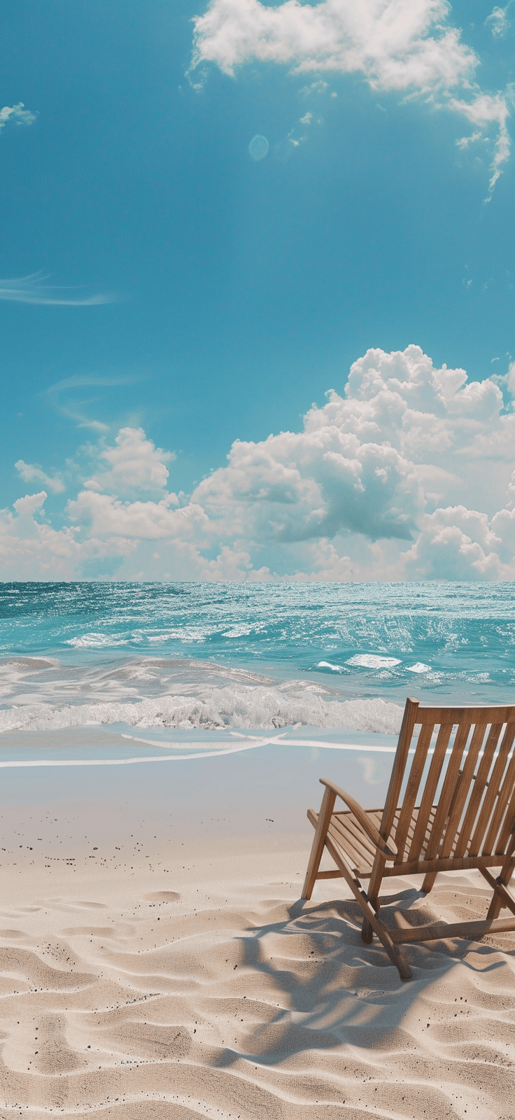
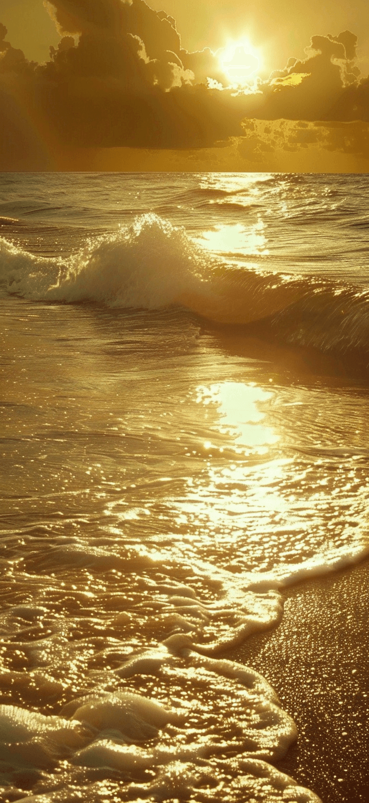
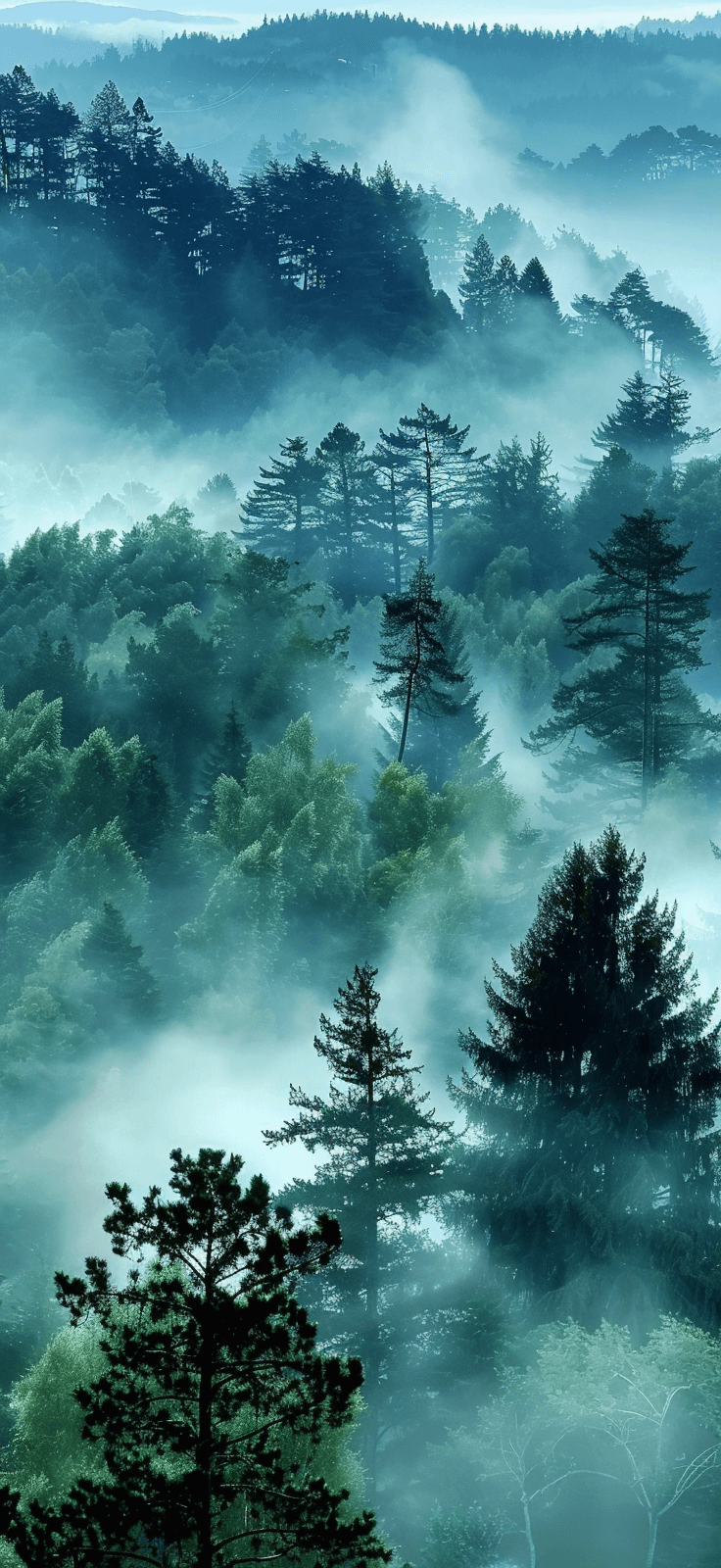
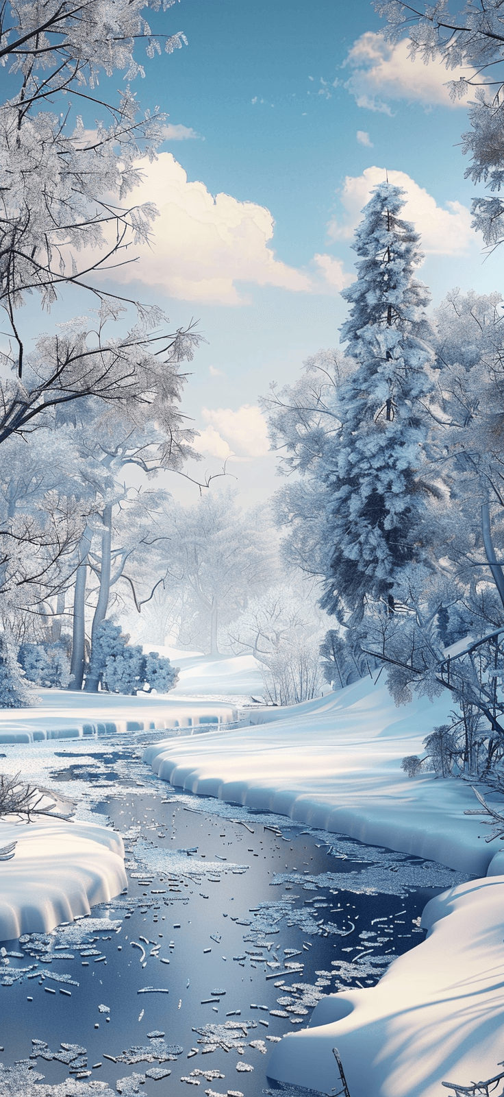
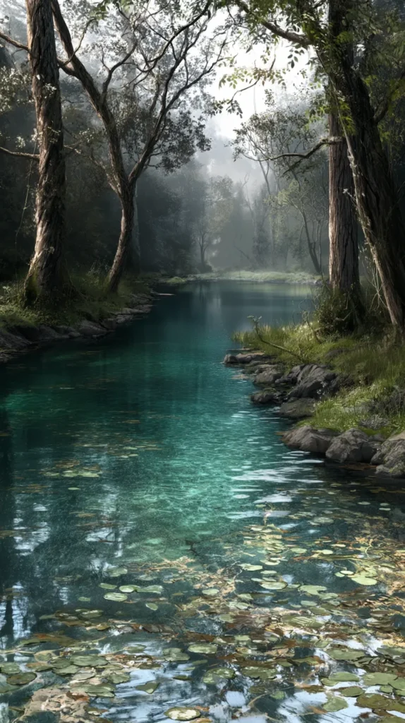
- Blue ocean swirls and cloud shapes for a breezier Earth Day mood
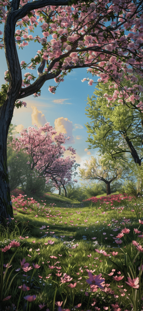
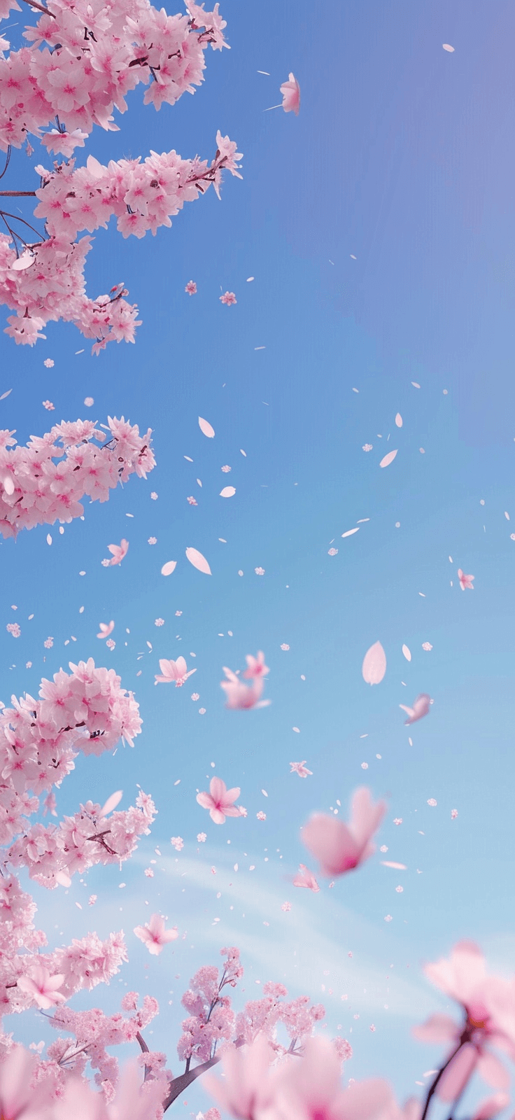
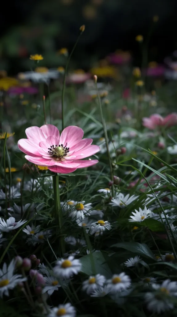
- Daisy clusters and tiny florals for a sweet spring look
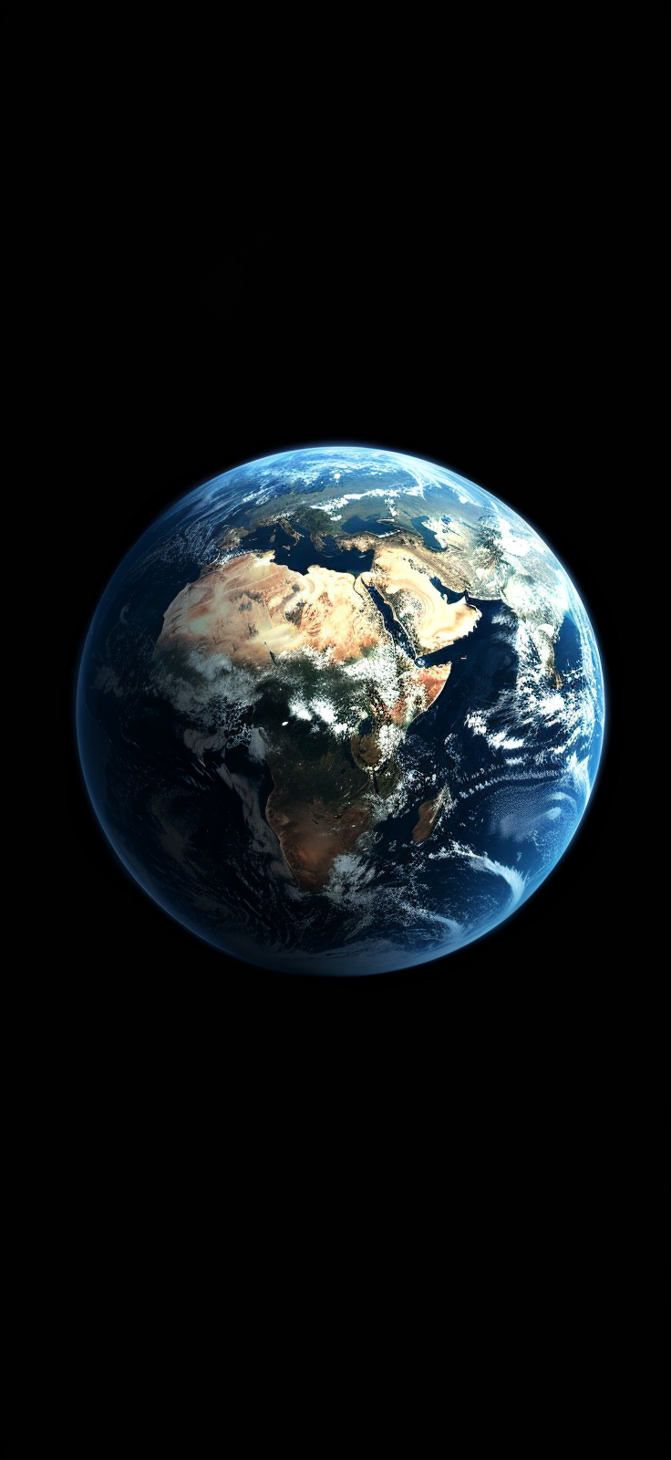
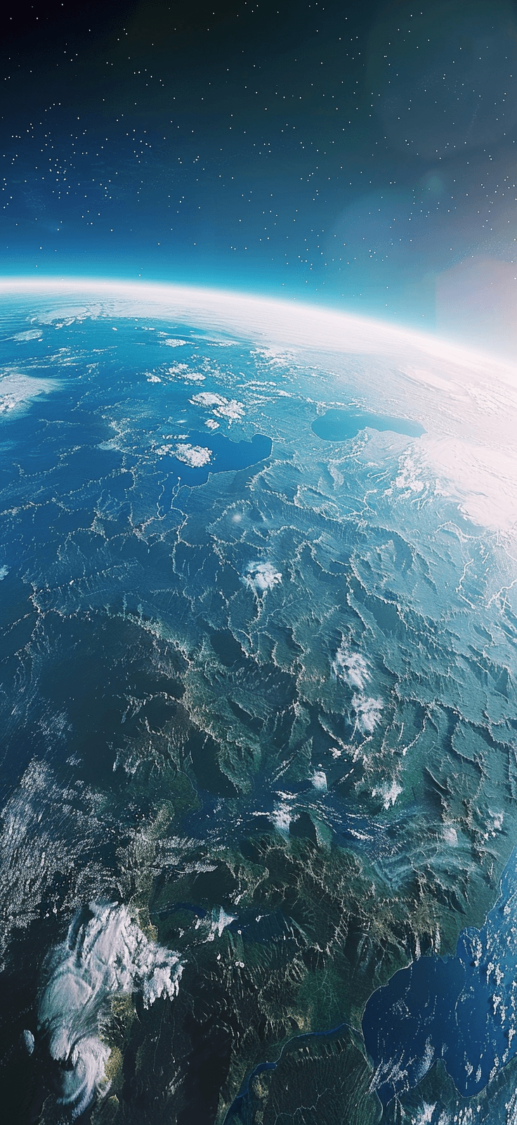
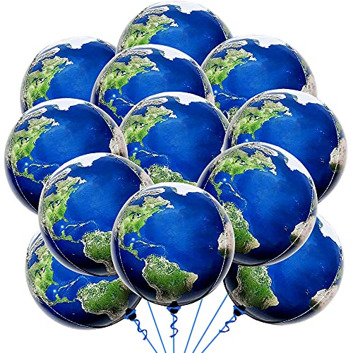
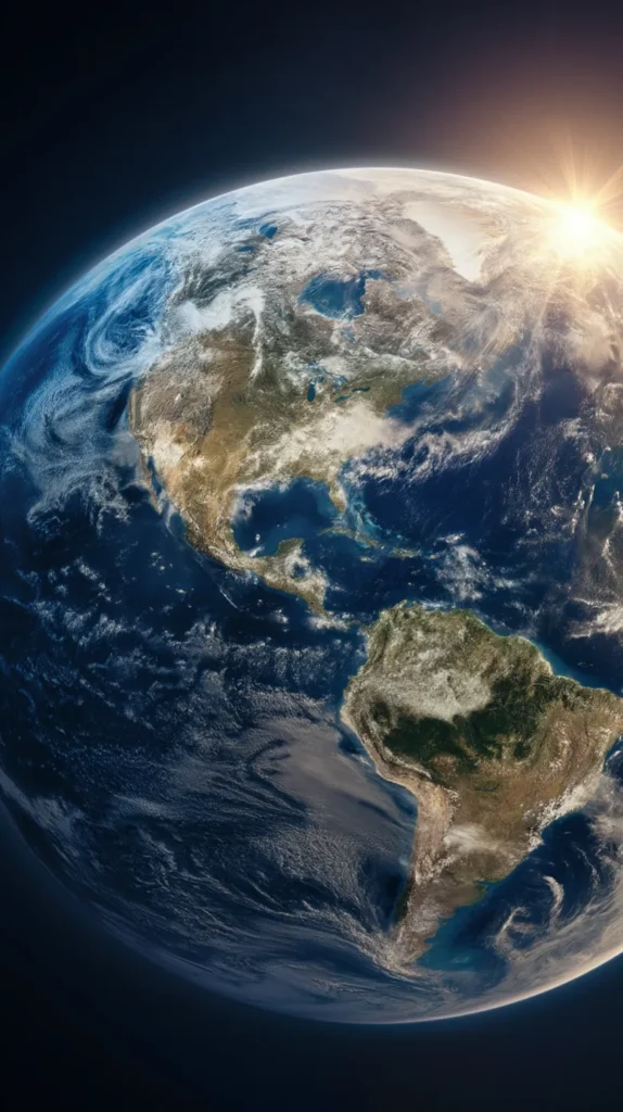
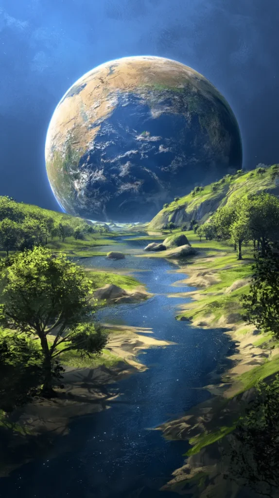
- Minimal planet sketches and line art for a cleaner, modern vibe
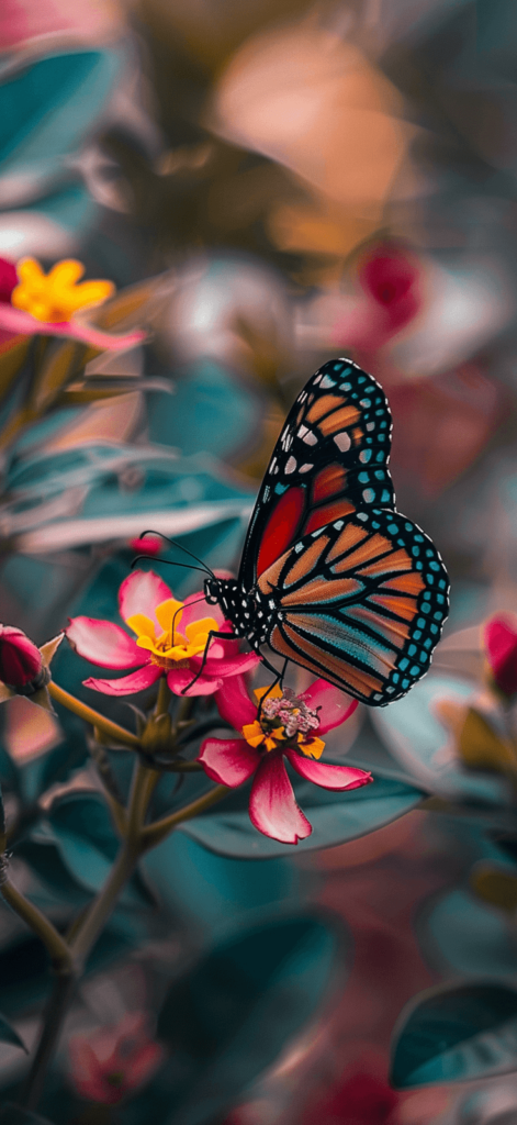
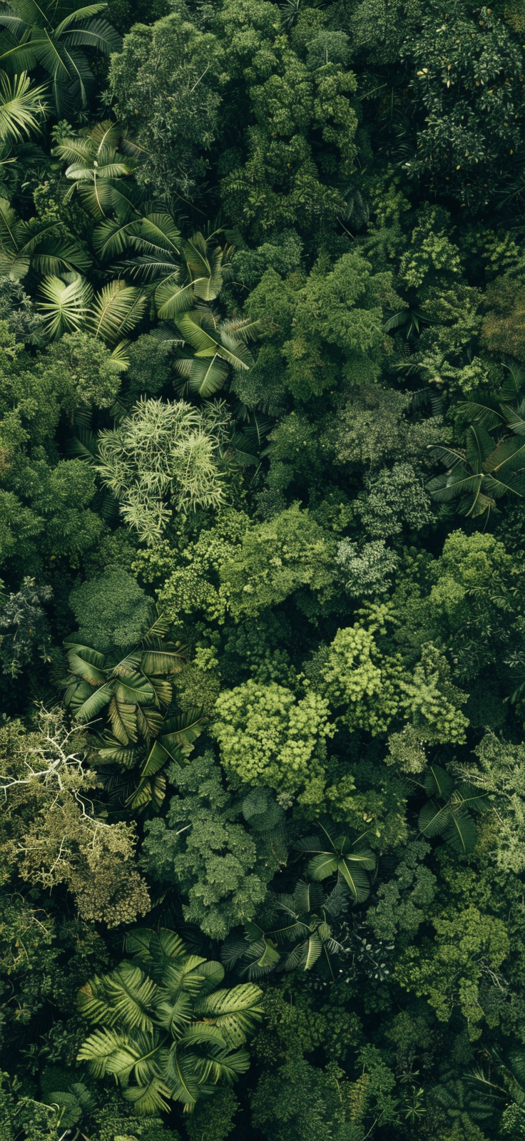
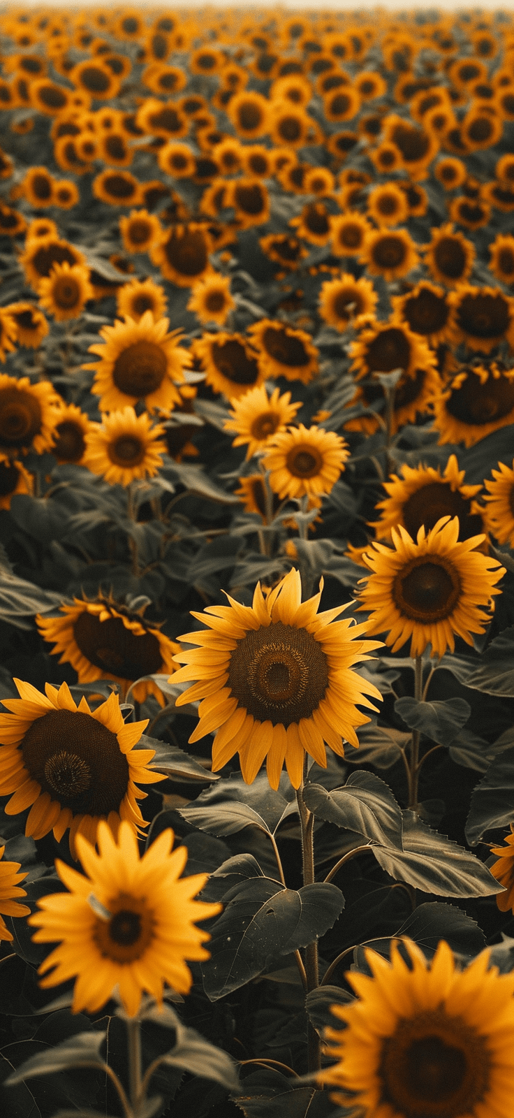
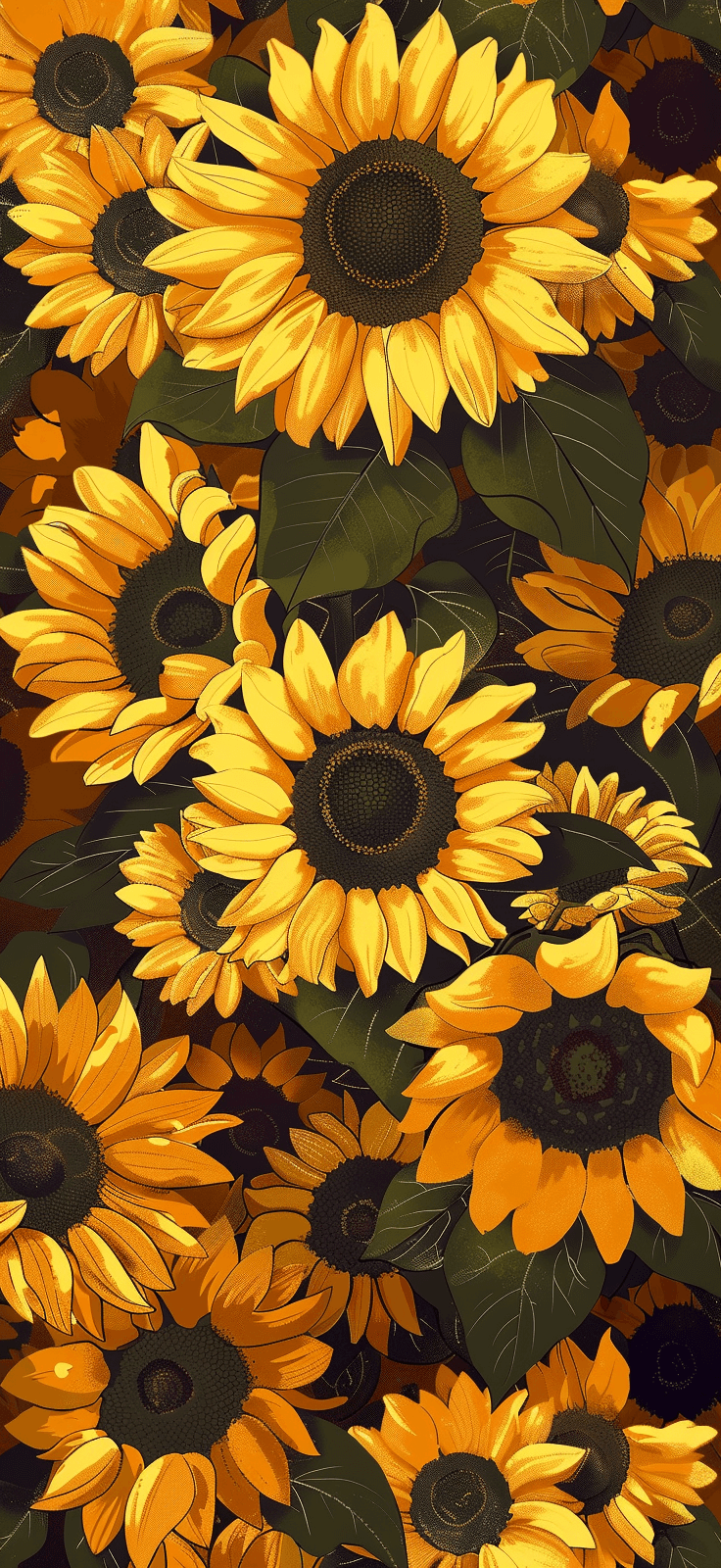
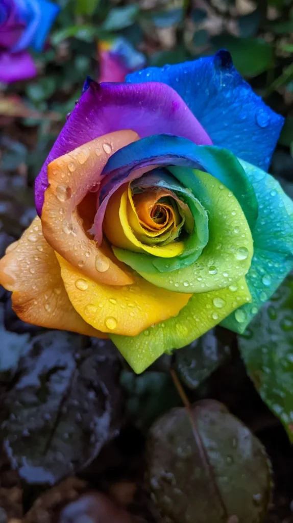
- Bright green botanical patterns for readers craving more color
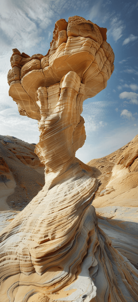
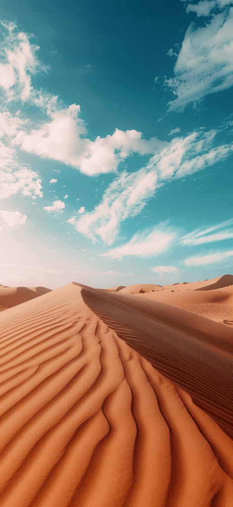
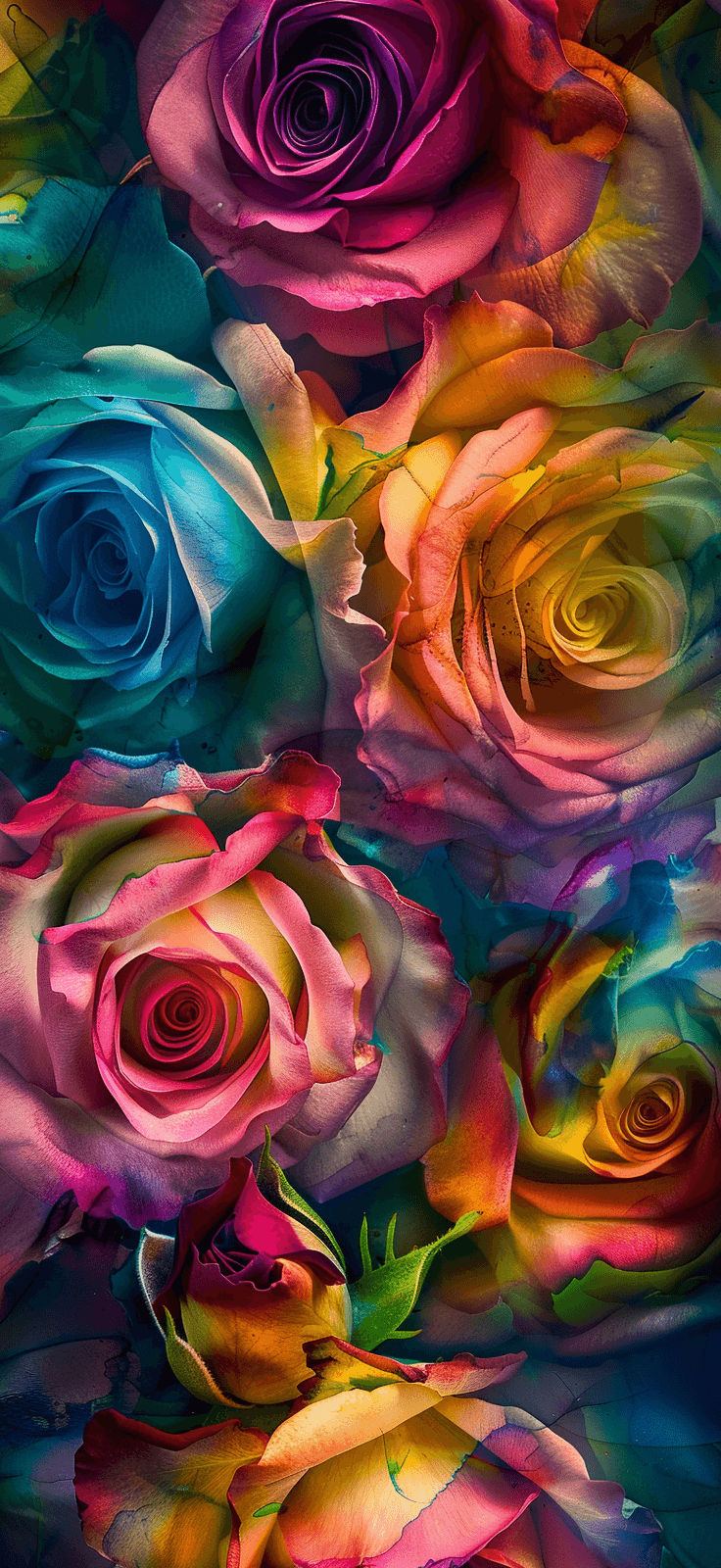
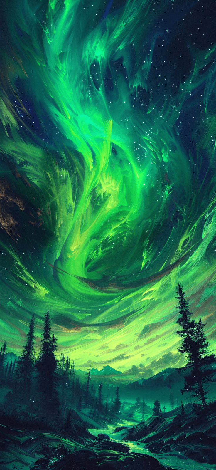
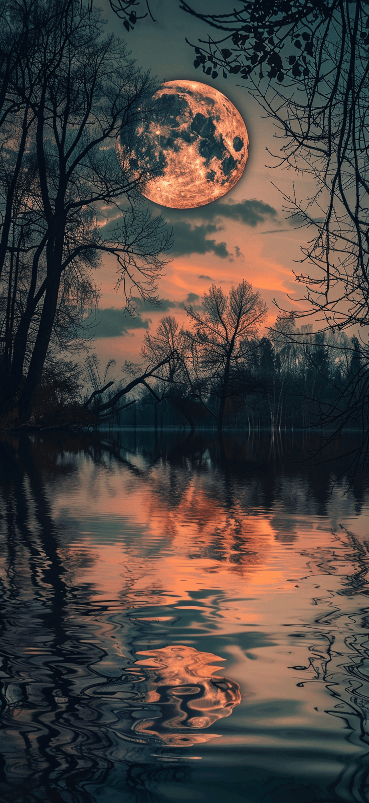
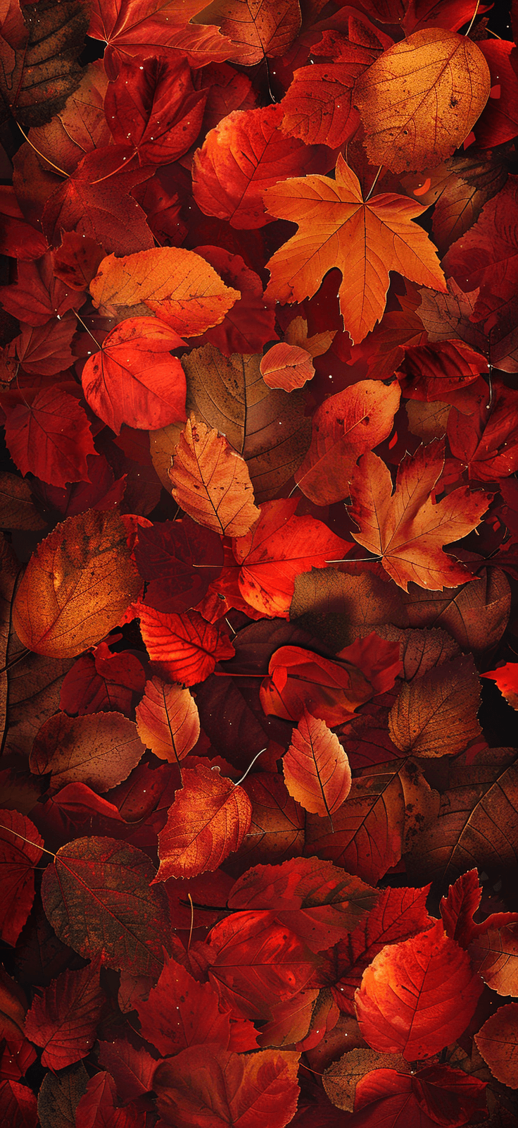
- Warm sunset tones with earth shapes for an artsy screen
Now, a common assumption says more detail means more beauty. I don’t buy that. On a phone, clarity wins. The prettier design often has fewer elements, stronger contrast, and enough open space for the time and widgets.
That’s why the simplest wallpaper can end up looking the most expensive. Wild, right? But it happens all the time. If your screen looks calmer, the whole design reads better. So before you pick the loudest option, glance at the softer ones again. They have a sneaky little charm.
And yes, if you want more than one Earth Day iPhone wallpaper, do it. Pick one for now. Save another for next week. A tiny digital wardrobe change never hurt anybody.

The Lock Screen Mood Matters More Than People Admit
I don’t think most of us say this out loud, but our phones set a tone. You see that screen before messages, calendars, grocery lists, and group chats hit. So the wallpaper becomes the opening scene. That’s not dramatic. It’s just true.
A harsh background can make everything look busier. Meanwhile, a soft one can make the same clutter look lighter. Nothing in your life changed, yet the visual tone did. That’s why I keep coming back to an Earth Day iPhone wallpaper, especially in spring.
Earth Day wallpapers work so well because they come with a built-in color story. Greens, blues, creams, and soft yellows already play nicely together. They don’t fight your icons. Nor do they make the date hard to read. Plus, they don’t look stale by next week.
I’ve found that some readers want cheerful. Others want chic. Then there’s the group that wants their phone to look like a tiny spa waiting room. I see you. This post leaves room for all three without turning into a random mess.
Here’s the surprising part. The wallpaper that looks safest on the page often looks prettiest on the phone. Big dramatic designs can shrink awkwardly. Softer patterns settle in better. They don’t beg for attention. Instead, they just look good.
So if you’re stuck between two favorites, try the calmer one first. Let it sit there doing its quiet little job. If you still want more color later, switch it. But the softer design may win you over before dinner. That twist catches people every time. That’s the thing with a good screen background. It doesn’t need applause. It just keeps making your phone look better in small, satisfying ways.


How to Set Your Earth Day iPhone Wallpaper Without the Annoying Guesswork
Once you pick your favorite Earth Day iPhone wallpaper from this post, setting it takes about a minute. The only fussy part is the crop. A gorgeous design can look weird if your phone trims it badly. That’s the mildly rude part.
I tend to notice that people overcomplicate this step when Apple already made the path pretty simple. You don’t need a giant tutorial. What you need is the clean version, fast. So here it is.
On an iPhone, use these steps:
- Save the wallpaper design from this post to your Photos app
- Open Settings
- Tap Wallpaper
- Choose Add New Wallpaper
- Open Photos
- Select your wallpaper
- Pinch to adjust the crop
- Hit Add
- Choose Set as Wallpaper Pair or customize the home screen separately
Now for the little thing that trips people up. If the design has a centered earth graphic, keep that art near the middle. But if the artwork uses a full pattern, you get more wiggle room. That tiny check saves frustration later.
Also, don’t assume the lock screen and home screen need the same energy. I like a prettier lock screen and a simpler home screen. It looks cleaner. Plus, your apps won’t fight the artwork. That tiny design choice does more than people expect.
So yes, the wallpaper is the fun part. Still, the final crop decides whether it looks polished or slightly off. Give that step one extra second. Your screen will reward you for it every single time. And if one design looks odd after cropping, don’t panic. Try another from the post. Some wallpapers simply fit certain screens better, and that’s normal.
Earth Day iPhone Wallpaper Picks That Also Work Beautifully on Android
Here’s the good news. Most of these Earth Day iPhone wallpaper designs look great on Android too. You may crop them a little differently, but the overall mood still lands. Pretty leaves stay pretty leaves. A lovely sky still does its job.
I’ve found that Android gives more variation, which sounds helpful until you remember how many screen sizes exist. So the goal stays simple. Pick a design with breathing room around the main art. That way the crop stays flattering instead of awkward.
If you’re setting one on Android, use these quick steps:
- Save the wallpaper design from this post to your gallery
- Open Settings
- Tap Wallpaper or Wallpaper and Style
- Choose your saved image
- Adjust the crop to fit your screen
- Set it for the lock screen, home screen, or both
Now, here’s the assumption worth tossing out. Android wallpapers do not need busier art to look complete. In fact, the opposite often works better. Cleaner designs crop more gracefully, especially after widgets and app labels enter the chat.
That’s why soft botanical prints, sky-inspired backgrounds, and simple earth graphics usually win on both systems. They flex. Plus, they don’t rely on one perfect placement. They still look intentional after cropping, which is exactly what you want.
So if you landed here with a Samsung, Pixel, or another Android phone, you’re not stuck with leftovers. Not even close. You can still scroll this post and get that same calm spring look. Cute is universal. I stand by that. The best part? You don’t need a separate design set. These wallpapers already do the work without turning your phone into a visual circus.
The Prettiest Picks Usually Aren’t the Loudest Ones
I know the flashy wallpaper often grabs attention first. It has bigger shapes, brighter color, and that whole “look at me” thing. Yet once it lands behind notifications, it can turn messy fast. That’s the plot twist.
I’ve found that the designs people keep longest usually look quieter at first glance. Not boring. Just balanced. They leave room for the clock. They also don’t fight the widgets. Meanwhile, they let the screen breathe, which matters more than people expect.
This post includes a nice spread of styles, and that helps. Some wallpapers lean playful with florals or brighter greens. Others look more polished with soft gradients, line art, or muted natural colors. One reader may call it too plain. Another may call it peace.
That’s why I wouldn’t pick based on the thumbnail alone. Open the design. Look at the spacing. Notice where your eye goes. Then ask one useful question. Will this still look pretty after texts, alarms, and weather widgets pile on top?
A lot of people assume bold equals better. I don’t think that rule holds on a phone. Bold can work, sure. But a balanced Earth Day iPhone wallpaper usually lasts longer. You don’t get tired of it as quickly. And nobody wants to swap wallpapers every twelve hours.
So yes, the prettiest option in this post may surprise you. It might be the one you almost skipped. Maybe the soft green one. Or the airy floral one. Sometimes the clean earth design with extra space around it. Quiet can still win the room, and sometimes it wins by a mile. That’s the sneaky beauty of a calmer Earth Day iPhone wallpaper. It doesn’t compete with your phone. It finishes it. That difference sounds tiny, yet it changes everything.

Wallpaper Picks for Every Kind of Earth Day Mood
Not everybody wants the same version of spring on their phone. Some people want soft and sweet. Others want modern and clean. Then there’s the crowd that wants more color, but still not chaos. Fair enough. This post covers that range.
I’ve found that it helps to match the wallpaper to your mood instead of your outfit or case. That sounds backward. Still, it works better. Your screen shows up in rushed moments, sleepy moments, and boring moments. Mood matters more than aesthetics alone.
If you want a quicker way to choose, use this cheat sheet:
- Pick florals or daisies for a cheerful, light spring look
- Choose leaf prints for calm, earthy, polished energy
- Go with oceans or skies for cooler, breezier color
- Try neutral earth shapes for a modern, minimal mood
- Choose brighter botanicals if your phone looks too plain
Now for the reframe. You do not need one Earth Day iPhone wallpaper that matches everything. You need one that makes your phone nicer to look at this week. That’s it. We put way too much pressure on tiny design choices, and it’s unnecessary.
So choose the design that fits your current mood. Then keep a second favorite saved. Maybe next week you’ll want the crisp blue one instead of the soft green one. Great. The whole point of an Earth Day iPhone wallpaper refresh is that it stays easy, low-stakes, and fun.
And yes, low-stakes pretty can still change the vibe of your whole day. I will defend that forever. Sometimes the tiny things pull the biggest weight. You’re not choosing a tattoo. You’re choosing a background. That freedom makes the whole thing more enjoyable.
Earth Day iPhone Wallpaper FAQs
Can I use these wallpaper designs on both my lock screen and home screen? Yes. That works beautifully if you love a matched look. Still, I often prefer the Earth Day iPhone wallpaper on the lock screen first. Then I use a simpler background on the home screen. That keeps apps easier to read.
Will the wallpapers in this post fit every iPhone model? Usually, yes. Most will fit nicely with a little crop adjustment. Newer iPhones may frame the image differently, especially near the clock area. However, designs with extra open space usually fit the easiest.
Do these wallpapers work after Earth Day too? Absolutely. Many of them read as spring, botanical, or calm nature-inspired designs. They don’t scream holiday. That’s part of the charm, and it makes them useful beyond one single week.
What if I like more than one design? Save more than one. Rotate them when your mood shifts. A wallpaper change is one of the fastest little refreshes ever. No shopping. No clutter. Just a better screen and a nicer vibe.
Will these work on Android phones too? Yes. You may crop them a bit differently, but many designs translate well across devices. Softer patterns, florals, skies, and minimal earth graphics usually adapt best.
Should I choose the boldest wallpaper so it stands out? Not always. Bolder isn’t automatically prettier on a phone. Very often, the cleaner design looks more polished once notifications appear. That tiny surprise catches people every time.
Do I need to replace my current wallpaper everywhere at once? Not at all. Start with the lock screen if you want the easiest change. That lets you enjoy the design without crowding your app pages. Sometimes one small switch is the prettiest move.
Your Lock Screen Just Got a Lot More Interesting
I like little upgrades that don’t ask for much. No big budget. No huge commitment. And no pile of stuff left on the counter afterward. An Earth Day iPhone wallpaper fits that mood perfectly, because it refreshes your screen without becoming a project.
I’ve found that tiny visual changes can make routine moments less dull. You glance at the time. You check a text. Or you open your notes app again. Meanwhile, that small wallpaper choice keeps giving your phone a cleaner, brighter tone. It’s subtle, but it isn’t nothing.
Living in Orlando, I lean toward wallpapers that look fresh without looking loud. That’s my sweet spot. I want springy, earthy, and pretty. I do not want visual static shouting at me before coffee. Life already supplies enough noise on its own.
So if you’ve been debating between a few favorites, trust the one you keep returning to. Usually that’s the answer. The design that makes you linger has something. Maybe it looks calm. Maybe it looks cheerful. Or maybe it just makes your phone look less tired.
And that’s the whole charm here. This isn’t about changing your life. It’s about choosing a little beauty on purpose. That’s why the right Earth Day iPhone wallpaper works. They’re useful, yes, but they’re also a quiet kind of fun. The Pinterest crowd understands this deeply.
Pick your favorite. Save a second one for later. Give your screen a tiny seasonal shift. Then go on with your day looking a little more put together than you did five minutes ago. That’s not too much. That’s just good taste with excellent timing.