Some people watch Disney movies for the princess dresses, the love stories, or the talking animals. I get it. Still, a Disney villain usually steals my attention within five seconds.
That’s not even a criticism. I keep noticing the same pattern. The villains get the sharpest lines, the boldest looks, and the biggest energy. Heroes often arrive like nice people. Villains arrive like an event.
Living in Orlando makes that extra obvious, because Disney floats around the background here all the time. That contrast says more than people realize. Even away from the parks, I notice villain art and wallpaper everywhere. It shows up in shops, homes, and online mood boards.
Maybe that says something about all of us. We say we want sweet, simple, safe characters. Yet we keep decorating with the dramatic one in purple flames. Then we claim we love the wholesome lead, and buy the print with the sarcastic smirk.
I’ve found that Disney villains hold attention because they don’t ask for it. They walk in knowing they’re the moment, which is rude, impressive, and hard to ignore. Their scenes usually carry more tension, more style, and more story than people admit.
And once I started thinking about that, I couldn’t stop. It’s not just who the villains are. What lingers are the traits, the movies, the artwork, and that slightly wicked aesthetic. That’s where this gets really good.

Some of the links on this page are affiliate links. That means if you click and make a purchase, I may earn a small commission at no extra cost to you. If you’re curious about the fine print, you can check out my full disclosure.
Why Every Disney Villain Sticks In My Head
A great villain never seems random. Even the campiest one usually carries a clear vibe, a sharp silhouette, and very specific chaos. That matters more than people think.
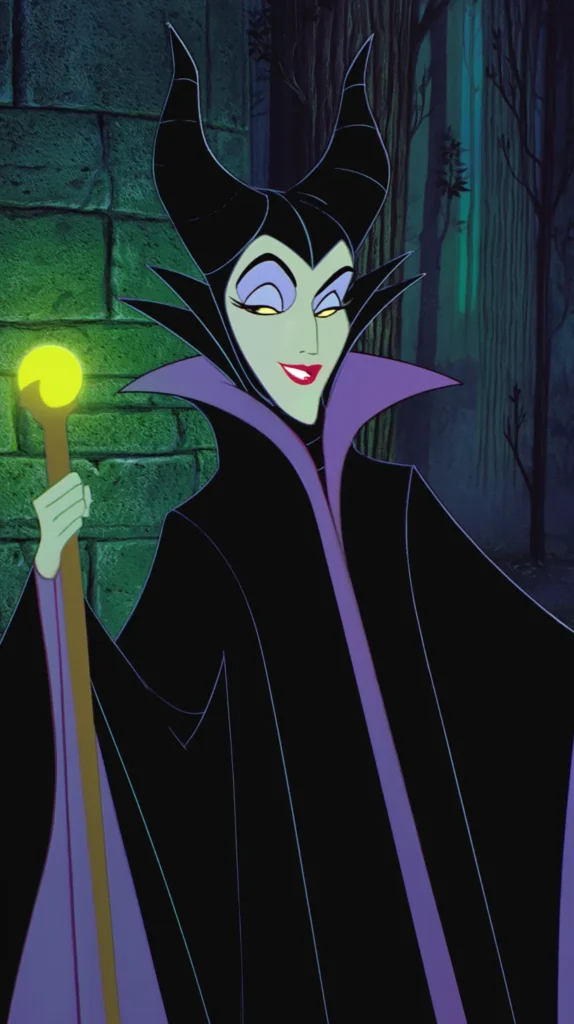
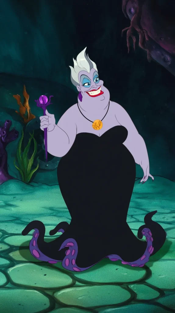
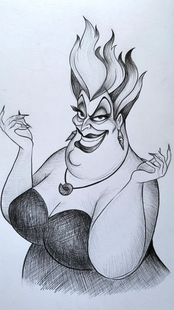
Take Maleficent for a second. She doesn’t just appear in Sleeping Beauty. Instead, she arrives with horns, drama, and cold confidence people still copy in art prints. Meanwhile, Ursula slithers through The Little Mermaid with jokes, volume, and full lounge-singer menace.
Neither woman blends into the movie. That’s the whole trick. A Disney villain sharpens the story. Everyone else reacts harder, talks faster, and panics better.
I tend to notice that heroes often explain themselves. Villains rarely bother. They state the plan, lift a brow, and let the room deal with it. That confidence lands.
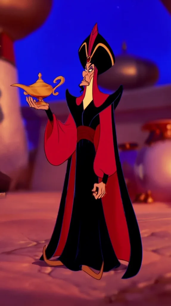
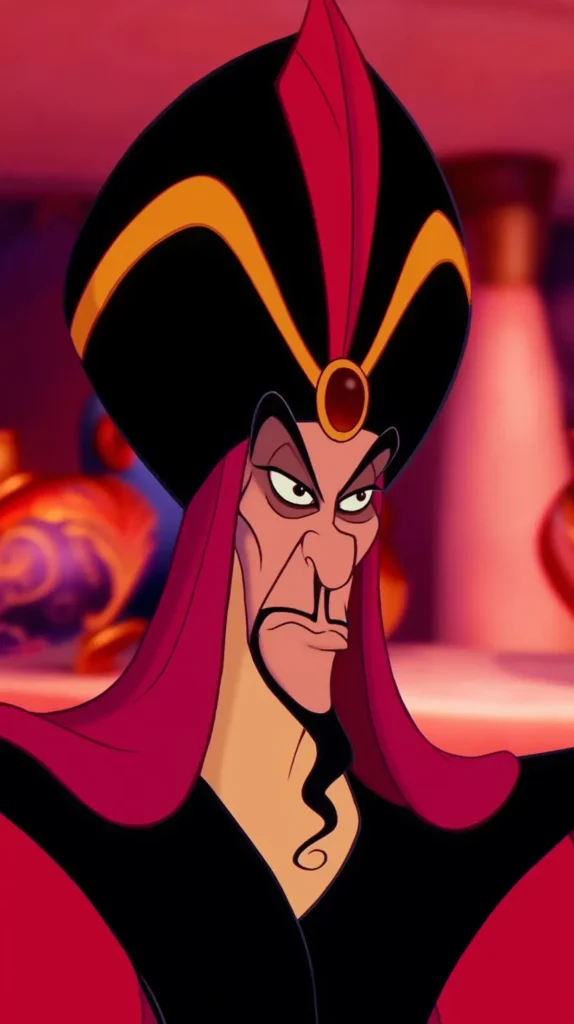
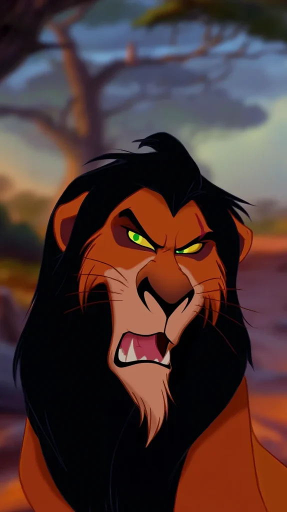
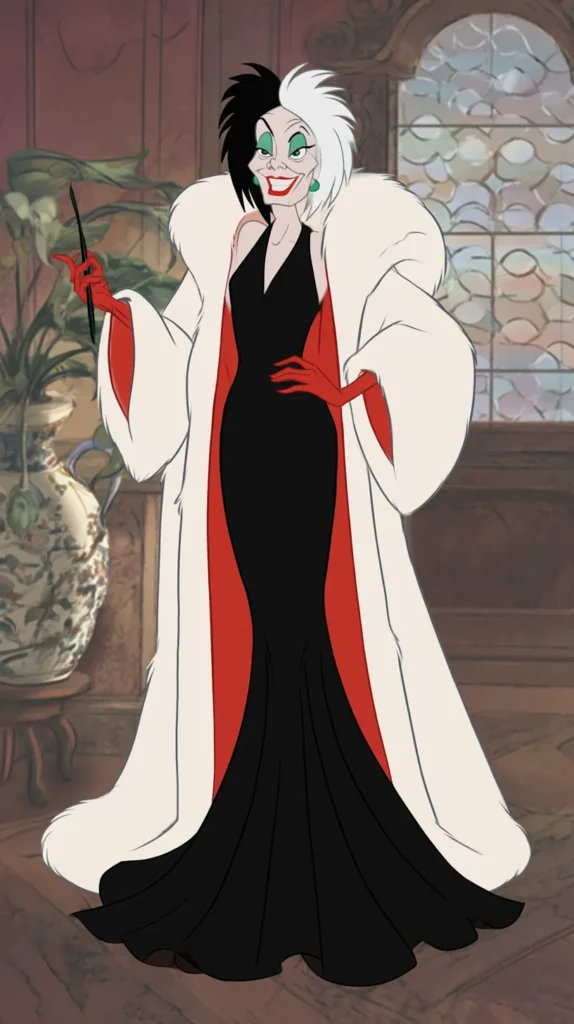
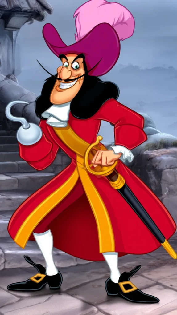
So does the design. Scar has that scarred face and low voice in The Lion King. Jafar brings long lines and cobra energy in Aladdin. Cruella storms through 101 Dalmatians like black-and-white chaos in heels.
Plenty of cute characters exist in Disney. Cute isn’t the same as unforgettable, though. Villains usually get cleaner shapes, stronger color stories, and bigger emotional swings.
Here’s the sneaky part. I don’t think people love villains because they want evil. Instead, I think they love clarity. Villains know what they want, even when it’s terrible. That certainty makes them hard to shake.
Yes, the songs help. The sarcasm helps too. Still, the real reason they linger sits deeper than a catchy entrance line. It starts with definition.

The Movies That Made Evil Look Weirdly Glamorous
Some Disney movies knew exactly what they were doing with villain energy. Others stumbled into it by accident. Either way, the result still worked.
I’ve found that certain films become favorites because the villain makes the whole thing crackle. Without that edge, the story might still be sweet. It just wouldn’t be nearly as addictive.
A few standouts always rise first:
- Sleeping Beauty gave Maleficent a gothic glow that still rules villain art.
- The Little Mermaid made Ursula funny, huge, and impossible to ignore.
- Aladdin turned Jafar into a slinky, dramatic nightmare with perfect timing.
- The Lion King gave Scar both family betrayal and a voice full of venom.
- 101 Dalmatians handed Cruella a look so iconic it outlived the film.
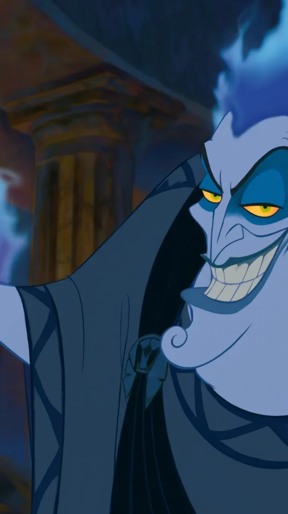
- Hercules let Hades rant, complain, and burn blue while stealing every scene.
That lineup says a lot. Disney didn’t just write bad people. They built whole visual worlds around them.
And that’s where the glamor sneaks in. No, villains aren’t role models. Yet the movies keep dressing them in the strongest shapes, best colors, and most memorable entrances.
Even their settings help. Ursula gets a lair. Maleficent gets green fire. Scar gets the elephant graveyard. Hades gets the Underworld and every sarcastic line delivery imaginable.
Meanwhile, many heroes get forests, castles, and a nice moral center. Lovely. Also, less spicy.
That contrast matters because viewers notice style before they name it. A Disney villain often turns the movie from pleasant into magnetic. Once you spot that shift, you start seeing the pattern everywhere.

Disney Villain Traits That Never Go Out Of Style
Every great villain has traits people recognize instantly. Not admirable traits, obviously. Still, they’re strong enough to make the character snap into focus.
First, there’s confidence. Not quiet confidence either. I mean the kind that fills a doorway before the character speaks. Maleficent has it. Cruella has it. Scar has it in a lazy, poisonous way.
Then comes precision. A Disney villain usually has a sharp point of view. Heroes may wander, doubt, or grow. Villains show up with a finished agenda and zero interest in softening it.
That’s fascinating to watch. It’s also why their dialogue lands so well. They don’t waste time sounding agreeable. Instead, they cut straight to the point.
Another trait I keep noticing is style discipline. Villains rarely look messy by accident. Ursula’s makeup, Jafar’s lines, the Evil Queen’s severity, and Mother Gothel’s rich colors reveal them instantly.
And then there’s theatricality. This matters more than people admit. A villain who knows how to perform becomes bigger than the plot for a minute. That little takeover changes everything.
Here’s the reframe people miss. The best villains aren’t memorable because they’re the loudest. They’re memorable because they’re the most committed.
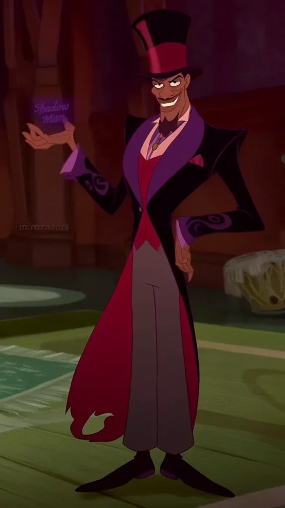
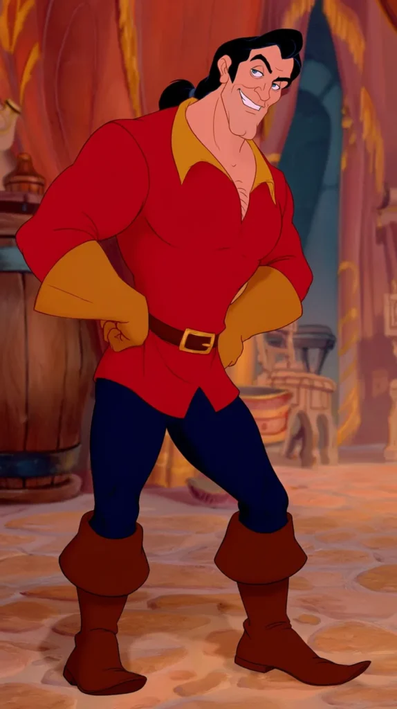
That’s why Hades works. So does Dr. Facilier in The Princess and the Frog. Yzma works too, even with all her chaos, because she commits fully to every ridiculous second.
I’m not saying villains should be copied. I am saying clear traits beat vague niceness every time on screen. We remember characters with edges, not blur.

Why Some Disney Villain Art Looks Better Than The Heroes
This is where things get deliciously unfair. A lot of Disney hero art looks nice. Disney villain art often looks stunning.
I think contrast does the heavy lifting. Villains come with darker palettes, stronger lines, and more dramatic poses. So the artwork starts with built-in tension. That gives artists more to play with.
Certain visual choices show up again and again:
- Maleficent works beautifully with black, green, and smoky purple.
- Ursula looks amazing with sea tones, shell details, and exaggerated curves.
- Scar shines in fiery reds, dry golds, and harsh shadow.
- Cruella thrives in black, white, and sharp red accents.
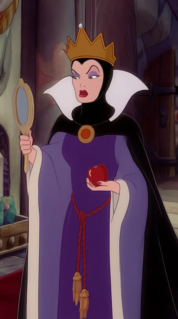
- The Evil Queen fits mirrors, apples, velvet, and severe geometry.
- Hades pops with blue flame against dark backgrounds.
That range matters. You can make villain art look gothic, sleek, playful, moody, or expensive. Hero art often leans softer, prettier, and more predictable.
Now, pretty still has a place. I love a dreamy castle print. Yet villain pieces usually stop the scroll faster because they hold more visual conflict.
Another reason is expression. Heroes smile. Villains smirk, glare, scheme, or stare through the frame. That gives wall art a pulse.
I’ve also found that villain art works better in grown-up spaces. A subtle Maleficent print can read chic. Meanwhile, a black-and-white Cruella piece can look fashion-forward. Even a moody Scar poster can work in a media room.
That’s the secret sauce. Disney villain art often reads less like merch and more like mood. Once that clicks, the obsession makes perfect sense.

The Villains Who Took Over Their Own Movies
Some villains do more than support the story. They hijack it, redecorate it, and leave with the best lines. That’s not a complaint. It’s a public service announcement.
Scar may be the clearest example. The Lion King has heartbreak, beauty, and big themes. Still, Scar slinks through the movie with such controlled bitterness that he changes the whole temperature.
Then there’s Ursula. Ariel drives The Little Mermaid, sure, but Ursula supplies the chaos, the humor, and the sharpest power shift. Without her, the movie turns sweeter and flatter.
Hades does this too. Hercules is a fun movie, yet Hades brings the speed, sarcasm, and modern rhythm people still quote. He’s not just the villain. That makes him the jolt.
A Disney villain can take over because villains often force the plot to move. Heroes respond. Villains provoke. That difference sounds small, but it changes everything.
Mother Gothel deserves more credit here. Tangled works because Rapunzel grows, yes. However, Gothel creates such weird tension that every scene with her buzzes.
And let’s talk about Cruella. In 101 Dalmatians, she doesn’t simply oppose the leads. She arrives like a storm cloud wearing a fabulous coat and too much certainty.
People often assume the best villain must be the scariest. I don’t buy that. The most effective one might just be the most disruptive.
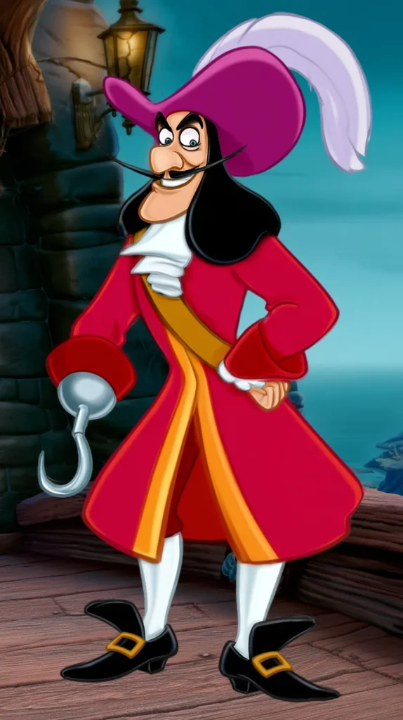
That’s why Yzma lingers. Gaston does it too. Dr. Facilier does it too. They twist the movie’s rhythm and keep things lively. Suddenly, they become the movie’s electricity.

Disney Villain Wallpaper That Looks Cool, Not Cartoonish
This topic gets dismissed way too quickly. People hear wallpaper and picture a child’s bedroom from 2004. That’s not the only lane.
Disney villain wallpaper can look bold, chic, dark, and surprisingly grown. The trick sits in the styling, not just the character choice. That part changes everything.
A few approaches work best:
- Try silhouettes instead of full character faces for a cleaner look.
- Lean into symbols like apples, flames, thorns, crows, or potion bottles.
- Pick moody colors instead of rainbow brights.
- Choose one villain per wall for a more elevated vibe.
- Use gallery-style framing nearby to make the room look intentional.
- Keep furniture simple so the wallpaper stays the star.
Maleficent wallpaper probably has the widest range. You can go gothic with thorns and green fire. Or you can go sleek with horned silhouettes. Either route works.
Cruella also translates beautifully. Black, white, and red already look graphic and polished. So the design reads fashion-forward, not theme-park obvious.
Scar wallpaper works better than many people expect too. Desert colors, shadowy shapes, and sun motifs create a mood without yelling lion at everyone.
Here’s the assumption worth flipping. Wallpaper doesn’t need to be loud to be fun. A Disney villain print can whisper and still get attention.
That’s why subtle patterns often win. Repeating poison apples, smoky flames, or tiny villain quotes can give a room edge without looking busy. And yes, I’d use that in an office, media room, or reading nook first.
The Quietly Unhinged Ones Deserve More Respect
Big villains get the merch, the quotes, and the wallpaper love. Meanwhile, the quieter ones sit in the corner being weird in far more interesting ways.
The Evil Queen is a perfect example. She doesn’t rant like Hades or swirl around like Ursula. Instead, she gives controlled coldness, polished vanity, and one of Disney’s best transformation scenes.
That restraint matters. A villain doesn’t need volume when menace does the job. Sometimes the stillness looks even creepier.
Lady Tremaine belongs here too. Cinderella’s stepmother isn’t flashy, yet she may be one of Disney’s most realistic villains. Her cruelty lands because it feels measured, petty, and painfully believable.
Then there’s Mother Gothel. She can joke, flatter, and manipulate in the same breath. That makes her unnerving in a different way. She doesn’t just threaten. Instead, she rewrites the emotional weather in the room.
I’ve found that quieter villains often age better with adults. Kids may enjoy the obvious drama first. Later, the subtle ones start looking much darker.
That shift makes sense. Manipulation, envy, vanity, and control read differently once you’ve seen more life. Suddenly, the quiet Disney villain becomes the one that lingers longest.
Even Judge Frollo deserves a mention, though he’s much heavier than many others. His menace works because he believes in his own righteousness. That makes him disturbing in a lasting way.
So no, the loudest villain doesn’t always win. Sometimes the one speaking softly leaves the deeper scratch mark. And that may explain why the quieter villains hit so hard in art too.
How Disney Villain Style Became Its Own Aesthetic
At some point, villain appreciation stopped being just movie fandom. It turned into a whole visual lane, and I completely understand why.
A Disney villain already comes with a strong palette, clear symbols, and a full personality package. That makes styling easy. You’re not inventing a mood from scratch. Instead, you’re translating one.
Certain aesthetics show up over and over:
- gothic glamour with Maleficent thorns, ravens, and green flame
- vintage fashion drama with Cruella black, white, and red
- underwater camp with Ursula shells, tentacles, and sea shimmer
- desert menace with Scar sunsets, bones, and dry gold tones
- royal poison vibes with the Evil Queen, mirrors, and apples
- neon underworld energy with Hades blue fire and sharp black contrast
That variety gives people options. Not everyone wants the same kind of dark. Some want elegant. Others want snarky. A few want full theatrical menace.
And that’s why the aesthetic keeps growing. Disney villain decor doesn’t sit in one box. It can look maximalist, minimalist, spooky, glam, or graphic depending on the execution.
I think people also like the permission it gives. Villain style says you can decorate with edge, humor, and a little vanity. That’s fun. It’s also a nice break from relentless sweetness.
Here’s the surprise. The appeal isn’t always rebellion. Sometimes it’s just relief.
Soft, pretty decor can start blurring together. Villain-inspired art, wallpaper, and color stories bring shape back into the room. They remind the eye where to land.
So yes, it’s dramatic. Good. Some aesthetics should enter like they know everyone will stare.
The Part That Lingers After The Credits
The older I get, the more I notice that Disney villains aren’t just side characters with better lines. They’re often the reason the whole movie keeps humming in my head afterward.
Maybe that sounds dramatic, but come on. We remember the green fire, the poisonous apple, the sea-witch swagger, and the dry little smirk. Those details stick because they carry texture, not just plot.
I’ve found that a Disney villain also gives fans more ways to play with the story later. You can rewatch the movie, quote the scene, buy the print, or save the wallpaper. Then build a mood board. That’s a lot of staying power.
Living in Orlando makes me notice that even more. Disney visuals never stay tucked inside the screen here. They spill into shops, art, home decor, and yes, plenty of Pinterest boards too.
And that’s what keeps this whole topic so fun. Villains aren’t memorable just because they’re bad. They’re memorable because they’re specific, stylish, theatrical, and gloriously overcommitted.
Meanwhile, the heroes often carry the lesson. The villains carry the flavor.
That contrast keeps pulling me back. One side gives heart. The other side gives drama, edge, and the image you still remember later. Somehow, the wicked one still looks the most polished.
So when someone says they love villain wallpaper, villain art, or a wicked entrance, I completely get it. Some characters don’t just appear in a story. They leave claw marks on the aesthetic, and that’s a pretty fabulous trick.